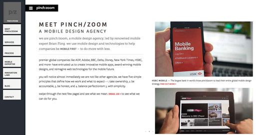
X marks the spot for mobile design agency website
Pinch/zoom uses CSS columns and some responsive craftiness to create a clever x-axis-oriented website design.
Sign up to Creative Bloq's daily newsletter, which brings you the latest news and inspiration from the worlds of art, design and technology.
You are now subscribed
Your newsletter sign-up was successful
Want to add more newsletters?

Pinch/zoom is a mobile design agency led by renowned mobile expert Brian Fling, and has a remarkable site that performs along the x-axis, the web’s less trodden path, on wide displays.
The design uses CSS columns, which can be difficult in responsive design to control the presence of a horizontal scrollbar, but pinch/zoom prevails and elegantly addresses the problem with some vertical responsive craftiness. The content has space to sing while the navigation, which works effortlessly in small or large viewports, sits out of the way and is only triggered on clicking the pinch/zoom logo.

On small devices, the dynamic shifts to traverse the more familiar y-axis. It’s clearly a considered decision: the wide viewport accommodates multiple columns and the horizontal layout seamlessly, but smaller viewports unable to handle several columns would offer a disjointed reading experience.
Article continues belowOften you’ll find websites that take this approach are open to experimentation, but it can often battle with our inbuilt habits. Pinch/zoom manages to step up to the challenge and produce something that feels solid and intuitive against the odds.
This showcase was originally published in .net magazine issue 243.
Like this? Read these!
- 10 responsive agency websites to inspire you
- Great examples of doodle art
- Brilliant Wordpress tutorial selection
Have you seen a good example of website navigation recently? Let us know about it in the comments box below!
Sign up to Creative Bloq's daily newsletter, which brings you the latest news and inspiration from the worlds of art, design and technology.

The Creative Bloq team is made up of a group of art and design enthusiasts, and has changed and evolved since Creative Bloq began back in 2012. The current website team consists of eight full-time members of staff: Editor Georgia Coggan, Deputy Editor Rosie Hilder, Ecommerce Editor Beren Neale, Senior News Editor Daniel Piper, Editor, Digital Art and 3D Ian Dean, Tech Reviews Editor Erlingur Einarsson, Ecommerce Writer Beth Nicholls and Staff Writer Natalie Fear, as well as a roster of freelancers from around the world. The ImagineFX magazine team also pitch in, ensuring that content from leading digital art publication ImagineFX is represented on Creative Bloq.
