The art of mixing Google typefaces made easy
Pairing fonts can be a frustrating and time consuming business. This infographic from FastPrint will make your life easier.
Sign up to Creative Bloq's daily newsletter, which brings you the latest news and inspiration from the worlds of art, design and technology.
You are now subscribed
Your newsletter sign-up was successful
Want to add more newsletters?
Google Fonts offers one of the largest open-source font repositories on the Internet, featuring in excess of 650 font families, all of which are available to download free of charge.
If you've used Google Fonts before (we're guessing you have, right?), you'll probably have noticed that although there's a mammoth selection of fonts available, not all of them go together.
Art and science
In fact, managing to find a couple of Google Fonts that are likely to look great alongside each other is a task easier said than done. Not only will it take hours, but it's sure to be a mind-numbingly boring process too.
Luckily though, you might never have to go through this soul-crushing process ever again, thanks to this epic infographic by FastPrint.co.uk.

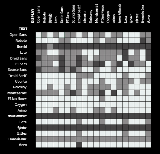
Aptly named The Art of Mixing Typefaces: Google Fonts Edition, the infographic acts as a kind of "cheat sheet" for pairing the most popular Google Fonts and contains a grand total of four hundred unique pairings.
Quick and easy
It's simple to use, you just need to choose a display font (best for headings) and a text font (best for body/paragraph content), then use the colour-coded grid to check their compatibility.
A white square means the fonts will work well together, a grey square means it's an unlikely combination, and the a black square means you should probably avoid the combination at all costs.
Sign up to Creative Bloq's daily newsletter, which brings you the latest news and inspiration from the worlds of art, design and technology.
As the infographic explains, font pairing isn't an exact science so it should only be used as a guide. Still though, it's worth a bookmark, as it'll probably save you hours of trial and error.
Words: Jodie Hopson
Jodie Hopson is an experienced designer at Fastprint. Fastprint is a UK printing and design company focused on quick turnaround and quality customer service. Follow them on Twitter at @fastprintuk.
Like this? Read these!
- The designer's guide to working from home
- How to build an app: try these great tutorials
- Free graphic design software available to you right now!

The Creative Bloq team is made up of a group of art and design enthusiasts, and has changed and evolved since Creative Bloq began back in 2012. The current website team consists of eight full-time members of staff: Editor Georgia Coggan, Deputy Editor Rosie Hilder, Ecommerce Editor Beren Neale, Senior News Editor Daniel Piper, Editor, Digital Art and 3D Ian Dean, Tech Reviews Editor Erlingur Einarsson, Ecommerce Writer Beth Nicholls and Staff Writer Natalie Fear, as well as a roster of freelancers from around the world. The ImagineFX magazine team also pitch in, ensuring that content from leading digital art publication ImagineFX is represented on Creative Bloq.
