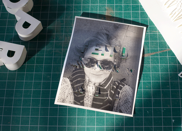
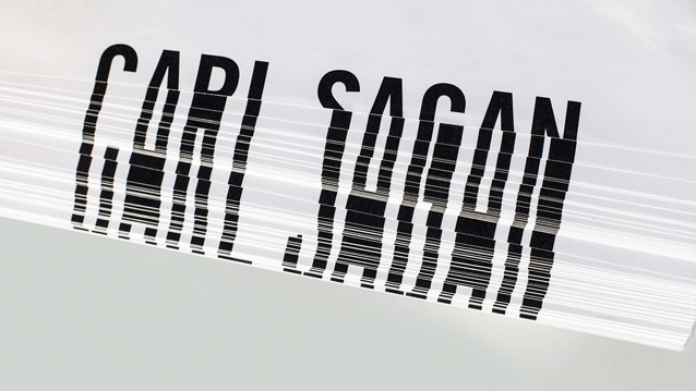
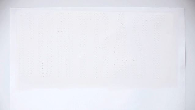
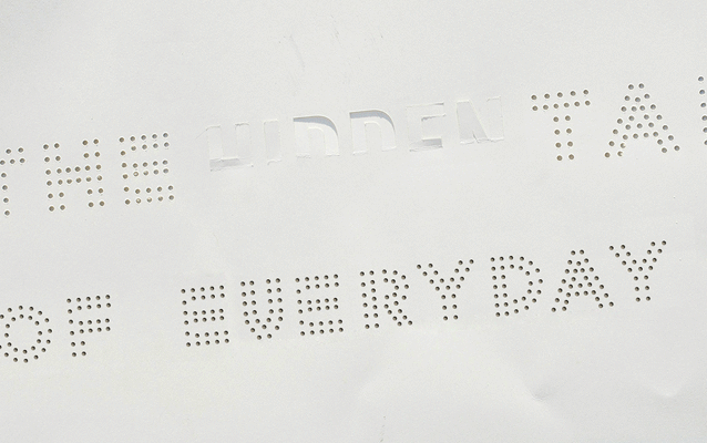
Kelli Anderson loves typography. Speaking at Typo San Francisco earlier this month, the subject gave her an excuse to try something that she had always intended to play with - paper. For each slide in her presentation, she came up with a different, semi-legible strategy for making a different type of paper lettering.
Kelli used the form of paper to render the image of the type, rather than using paper as a substrate for ink. She did break that rule once, using ink for one of the creations but most of the lettering experiments are white-on-white; sticking to the 'paper-on-paper' ambition.
This is where subtle typography triumphs. By using this minimalist approach, Kelli has crafted something really beautiful. Looking into the extensive detail and rendering of the font experiment makes us think Kelli must have had to have a hell of a lot of patience for the project. You only have to look at the final images to see it was all worth it.


See more inspiring typography on the Kelli Anderson website.
Like this? Read these!
- Free graffiti font selection
- Illustrator tutorials: amazing ideas to try today!
- Great examples of doodle art
Have you seen any striking typography experiments? Let us know in the comments box below!

