How to create a minimalist site people won't hate
Minimalism often frustrates visitors who can't find what they're looking for. Here's how to do it well.
Sign up to Creative Bloq's daily newsletter, which brings you the latest news and inspiration from the worlds of art, design and technology.
You are now subscribed
Your newsletter sign-up was successful
Want to add more newsletters?
Minimalist design has risen in popularity over the past few years with plenty of beautiful sites around that reflect its content-focused design philosophy.
A good definition of minimalist design comes courtesy of UX Movement: "A truly minimalist design would have the highest possible signal-to-noise ratio". But what exactly does this mean?
In design, noise is anything that distracts a user from accomplishing their immediate goals. An information-heavy site with many design elements "dilutes the signal" and takes away from providing a great user experience. UX Movement point out that in order to avoid this, you should "shoot for maximum signal and minimum noise".
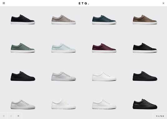
Check out the site above, which is for Amsterdam shoemaker ETQ. It's pretty clear that the site is all about shoes. As awwwards point out, the site is "stripped down to its bare essentials" in keeping with the brand's mission.
ETQ states that it "was born under the mindset of eliminating over accessorized branding and focusing primarily (sic) on letting the quality of the product speak for itself."
The design reflects the mission statement: there's no flashy imagery, no complex brand messages, just crisp images of the product. The designers concentrated their efforts on allowing the site design (like the shoes themselves) to communicate simplicity and quality.
The approach also remains consistent across other pages. If you click through on a design that you like, then you're taken to a simple product page using high-resolution images to zoom in on every detail of the product design.
Sign up to Creative Bloq's daily newsletter, which brings you the latest news and inspiration from the worlds of art, design and technology.
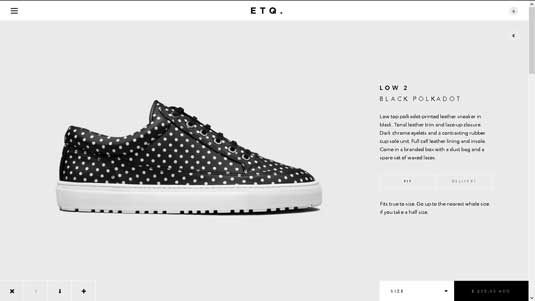
The product page contains a brief description with links to 'fit' and 'delivery' which offer details when clicked. Size is chosen through the bottom, white box in the right-hand corner, while the price is highlighted in the black box.
The visual treatment of the price subtly suggests quality to the user (and they are priced on the high side, at around $265 (Euro: 235).
Note the use of colour too, which we described in the free ebook Web Design for the Human Eye:
- Black – denotes class, excellence, stability and strength
- Gray – promotes feelings are stability and calm
- White – Pure, cool, calm and modern
The smart colour choices present the shoe as a high class product, which offers a sense of calm and stability. But does the design cut out the noise?
Absolutely. There's very little text on any of the pages and even the navigation menu remains hidden until you click on it. Nothing distracts from the main message – which is 'this is a shoe that's good enough quality that no gimmicks are required'.
Cutting out the noise is all about removing those elements that are not necessary in order to get your 'signal' across as clearly as possible.
Can you overdo minimalism?
That depends. If you design a site so minimalist that the signal (the message about the brand) isn't conveyed, then yes, it is too minimal.
As discussed earlier, the idea is to strip away unnecessary elements, leaving those that amplify the signal. Again, minimalist doesn't mean necessarily mean simple and it could be that the backend and the UI is actually quite complex, but this doesn't show in the design.
It's important that you arrive at the design process with no preconceptions, as they do exist with regard to these kinds of designs.
For example, a lot of people imagine that minimalist means flat design, while others equate it with certain colours such as white and gray. Others still believe minimalism is all about the use of strong colour to give signals. On the contrary, minimalist design comes in all shapes, sizes and colours.
Don't sacrifice usability for visual flair
Use visual cues such as colours to give signals to your users. Use whitespace as a sculpting tool to create breathing room for on-screen elements (thereby directing the user's eyes to the more important content). But don't get carried away.
If your navigation is represented by icons, make sure labels appear on hover. Make sure the user always knows where they are, and how to get to their next destination. Choose a legible and readable typeface in a size that won't make people squint.
The list goes on, but remember that your site must be usable before it can be desirable in any form.
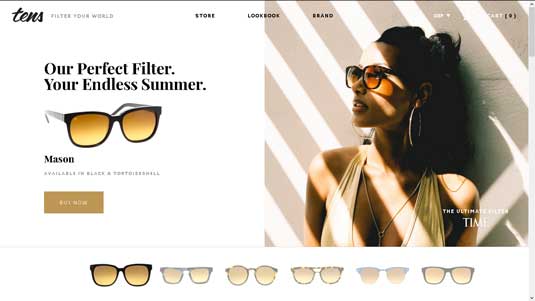
Check out the screenshot above for Tens Sunglasses. The design is clean, with plenty of white space and a disciplined use of colour.
The white space points your attention clearly to the sunglasses featured in the main body of the page, while the image lends a sense of warmth and luxury.
Interestingly, the colour is just on the edge of brown – which is one that colour psychology argues we shouldn't use as it's universally disliked. In this context, the colour works because it's an orange-brown reminiscent of sun and sand.
The sunglasses displayed across the bottom of the page are actually navigational elements. When clicked, a new page slides in with a different image in the left-hand pane and the selected sunglasses in the right. At the top of the page, users can still access a traditional text-based navigation.
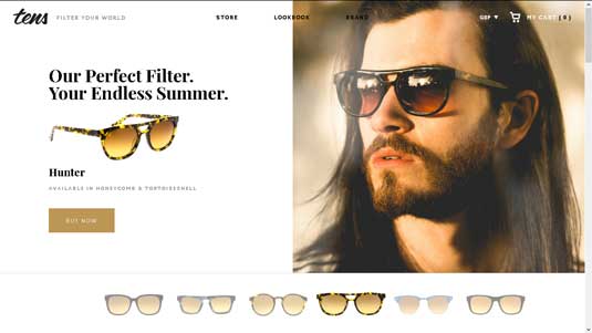
The site tagline and subheader remains the same on each page, ensuring that the brand message remains as the primary signal consistently.
As you scroll down the page for more information, there's still just enough navigation for users to either explore the product in more detail or complete a purchase. The content (in this case, product and lifestyle photos) takes center stage, and the remaining interface elements simply help the user explore the narrative.
While the body text size on the page could be a few points larger, the typeface itself is legible and readable. Overall, the site is a good example of balancing minimalism, usability, and strong branding.
Preparing for minimalism
If you're considering building a minimalist website for the first time, then do some homework. Web design always seems to be about one trade-off or another, so you should first consider the following.
- Usability – The design should never distract from the usability of the site.
- Content – What's important and what can safely be left out.
- Hierarchy – Where should everything live on the page and which elements should be given priority.
- Typography – A key ingredient of minimalist sites, you can find plenty of stunning examples and best practices online.
- Wireframes – Create low-fi wireframes based on the content that you need to include and decide early on which colours you want to use and why. It's fine to use Lorem Ipsum in the first wireframe, but as you iterate, you should start using real content (even if it's rough).
First, create a content inventory and only include what users care about. Next, start exploring the information architecture through card-sorting exercises, wrapping up with a site map. Once you've mapped out the content, then you can start wireframing and prototyping. Don't be afraid to subtract design elements until you feel like the site is about to break – test it with colleagues or users and then adjust as necessary.
By following this content-focused process, you're able to naturally create a leaner site without obsessing over bare-bones aesthetics. Follow the philosophy (not the aesthetic), use a grid to keep everything aligned and positioned correctly, and you'll be on the right path to a more lightweight yet captivating site.
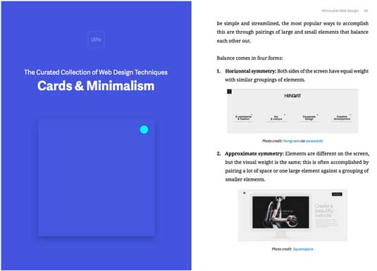
For more tips, check out the free ebook Cards & Minimalism. The 70+ page ebook explains the best techniques for designing elegant websites with 43 examples from companies like Google, Squarespace, and others.
Words: Jerry Cao
Jerry Cao is a content strategist at UXPin — the wireframing and prototyping app — where he develops in-app and online content for the wireframing and prototyping platform.
Like this? Read these!
- 20 steps to the perfect website layout
- How to build an app: try these great tutorials
- Free graphic design software available to you right now!

The Creative Bloq team is made up of a group of art and design enthusiasts, and has changed and evolved since Creative Bloq began back in 2012. The current website team consists of eight full-time members of staff: Editor Georgia Coggan, Deputy Editor Rosie Hilder, Ecommerce Editor Beren Neale, Senior News Editor Daniel Piper, Editor, Digital Art and 3D Ian Dean, Tech Reviews Editor Erlingur Einarsson, Ecommerce Writer Beth Nicholls and Staff Writer Natalie Fear, as well as a roster of freelancers from around the world. The ImagineFX magazine team also pitch in, ensuring that content from leading digital art publication ImagineFX is represented on Creative Bloq.
