6 clever persuasion techniques in web design
How do you get website visitors to do what you want? Jerry Cao outlines some clever techniques.
Sign up to Creative Bloq's daily newsletter, which brings you the latest news and inspiration from the worlds of art, design and technology.
You are now subscribed
Your newsletter sign-up was successful
Want to add more newsletters?
The eternal challenge in web design is balancing user needs with business needs. Your design should always serve the intersection of the two paths.
Get some help choosing a great website builder here
Colleen Roller, senior user researcher at Merrill Lynch, provides us some tips for improving user decision-making. Some of these tactics are adapted for digital content from interpersonal communication skills and even sales techniques.
In this article, we examine some of our favourite examples of persuasive design based upon the concepts outlined by Roller. Some of the techniques are more obvious, while others more subtle. All of them, however, play a huge role in swaying user decisions during any web experience.
01. Salience
Our discussion of designing for scanning extends beyond just the F or Z pattern. As Dr David Travis suggests, you can also highlight content to change users' minds. Salience refers to when an object appears more important than its surroundings. Both you and the user want to achieve their goals, so why not create a design that satisfies both your needs?

BMW North America's site design makes it easy for users to decide where to go. The blue call to action stands out against the vehicle background, while the three options below it are all strong secondary choices.
If you're interested in a BMW, most of the important decisions are covered here, covering the spectrum of buyer readiness:
Sign up to Creative Bloq's daily newsletter, which brings you the latest news and inspiration from the worlds of art, design and technology.
- Learn about a seasonal sale (most prominent option)
- Learn about other special offers
- Customize your own BMW
- Contact a dealer
The site presents these options in a clear hierarchy that's easy to interpret thanks to the grid format.
As described in the free ebook Interaction Design Best Practices, salience is enhanced when you present it in the right context. For ecommerce sites, one of the best ways to present sale items or accessories is when someone has already shown interest in a product.

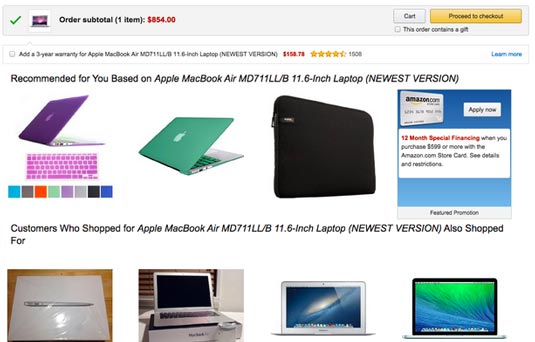
For example, on Amazon, once I've placed an item in the cart, the site suggests that you'll also need something to protect the laptop (like the black case). They also suggest a warranty. The checkout stage is a perfect time to remind users about "upsell" products since they've already demonstrated a willingness to buy.
To learn more about salience in decision-making, check out this excellent piece on UXMag.
02. Anchoring & ordering
First impressions set the context for the rest of the experience; creating this frame of reference is anchoring. For example, if a user sees an expensive laptop displayed prominently, it will make other laptops on the screen seem cheaper. While it might seem counter-intuitive, this initial "sticker shock" makes other options more attractive.
One of the best ways to utilize anchoring is with the order you choose to display your content.
In the above example, putting your most expensive laptop at the top of a product list is a subtle way of anchoring it in the user's mind. Whichever laptop you choose to list next will automatically look more affordable.
03. Context
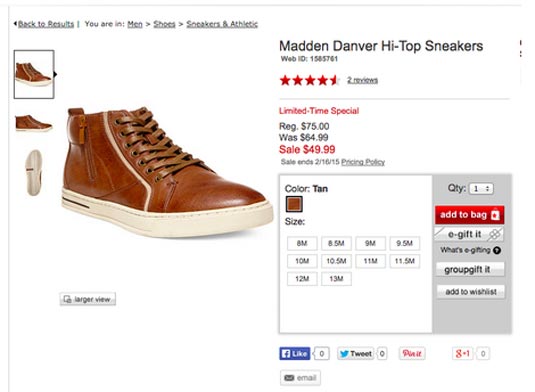
The design below from Macy's includes a higher price, but feels like a good deal thanks to the $75 price anchor.
As Roller explains, this is because decision-making requires the logical brain and the "gut brain" — but the gut leaves the first and strongest impression. The gut brain decides, while the logical brain usually just reviews the decision.

If you wanted to make context even more powerful, combine it with the tactic of ordering. For example, listing a $109.99 pair of shoes before the one shown above would make the cheaper set more enticing.
Next page: framing, reference and loss aversion...

The Creative Bloq team is made up of a group of art and design enthusiasts, and has changed and evolved since Creative Bloq began back in 2012. The current website team consists of eight full-time members of staff: Editor Georgia Coggan, Deputy Editor Rosie Hilder, Ecommerce Editor Beren Neale, Senior News Editor Daniel Piper, Editor, Digital Art and 3D Ian Dean, Tech Reviews Editor Erlingur Einarsson, Ecommerce Writer Beth Nicholls and Staff Writer Natalie Fear, as well as a roster of freelancers from around the world. The ImagineFX magazine team also pitch in, ensuring that content from leading digital art publication ImagineFX is represented on Creative Bloq.
