6 online music services with killer UI
Take inspiration for your own designs from these user interfaces, says Niall O’Loughlin of 99 Designs.
Sign up to Creative Bloq's daily newsletter, which brings you the latest news and inspiration from the worlds of art, design and technology.
You are now subscribed
Your newsletter sign-up was successful
Want to add more newsletters?
04. Soundcloud: the community player
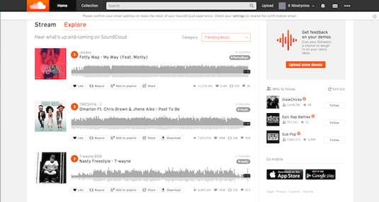
Soundcloud is a service that has a more community feel and the UI includes a large amount of white space with bright colours to make page actions stand out.
It's a 'busy' interface which contains a media player that resembles an infographic, excellent social functionality which enables you to share, like or comment and a cool option for artists to tag their songs.

The toolbar at the top remains in place as you scroll and lets you change your collection or personal information while also searching and uploading music.
Finally, you can get feedback on your music by using the Call to Action on the right hand side of the page and a list of artists to follow.
05. iTunes: the media giant
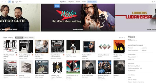
While iTunes radio is free, you will have to pay from $0.69 to $1.29 per song on the iTunes Store. It is one of the least popular services by all accounts which may explain why Apple purchased Beat Sounds.
While the other services on the list typically allow you to download songs so you can listen offline and create playlists, iTunes only suggests the songs you should buy.

The backdrop is mainly white but there is an emphasis on bright imagery which highlights a music list (not your personal collection) while you can see a grid of new music on sale beneath the ad banners.
Sign up to Creative Bloq's daily newsletter, which brings you the latest news and inspiration from the worlds of art, design and technology.
On the right hand side of the screen is outdated navigation which allows you to search for recommendations, radio etc.
06. Tidal: the new kid on the block
This streaming service is the new kid on the block and is owned by Jay-Z. The idea behind Tidal is to make artists the owners which ensures that they are well compensated for the music they create. Standard subscriptions begin at $15 a month while the high-res collection costs $24 a month.

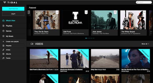
Tidal has been accused of ripping off Spotify and a quick look at the UI explains why. The colour scheme is very similar with the dark grey background with bright notifications and white text.
The featured artists section is made up of aesthetically pleasing rectangular shapes and the text beneath the imagery includes the artist title; scroll over it and you get 'play' and 'watch' options with more information placed on top of the image. It's fair to say that Tidal's UI is a simpler version of Spotify's.
Words: Niall O'Loughlin
Niall O'Loughlin is marketing manager for 99designs, an online graphic design marketplace that enables customers to quickly source graphic design work.
Like this? Read these!
- Sound design: why creatives still want to design for music
- Brilliant Wordpress tutorial selection
- Photoshop tips, tricks and fixes to try today

The Creative Bloq team is made up of a group of art and design enthusiasts, and has changed and evolved since Creative Bloq began back in 2012. The current website team consists of eight full-time members of staff: Editor Georgia Coggan, Deputy Editor Rosie Hilder, Ecommerce Editor Beren Neale, Senior News Editor Daniel Piper, Editor, Digital Art and 3D Ian Dean, Tech Reviews Editor Erlingur Einarsson, Ecommerce Writer Beth Nicholls and Staff Writer Natalie Fear, as well as a roster of freelancers from around the world. The ImagineFX magazine team also pitch in, ensuring that content from leading digital art publication ImagineFX is represented on Creative Bloq.
