Sound design: why creatives still want to design for music
Adrian Shaughnessy investigates designers’ love affair with music.
Imagine if, at the end of the 20th century, you'd been asked to fill a time capsule with graphic design artefacts that evoked the spirit of the first hundred years of the modern era. What would you include? You'd throw in half a dozen classic logos, some Swiss posters and probably something from Milton Glaser, Paul Rand, or Saul Bass.
You would also include a few album covers: 20th century graphic design without album covers is like a football match without a ball - unthinkable. You'd have to include Sgt Pepper, maybe Never Mind the Bollocks, a Joy Division, Nirvana, Oasis or Blur sleeve, something from US hip-hop. Point is, you'd be spoilt for choice.
20th century graphic design without album covers is like a football match without a ball - unthinkable
Now imagine you're doing the same task for the first 13 years of the 21st century. What would you place in the shiny titanium container? You'd include a computer game, the user interface from an iPhone, the Google logo, perhaps a Facebook or MySpace page. But would you include any album covers? I wonder.
Article continues below 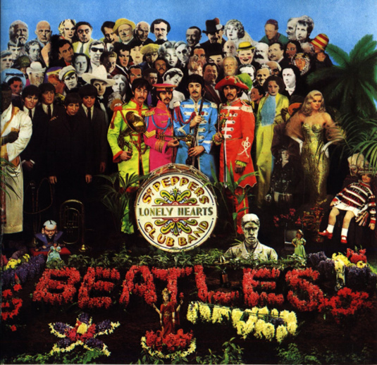
It's not as if album covers no longer exist. More music gets made, released and consumed than ever before. Record companies are still in business. Lady Gaga and Beyoncé are global superstars and just as popular as the pop giants of the past. Despite downloads and the arrival of streaming services, people still buy CDs, vinyl LPs and box sets stuffed with LPs, CDs, DVDs and booklets. And here at Creative Bloq we celebrate the best album art every week.
But something has happened to the album cover. It's no longer the centrepiece of a new album release. It's now just part of a bubbling stew of ingredients that might include a website, an app, a YouTube channel, a TV advert - even merchandise. It seems we have reached the stage where the T-shirt or the baseball cap is as important as the album cover. It might even be true to say that there is more money in T-shirts and caps than in record sales.
Yet, for many music fans, the album cover still matters. And of course, for graphic designers and those involved in music design, the album cover is still regarded as an important playground for experimentation and free expression.
But if we accept that a major part - if not the only part - of being a graphic designer is to produce something 'graphic', then what is the point of being a music designer when the main outlets are postage-stamp JPEGs online? Yet graphic designers still want to design for music. What is the reason for this?
Sign up to Creative Bloq's daily newsletter, which brings you the latest news and inspiration from the worlds of art, design and technology.
The record company view
Equipped with an iPhone stuffed with MP3 files and a copy of Wired under my arm (once upon a time it would have been NME, but if you want to know what's happening in the music business today, read Wired), I set out to find out what it means to be a music designer in the age of instant downloads. My first stop was the music business.
I began my search by speaking to Dan Sanders at Virgin EMI Records. Sanders is the label's creative director. She designs and art directs major projects, and commissions campaigns for the label's many acts. Artists signed to Virgin include Bastille, Emeli Sandé, Lorde, Arcade Fire and Massive Attack. Once a feisty independent label formed out of the hippie ethos of the young Richard Branson, the label is now part of Universal, one of the world's largest entertainment conglomerates.

I asked Sanders what challenges were facing an in-house art director in the digital age. "As digital consumption grows exponentially," she notes, "it is more and more important to build a strong, cohesive visual identity for an artist and it's important that the message remains the same - perhaps even a little repetitive - across many platforms."
Like all music designers, Sanders has two 'clients' - the labels that pay her salary, and the artists whose music she is promoting. The objectives of these two parties are not always compatible. On the one hand, set against a backdrop of low-cost streaming and illegal downloading, record companies are increasingly frantic in their quest for more sales. At the same time, musicians tend to want cover art and campaign imagery that reflects their music, rather than adhering to commercial norms.
As digital consumption grows exponentially, it's more and more important to build a strong, cohesive visual identity for an artist
How does Sanders deal with these, sometimes competing, demands? "I think artists regard the visual output as a delectably pure and flamboyant expression of their musical art; something for their fans to luxuriate in; something to enhance and amplify their musical output," she says.
"In the past I think these expressions were less burdened by commercial responsibility. Today, in a very crowded market and a more results-driven world, artists and labels have become more collaborative in using the creative direction to reach out to new audiences. This has been particularly visible in the explosion of digital, as it's the main source of music consumption in youth audiences."
Sanders' role at Virgin involves working closely with external designers. What does she look for in the creatives she works with? "I look for ideas and applications that feel different to everything else," she says. "Blind multi-designer pitches feel so wrong these days and they often deliver recycled ideas. That said, you occasionally get a killer pitch when the music has really captured a designer's imagination - and that's an excellent thing when it happens."
Packaging family
At the other end of the industry spectrum is Mute Records. Formed in the late 1970s, it remains today a beacon of independence, radicalism and musical innovation. While other labels mimic the commercial manners of giant corporations, Mute retains a healthy dose of post-punk anarchism. Famous as a pioneer of techno and electronic music, Mute has released records by such diverse artists as Depeche Mode, Goldfrapp, Can and Diamanda Galás.
For Paul A. Taylor, who is in charge of the label's cover art and visual representation, the priorities are "to arrive at the end with something that the artist feels represents the album, that Daniel Miller [Mute's founder] feels is interesting and challenging - and works when it's the size of a thumbnail - and something that the marketing department can bastardise in order to sell it."
How does Taylor, I asked, deal with the competing demands of physical music packaging versus digital? "In the main," he says, "digital is about reminding people it's there. A lot of the time artists are understandably focused on the physical version of the album, and this happens a lot with designers too. So, it's important to make sure everyone remembers each aspect is as important as each other. Each needs to be treated differently, but there must remain a close relation. In other words, kissing cousins is fine, it doesn't always need to be brother and sister."
I don't think there is such a thing as special packaging. You package music appropriately for the appropriate recipient.
Mute has, over many years, produced a wide variety of special packaging and box sets - often with high production values. I asked Taylor how the label viewed special packaging: "Well, I don't think there is such a thing as special packaging," he muses. "I see it as appropriate packaging. You package music appropriately for the appropriate recipient.
"I still think streaming is trying to find its appropriate packaging, but when it does find it, it's going to be incredibly interesting. Downloads never found any appropriate packaging and it's why downloading will ultimately fail. I see downloads disappearing before CDs and never getting a second wind like cassettes seem to be inexplicably getting - although cassettes are pretty, I suppose. Downloads are purely functional, with no aesthetic, so who would want a download when you can have a stream?"
The designer's view
If we accept the importance of record cover design as a test bed and laboratory for graphic experimentation (think of graphic design without Neville Brody, Peter Saville, Stefan Sagmeister, all of whom designed sleeves in their early careers) then it’s clear that cover art is too important to let slip into disuse like some shipyard in a post-industrial British seaport. Fortunately, there are still graphic designers dedicated to using covers as a way of forging new visual languages and codes, even if making a living doing so has never been more difficult.
One of the leading figures in this field is Gez Saint, founder and creative director of Big Active. In the past 12 months, his studio has designed cover art for Goldfrapp, White Lies, London Grammar, Haim, The Family Rain and Felix Da Housecat.
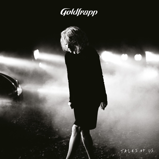
Saint is an optimist: "The tangible nature of the owned and cherished artefact is once more enjoying a surge of renewed interest," he notes. "At the same time, streaming and social and mobile formats are changing the nature of what is happening on the digital side of things. For digital natives who use the web as an environment to create and share, the way forward is possibly more about uploading than downloading."
Big Active sleeves are visually rich, often using sharp-brained
illustration to create compelling visual counterpoints to the music they enwrap. But Saint sees the immaterial realm of digital music as an incentive to smarter thinking, rather than a creative cul-de-sac: "Designers need to adapt, become proactive and embrace positive new approaches, and change their ways of thinking," he urges.
He also warns against nostalgia and a starry-eyed retro view of cover art: "It simply doesn't cut it to wish for the good old days where graphic designers focused just on the packaging," he argues. "That mindset is indulgent and unsustainable - the world has moved on. New music design is about forging partnerships with artists and labels to create content and engagement that can fit hand-in-glove with the way that music is enjoyed and consumed - by fans - in whatever form that might take."
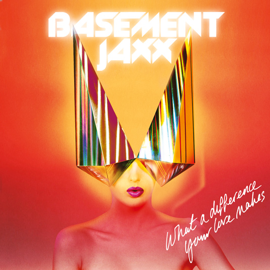
In Saint's view, one thing at least hasn't changed: "At its most fundamental level in the digital space," he says, "it's still about creating the defining image and expressing this in the form of a product 'packshot'. So in terms of the most basic requirements, we're mindful that the scale of digital packshots tends to be about the same sort of size as postage stamps - which means they really need to be graphically effective," he continues.
"Also, the way in which people interact with artwork in a digital environment is different to print - I'm thinking here especially of mobile devices, tablets and so on. The engagement is much more experiential and there's greater opportunity to create and share."
A swansong
The Anglo-Norwegian duo Non-Format - Jon Forss and Kjell Ekhorn - has been producing visually rich and dramatic cover art for a variety of musicians since 2000. The studio is widely celebrated for its high-concept, art-directed photography and meticulous typography
- work that requires high-end reproduction and a large canvas to stretch out on.
How, I wondered, do the pair ensure that their design survives translation to JPEG on iTunes, for example? "Well, it's certainly true that there's a huge difference between a printed piece of packaging and a 220-pixel square on iTunes, and we bear this in mind more than we did a few years ago," they say. "If we're working on packaging and we know it's going to be digital-only, we treat it a bit differently than we would if we know there's also going to be a CD and perhaps a vinyl LP version."
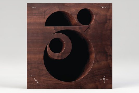
Like Saint, Forss and Ekhorn are not defeatist. The resurgence of interest in vinyl and special edition packaging has led to plenty of opportunities for them. "Rather than the usual CDs, we're increasingly asked to design special edition vinyl packaging plus a digital packshot," they note. "If this is the swansong of music packaging then it's actually a rather nice one."
Non-Format may have become acknowledged masters of the album cover, but they make no claim to have mastered the digital presentation of music. Nor, it seems, can anyone else. The reality for users of downloading or streaming channels is still the shrunken head of the JPEG: "We're entering a period where the industry seems unable to make up its mind about what exactly digital packaging should - or could - be," Non-Format notes.
“It naturally takes time to figure out what a new format can bring to the table and so far we haven't really 'seen the light' with regards to what digital packaging can do to enhance the listening experience. Sometime in the near future the idea that music needs to be accompanied by physical packaging may well seem absurd."
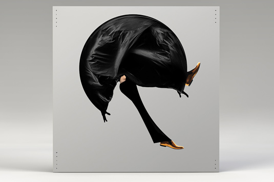
This is close to my own view. As a lifelong consumer of music, and as someone who is still an occasional designer of record covers (I've also written four books on the subject), I now live happily in the world of music without physical packaging. I use paid-for streaming and downloading services, and would find life unimaginable without them. For me, I see the end of physical packaging as a sort of liberation. Increasingly, my shelf-warping collection of vinyl, CDs and box sets now looks redundant - only nostalgia stops me from offloading them.
The new immateriality of music enables me to have an even more intimate relationship with it. By concentrating only on the sound I am free to revel in the music in a way that is not possible with packaged music. I also enjoy being free from the messy business of returning records to their packaging, and the constant fear of damaging playing surfaces.
I still worry about the future of graphic design. Without music packaging as an experimental zone, where will the Peter Savilles of the future come from? Shorn of record sleeves, minus passionate indie labels, and without packaging-loving musicians, how will graphic design find a comparable platform for sheer innovation? Graphic design will survive, of course. It always does. But will it be quite so rich and varied?
Words: Adrian Shaughnessy
Adrian Shaughnessy is a graphic designer, writer and educator. He has written and art directed numerous books on design. He lectures extensively around the world, and is a senior tutor in graphic design at the Royal College of Art, London. This article originally appeared in Computer Arts issue 225.

The Creative Bloq team is made up of a group of art and design enthusiasts, and has changed and evolved since Creative Bloq began back in 2012. The current website team consists of eight full-time members of staff: Editor Georgia Coggan, Deputy Editor Rosie Hilder, Ecommerce Editor Beren Neale, Senior News Editor Daniel Piper, Editor, Digital Art and 3D Ian Dean, Tech Reviews Editor Erlingur Einarsson, Ecommerce Writer Beth Nicholls and Staff Writer Natalie Fear, as well as a roster of freelancers from around the world. The ImagineFX magazine team also pitch in, ensuring that content from leading digital art publication ImagineFX is represented on Creative Bloq.
