Create a consistent set of icons in Sketch
How to create a neat collection of webmail icons using Sketch.
Sign up to Creative Bloq's daily newsletter, which brings you the latest news and inspiration from the worlds of art, design and technology.
You are now subscribed
Your newsletter sign-up was successful
Want to add more newsletters?
09. How to see Union
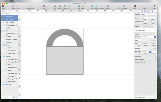
If you are used to Illustrator, this step is going to be fun: draw a simple circle (O) 89 x 89px. Then, go to Borders in the Inspector Panel and select 'Inside Position' with 15 thickness. This value is important – when we were drawing the rectangles for the bin, the shapes were 15px wide. This value needs to be the same in the bell, so the outlines will look consistent. Zoom in and draw a rectangle on top of the circle, then choose Union from the top menu.
10. Make icon bell-shaped
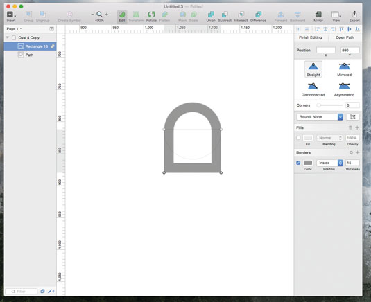
You will now have a horseshoe shape that needs to be tweaked and transformed into a bell. In Sketch, select a shape and then press Edit in the toolbar at the top so the anchor points of the shape become visible. You will see a round point in each of the corners. By clicking any of these points and dragging them around, you can change their position. You can drag the anchor points and change the height of the bell too. Pretty handy!
11. Add a notification sign
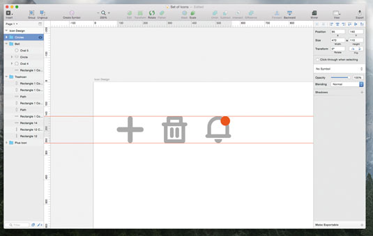
Use the same shape that formed the bottom of the bin lid (about 105px in width) to design the bottom of the bell.
The next step is to draw a full circle, cut it in half and centre it. This will represent the clapper inside the bell – it's just a tiny detail, but useful in making the icon recognisable. You can also add a notification sign at the top by using a full circle filled with red. The notification icon will alert the user to a new message or any other related activity.
12. Draw mail icon
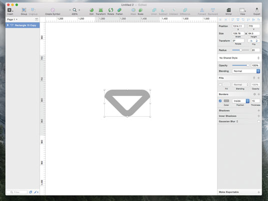
The mail icon is an interesting one. Although it may seem more complex than the others, it is actually one of the easiest. Draw a rectangle (R) sized 110 x 110px. The corner radius will be only 20px in this case – we don't want the rectangle to look too rounded. Copy and paste the shape, and rotate the new one 45 degrees anti-clockwise. Copy and paste the first rectangle again and then intersect the rotated one to give the envelope flap.
13. Combine shapes
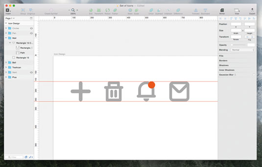
So far, we have been keeping the shapes separate in the layer list for each of our icons. In Sketch, when you combine two shapes, you can still tweak each shape separately until you press the Flatten button in the Toolbar.
When you flatten a shape, Sketch will combine the multiple paths inside the shape into one path. Some people prefer to use flattened shapes, but there is no real need for that here.
Sign up to Creative Bloq's daily newsletter, which brings you the latest news and inspiration from the worlds of art, design and technology.
14. Make pen icon
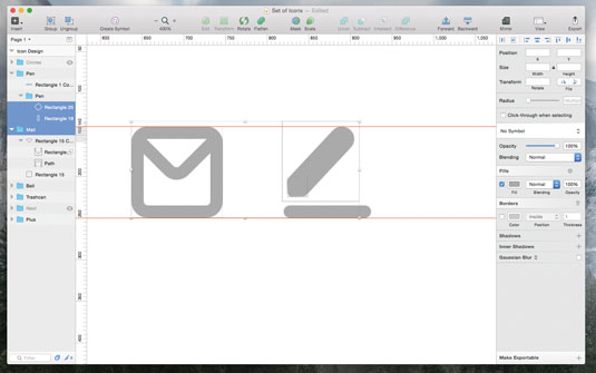
Let's focus on the last two icons. The pen will look like a rounded pen on a sheet of paper. For this, let's use a rectangle of 30px width and rotate it 45 degrees. To make the top slightly rounded, let's draw another rectangle on top of it, 24 x 24px. We'll put the radius at 5, to make the shape nice and smooth. We can use the same shape we used for the bottom of the bin lid to create a sheet supporting the pen.
15. Create 'previous' icon
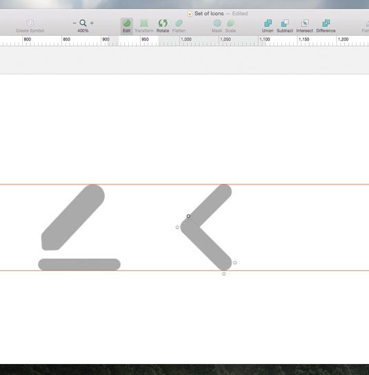
The last arrow icon can be easily made using the plus icon as a starting point. Use the same thickness as the plus icon to create an arrow pointing towards the left to signify 'previous'. To do that, take exactly the plus icon and rotate it by 45 degrees. Then adjust the width of the sides of the arrow, tweaking each rectangle individually.
16. Flip arrow to make 'next' icon
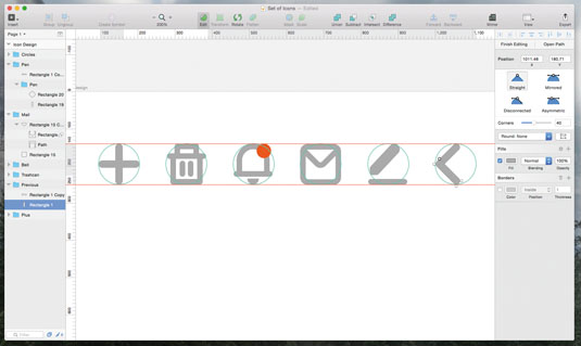
The 'previous' icon could easily be flipped horizontally to also create a potential 'next' icon. The roundness of the arrow is exactly the same as the plus icon. Now you just need to make sure these new icons fit in the guideline circles, like the rest of the set.
You now have a full set of six consistent icons to be used in a user interface for a webmail service, but you also have a solid foundation for building other icons that can fit in the same set.
You can now extend this icon set or create the same one in different sizes for different purposes. In Sketch, you are dealing with vector shapes so it's easy to adjust the size of each icon.
This article was originally published in net magazine. Subscribe here.
Related articles:
