5 top examples of fixed navigation - and how to use it properly
Fixed navigation is still a fashionable device in design. But make sure you really need it, says Gene Crawford.
Sign up to Creative Bloq's daily newsletter, which brings you the latest news and inspiration from the worlds of art, design and technology.
You are now subscribed
Your newsletter sign-up was successful
Want to add more newsletters?
With tools such as jQuery being widely used we're seeing some new trends across responsive website design. One of these is fixed navigation, where the main navigation elements on a page are fixed in place, whether in the header or one side of the website layout. This type of overall navigation element can be both useful and visually interesting, but avoid making the navigation stick just for the sake of it when you're building the website.
There are many considerations worth practising for a fixed navigation design. What's good for large display sizes, such as a desktop or laptop monitor, may not work on a smaller screen like that of an iPhone. The main interaction is centred on scrolling, so if the page is very long, it may be perfectly suited; but if not, it could feel gratuitous.
Does the navigation design visually work in the layout as a fixed element? Some of the more successful uses occur where design elements blend into each other and disappear or interact in some way upon scrolling, creating a much richer interaction than just a block of colour behind some links. If it's a single-page design you can use the fixed navigation to help inform the visitor about which section of the page they are currently viewing, just like if they were taken to a new page.
Article continues belowFixed navigation can be a powerful design pattern when used to help a visitor. It can also greatly enhance the experience of using your website when it interacts with the design visually. Like all things though, there should be a reason for it to be there. If you can't justify it in some way then you should take a step back and think about why you're using it. Poorly executed navigation can spell disaster for user experience.
Five examples to check out
01. Theory
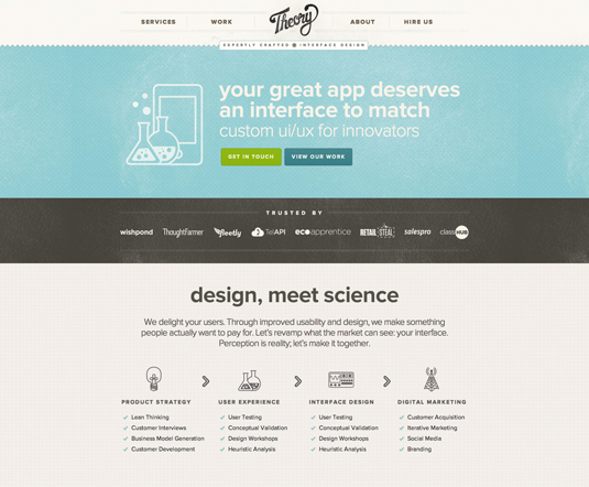
The navigation design for web design firm Theory is a great prototypical fixed navigation design to study. It visually mixes with the page design well and uses colour to denote which section of the page you are currently viewing.
02. Creative Sloth
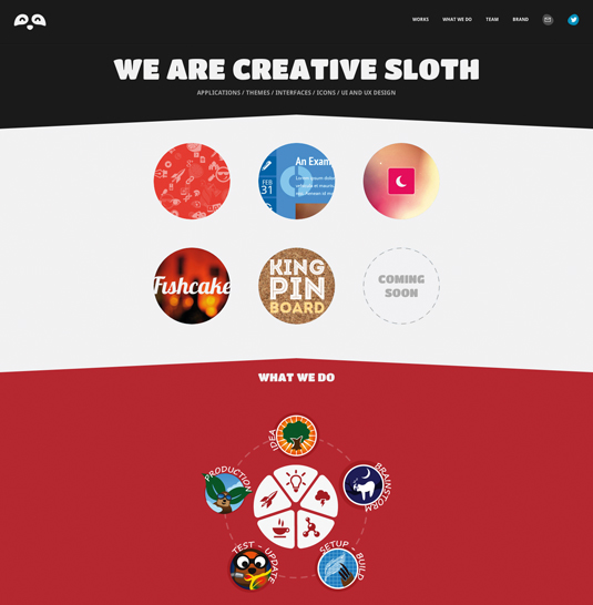
The fixed navigation header on the website for design firm Creative Sloth is a good example of not needing much other than some visual design queues to make it look great.
03. Kiawah Island
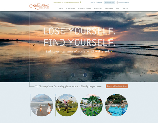
The fixed navigation interaction on vacation resort town Kiawah Island's website is unique in that it stays fixed just long enough to get you past the large image used for the slideshow before it disappears.
Sign up to Creative Bloq's daily newsletter, which brings you the latest news and inspiration from the worlds of art, design and technology.
04. Vancouver YMCA
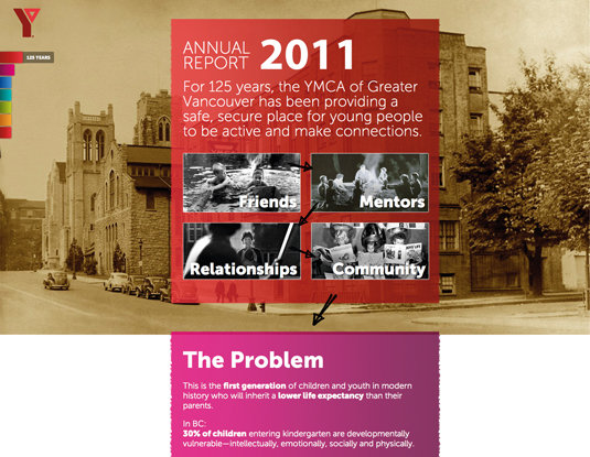
The navigation design for Vancouver YMCA's website is fixed to the left side of the page. It helps by showing you what section you are viewing.
05. Google Ventures
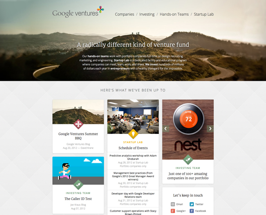
The Google Ventures website does not have a typical fixed navigation. It's fixed only for a short period while scrolling, then disappears.
Words: Gene Crawford
This article first appeared in issue 234 of .net magazine.

The Creative Bloq team is made up of a group of art and design enthusiasts, and has changed and evolved since Creative Bloq began back in 2012. The current website team consists of eight full-time members of staff: Editor Georgia Coggan, Deputy Editor Rosie Hilder, Ecommerce Editor Beren Neale, Senior News Editor Daniel Piper, Editor, Digital Art and 3D Ian Dean, Tech Reviews Editor Erlingur Einarsson, Ecommerce Writer Beth Nicholls and Staff Writer Natalie Fear, as well as a roster of freelancers from around the world. The ImagineFX magazine team also pitch in, ensuring that content from leading digital art publication ImagineFX is represented on Creative Bloq.
