Has your website survived mobilegeddon?
Mobilegeddon has been and gone. Andrew May asks if your website is ready yet.
Sign up to Creative Bloq's daily newsletter, which brings you the latest news and inspiration from the worlds of art, design and technology.
You are now subscribed
Your newsletter sign-up was successful
Want to add more newsletters?
Okay, slight exaggeration. But in case you missed Mobilegeddon, or you're wondering why your mobile rankings have dropped through the floor, here's what's happened and what you can do to get your site mobile-friendly (a good website builder might help here).
Why Google's latest update is making mobile searches easier
It's not news that we're in love with our smartphones. Back in June 2013, Mobile Marketing quoted research from Deloitte showing that seven in 10 people in the UK owned a smartphone. Then, in December 2013, Business Insider made the staggering claim that by the end of 2013 there would be two smartphones for every nine people on earth. And, depending on which study you look at, mobile searches are said to account for anything from 25 to 70 per cent of searches online.
Conclusion? A lot of people are searching for stuff online from a mobile, and that's not about to change anytime soon.
Article continues belowSo why does that matter to Google? Well, like it or hate it, Google is the self-styled cyber police. And now the search engine giant has taken pity on mobile users worldwide who are stabbing at smartphones with their fat fingers, trying to search online.
Google is specifically targeting websites where the text is 'too small to read' (causing humans to squint), the links are 'too close together' (our chubby human digits can't tap them easily) and sites that are too wide for the screen. Because having to scroll horizontally is A Bad Thing. And if you don't whip your website into shape and make it mobile friendly? Google will shoot your mobile rankings down in flames.
But don't fret. The search engine hasn't left you alone to struggle with this problem. It has provided tools.
Test your website for 'mobile friendliness'
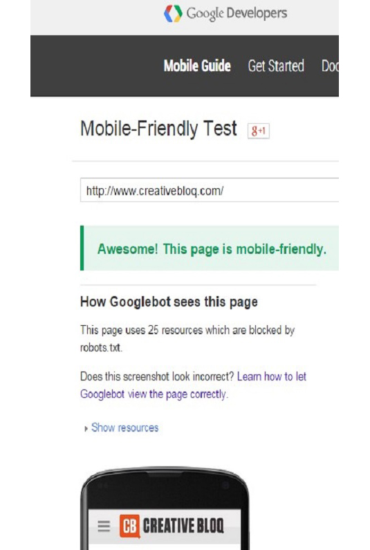
The quickest way to check which pages of your site are mobile friendly is to use Google's testing tool. Type in the URLs that you want to test (each page of your website can be entered separately), wait a few seconds and you'll have your answer.
Sign up to Creative Bloq's daily newsletter, which brings you the latest news and inspiration from the worlds of art, design and technology.
Ideally, you'll get this cheerleader type message from Google:

And if your website isn't so mobile-friendly? The happy green writing changes to red (in case you've not appreciated the seriousness of the situation) and your site is labelled 'Not mobile-friendly'.
Currently most sites seem to be not making the mark because of text that is too small to read, links too close together and because the mobile viewport is 'not set'. The viewport determines how a webpage shows up on a mobile device, and if it hasn't been 'set', then the page will be displayed to fit a desktop screen, typically much wider than a mobile screen. This will force readers to scroll horizontally which Google thinks provides a substandard viewing experience for users.
Next page: what do do if your site isn't mobile-friendly

The Creative Bloq team is made up of a group of art and design enthusiasts, and has changed and evolved since Creative Bloq began back in 2012. The current website team consists of eight full-time members of staff: Editor Georgia Coggan, Deputy Editor Rosie Hilder, Ecommerce Editor Beren Neale, Senior News Editor Daniel Piper, Editor, Digital Art and 3D Ian Dean, Tech Reviews Editor Erlingur Einarsson, Ecommerce Writer Beth Nicholls and Staff Writer Natalie Fear, as well as a roster of freelancers from around the world. The ImagineFX magazine team also pitch in, ensuring that content from leading digital art publication ImagineFX is represented on Creative Bloq.
