How to design for human behaviour: 5 pro tips
When designing online interactions, you need to focus on how people actually behave, explains Jerry Cao.
Sign up to Creative Bloq's daily newsletter, which brings you the latest news and inspiration from the worlds of art, design and technology.
You are now subscribed
Your newsletter sign-up was successful
Want to add more newsletters?
Our two-volume series Interaction Design Best Practices delves into the details of the art of interaction design: how different interaction elements affect the UX, and the best practices for each.
The second book in the series, Interaction Design Best Practices: Mastering the Intangibles, highlights the aspects of time, responsiveness, and human behavior – and how to make each one work for your design.
(For more IxD guidelines, read the first book in the series, which covers the tangibles of words, visuals, and space.)
In this piece, we'll provide the top lessons from the book in an easily digestible format.
01. Play into natural habit-forming mechanisms
You don't need a science textbook to know that humans are creatures of habit. Our reliance on previous actions is written straight into our DNA, and an effective IxD designers knows how to use this to their advantage.
The basics of the human habit-forming mechanism is a three step process:
- Cue – The person sees or hears a familiar signal that initiates the habit.
- Routine – The person runs through a procedure.
- Reward – The reason the habit is formed in the first place: the person receives a reward for performing the habit, validating their behavior and reinforcing the habit for next time.
While this process covers everything from salivating dogs to zoning out on your drive home from work, it's especially useful in interaction design.
Sign up to Creative Bloq's daily newsletter, which brings you the latest news and inspiration from the worlds of art, design and technology.

For starters, having a consistent cue is essential for forming reliable habits, so changing the location or look of your icons too frequently will upset this.
Sometimes the reward is inherent, such as checking your messages to stay informed (or talk with whomever you met at the bar last night), but if you want users to perform an action without its own reward, invent one.
For example, Netflix rewards users who rate the movies they watch by offering personalized recommendations after they do. The consistency of this means that every time they're prompted to rate a movie (cue), if they do (routine), then they'll receive a new recommendation (reward).
02. Apply Hick's Law to decision-making
Hick's Law explains that the more options that are available, the longer the process of making a decision. Because decision-making is essential to IxD, so, too, is Hick's Law.
The trouble with applying Hick's Law is that, on the one hand, users want a lot of choices and options, but on the other, too many choices and options make it difficult to come to a decision, and may even cause decision paralysis.
Luckily, there are some common strategies to give you the best of both worlds.
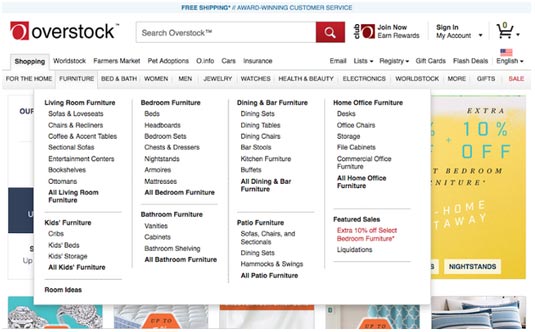
First, the UI pattern of hidden, or hover, controls allows you to offer your users more options without sacrificing screen space or overwhelming them with too much all at once. When the user hovers the cursor over the relevant item, a new panel of controls appear – but only as needed.
Another is simply reducing secondary content. The less available options you have, the more potent the remaining ones are. By stripping away any unnecessary or secondary content, you allow the user to stay focused on what is genuinely important.
03. Reduce steps to reduce friction
Friction is any part of your UI that works against the user, whether confusing usability, disorienting navigation, or – as we'll explain here – tasks taking too long.
One of the easiest ways to shorten task times is to reduce the amount of steps required. Sometimes this can be done logically. If you suspect a task is taking longer than necessary, try writing out and numbering each step. For example, sending an email might be:
- Log in.
- Click "Compose."
- Click inside recipient box.
- Enter recipient.
… etc. If you're list feels long to you, it will feel long to your user, too. Try to look for redundancies that can be eliminated or combined with other steps.
Taking advantage of certain UI patterns can help, too. For example, having the cursor start in the most popular field can help. When opening Google, the cursor starts in the search box, eliminating the step of having to click within it.
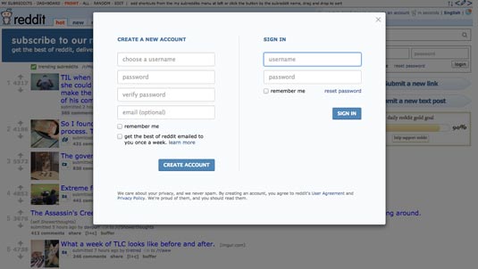
Similarly, in Reddit, when a user clicks an action that requires logging in, the login screen is displayed immediately, circumventing an extra the step.
If you'd like to learn more about minimizing friction, check out this excellent piece from design agency Digital Telepathy.
04. Design for emotion
Establishing an emotional connection with your design is just as important as fulfilling a need or having workable usability. It's how a site or app makes us feel that keeps us coming back.
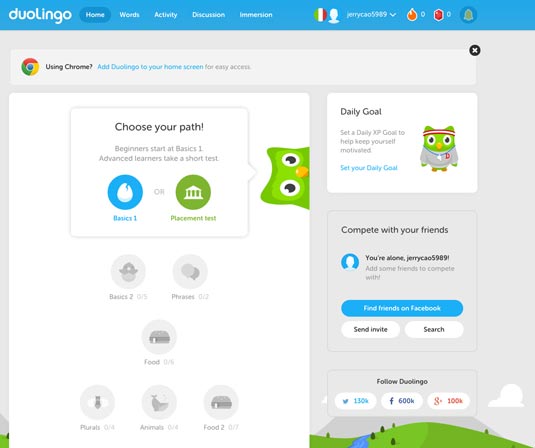
While designing for emotion is an art in itself, we've found these strategies most helpful in appealing to users' hearts as well as their brains:
- Appealing Visuals – The look of a site will affect the mood it elicits in the user, so make sure that you not only have an attractive display, but one whose tone fits what you're going for.
- Discoverables – Users like surprises, so integrating small discoverables can create moments of joy when they're revealed.
- Consistency – This is essential for building trust. Be cautious of mistakes, such as product descriptions not matching photos.
- Customization – Giving your users the option to personalize their experience will make it feel like theirs.
- Gifts – Providing free gifts to your users will help earn their favor, especially if it's actually useful.
Don't underestimate the power of delight – it doesn't matter how practical your product is unless the user actually enjoys it. To learn more about emotional design, check out some of our favorite articles:
- Emotional Interface Design - Aarron Walter
- The Personality Layer - Simon Schmid
- Passive Magic: The Design of Delightful Experiences - Stefan Klocek
05. Animation is not just for looks
Animation has become a staple of most interfaces, and for good reason. For starters, playful animations add a degree of delight to the interface, establishing an emotional connection that sticks with the user just as much as the service the product provides.
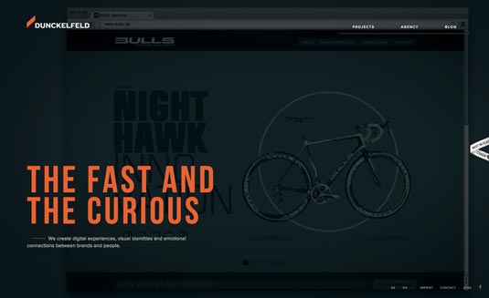
But animation is more than just a "pretty face." It offers many practical applications to an interface to smooth and enhance the entire experience:
- Eases Transitions – A seamless animation when opening a new page or menu will ease the transition and prevent an otherwise jarring moment.
- Reveals Information – Movement attracts attentions, so an animated notification, such as a bouncing exclamation point over a static one, will have a better chance of getting noticed.
- Distracts from Loading – If the user has to wait for something to load, you risk upsetting their UX. However, an animated status bar gives them a distraction and informs them how much time they have to wait. Better, a clever animation may even entertain them, turning a negative into a positive.
- Creative Scrolling – Animated scrolling creates a visually stunning effect for your product that sets you apart from your competition while simultaneously serving a necessary function. If you're utilizing a scroll, why not make it memorable.
Practical reasons aside, don't neglect the importance of the enjoyment animation brings. The emotional connection could make the difference between how frequently, if at all, the user returns. User prefer the products that are fun to use, even more than practicality.
If you'd like to learn more about animations in UX design, we highly recommend this A List Apart piece by designer Val Head.
This is just the beginning...
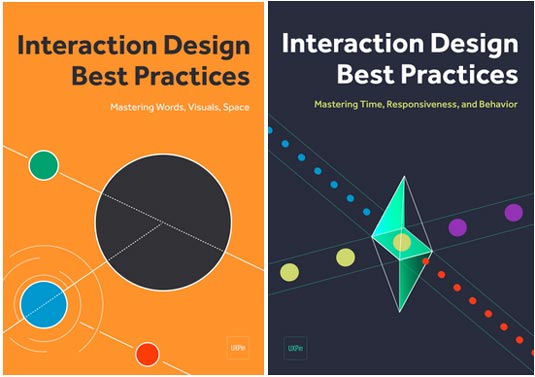
The above tips are just a start; the craft of interaction design is deep and varied, and this article lists only a few of its secrets. For more information, check out the entire Interaction Design Best Practices series to learn about:
- Persona creation
- Writing tips and guidelines
- Using visuals to guide user's sight
- An examination of UI patterns
- Proper layout formats and how to use white space
- The spectrum of response time tolerances
- Using feedback to create dialogues
- Ways to reduce friction
This series and the rest of the design library library are available for free.
Words: Jerry Cao
Jerry Cao is a content strategist at UXPin — the wireframing and prototyping app. To learn more about how to create visually digestible interfaces, download the free e-book Web UI Design for the Human Eye: Colors, Space, Contrast.
Like this? Read these!
- 10 web design trends for 2015
- Hands-on review: Adobe Photoshop CC
- The ultimate guide to logo design

The Creative Bloq team is made up of a group of art and design enthusiasts, and has changed and evolved since Creative Bloq began back in 2012. The current website team consists of eight full-time members of staff: Editor Georgia Coggan, Deputy Editor Rosie Hilder, Ecommerce Editor Beren Neale, Senior News Editor Daniel Piper, Editor, Digital Art and 3D Ian Dean, Tech Reviews Editor Erlingur Einarsson, Ecommerce Writer Beth Nicholls and Staff Writer Natalie Fear, as well as a roster of freelancers from around the world. The ImagineFX magazine team also pitch in, ensuring that content from leading digital art publication ImagineFX is represented on Creative Bloq.
