Twitter map highlights success of #RefugeesWelcome
This data visualisation reveals just how much attitudes are changing. We reveal how it was made.

In the last few years, the media has been filled with negative stories about asylum seekers. But in recent weeks that's all changed, with people across Europe loudly and publicly proclaiming their support for refugees from war-torn Syria.
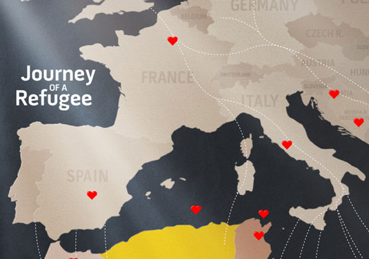
To highlight the strength of this groundswell of opinion, humanitarian aid charity Doctors of the World has teamed up with London/Sydney-based digital agency Impero to create a real-time visualisation of all the positive things being tweeted about refugees.
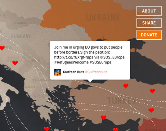
The Journey of a Refugee map shows all tweets in real-time, and plots them along the routes refugees are travelling across the continent.
It works by using the Twitter streaming API to capture tweets as they happen, pushing new tweets into the browser using WebSockets, with the help of socket.io and node.js.
A variety of key words and hashtags are used to identify relevant tweets and sentiment tracking to ensure that these are positive.

"We wanted our contribution to help drive change," says Michael Scantlebury, creative director and founder of Impero. "By visualising the very real issues faced by refugees in combination with positive stories of support throughout Europe, the map offers an accessible way for Britons to understand the current crisis.
"Partnering our creative and technical teams with the expertise of Doctors of the World has produced an awareness tool that we believe can have real impact."
Sign up to Creative Bloq's daily newsletter, which brings you the latest news and inspiration from the worlds of art, design and technology.
Liked this? Try these...

Tom May is an award-winning journalist specialising in art, design, photography and technology. He is the author of the books The 50 Greatest Designers (Arcturus) and Great TED Talks: Creativity (Pavilion). Tom was previously editor of Professional Photography magazine, associate editor at Creative Bloq, and deputy editor at net magazine.
