Forget flat design - check out these realistic icon designs
Take a look at this range of realistic iOS icon designs that kick flat design to the curb.
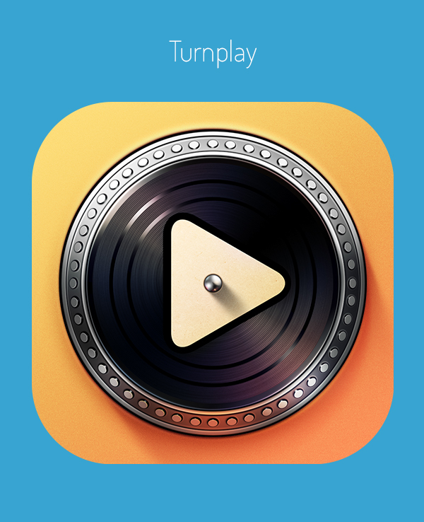
The trend of flat design still seems to be going strong and whilst there are some examples of flat design that work, there are some projects where a more realistic look works better. These iPhone app icons were created by design agency Ramotion, who decided to leave flat design at the door and instead go as realistic as possible.
Using a range of impressive illustrative techniques, the team have come together to create some of the most good-looking icon designs we've seen in a long time. Shadowing and sleek 3D execution allows the icons to really pop from the screen, showing us that sometimes flat design doesn't work best.
We've picked a few of our favourites here but you can check out the team's Behance page to see the full of range of realistic iPhone icon designs. Scroll down to see some original sketch ideas and the icon designs in a variety of sizes... could we be about to see a skeuomorphism revival?
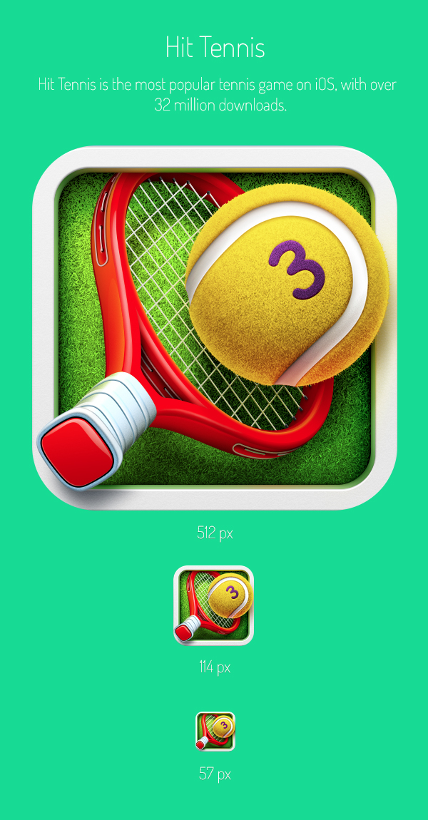
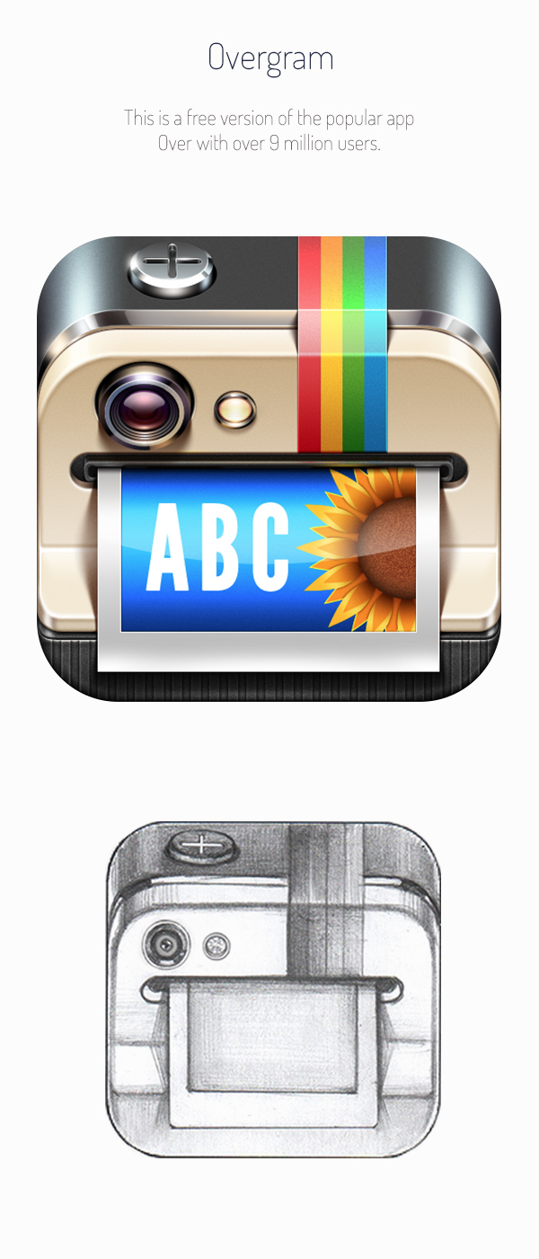
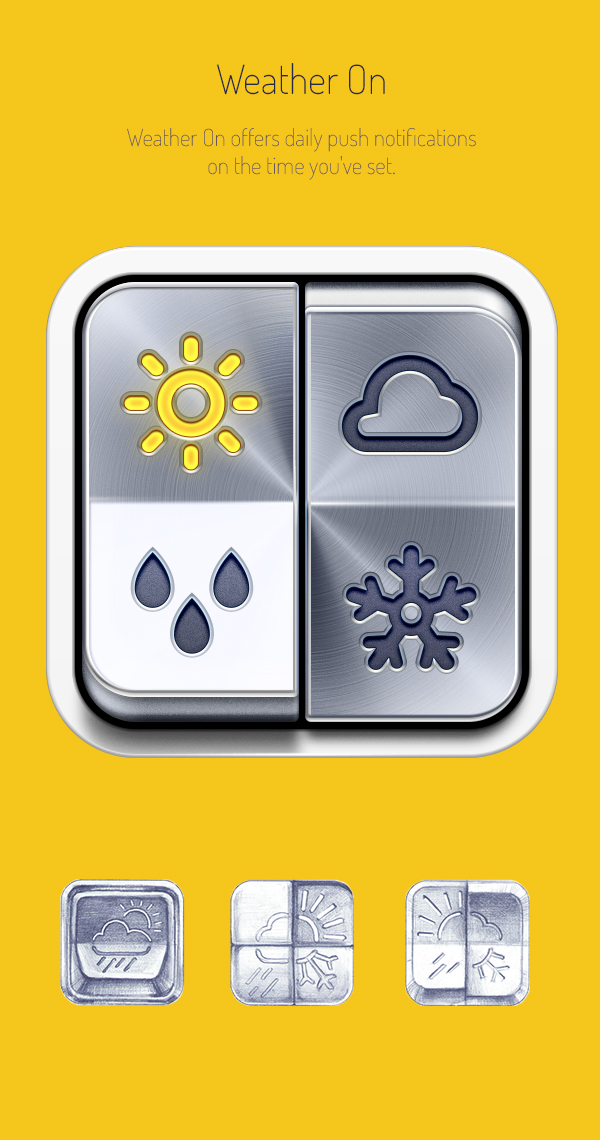
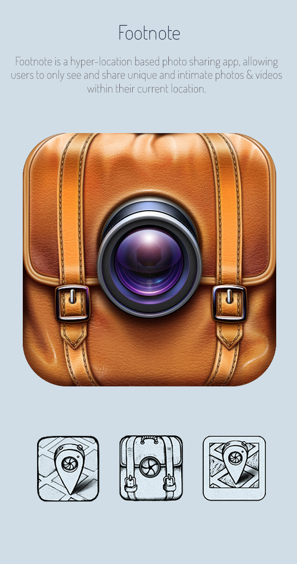
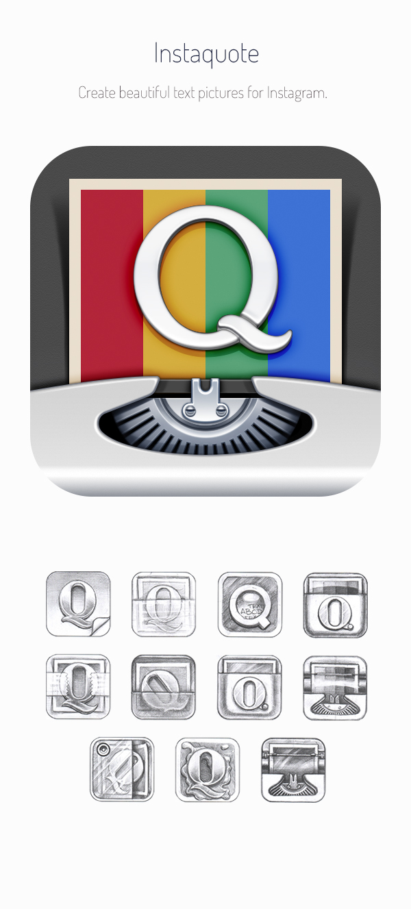
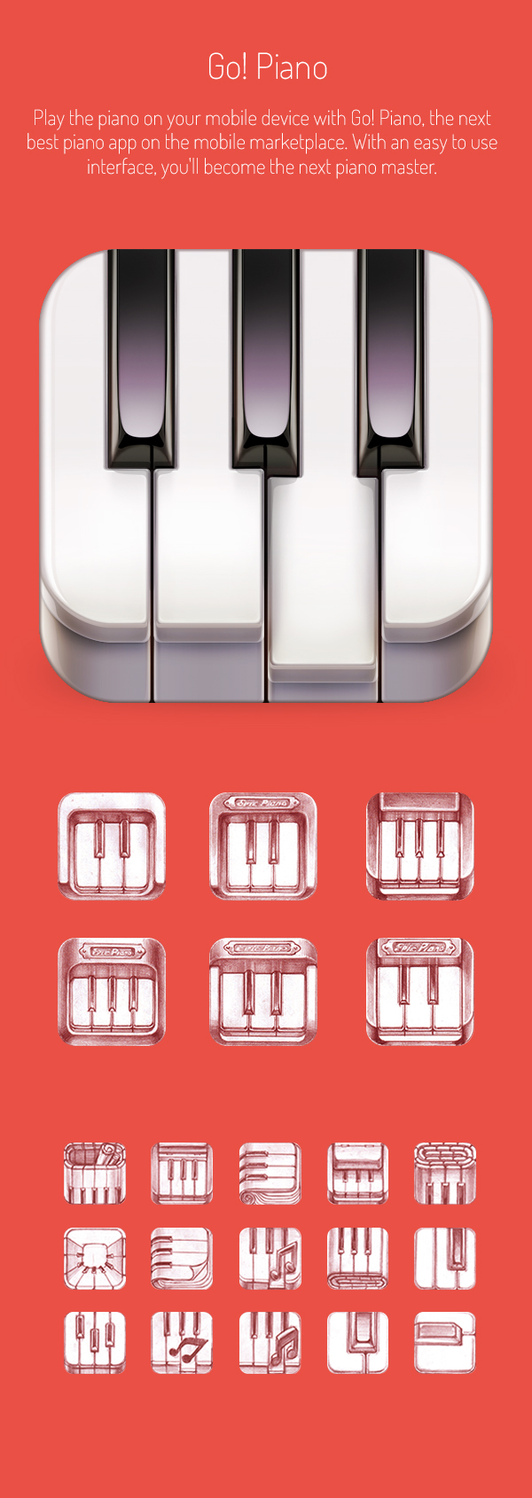
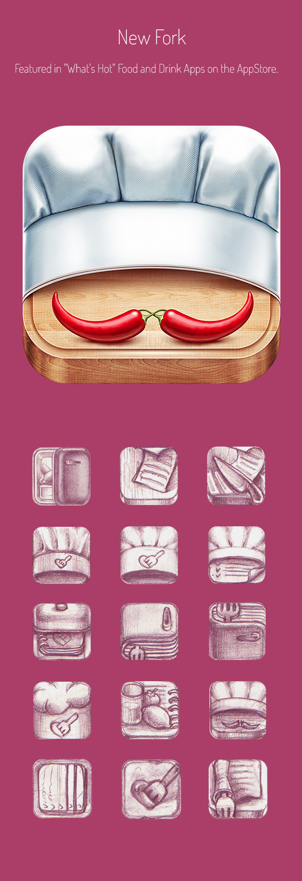
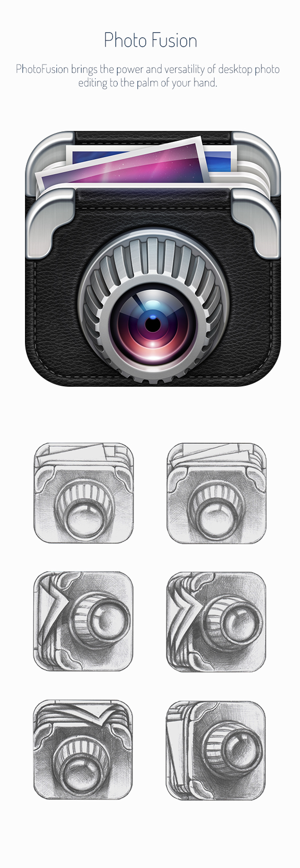
Do you prefer these icon designs to the usual flat design offerings? Let us know in the comments box below!
Daily design news, reviews, how-tos and more, as picked by the editors.

Thank you for reading 5 articles this month* Join now for unlimited access
Enjoy your first month for just £1 / $1 / €1
*Read 5 free articles per month without a subscription

Join now for unlimited access
Try first month for just £1 / $1 / €1

Sammy Maine was a founding member of the Creative Bloq team way back in the early 2010s, working as a Commissioning Editor. Her interests cover graphic design in music and film, illustration and animation. Since departing, Sammy has written for The Guardian, VICE, The Independent & Metro, and currently co-edits the quarterly music journal Gold Flake Paint.
