Blood Cancer United unveils powerful new brand identity
The rebrand puts community at its core.

Sign up to Creative Bloq's daily newsletter, which brings you the latest news and inspiration from the worlds of art, design and technology.
You are now subscribed
Your newsletter sign-up was successful
Want to add more newsletters?
September marks Blood Cancer Awareness Month, and to honour the occasion, the Leukemia & Lymphoma Society has debuted its new identity. Rebranding to Blood Cancer United, the organisation reestablishes itself as a beacon for its community with a refreshed look that signals a refined yet approachable new era.
The best rebrands are often defined by a sense of purpose, something that Blood Cancer United's new identity embodies. With its new name and inclusive identity, the rebrand features future-proof design with authenticity, unity and passion at its core.
Led by global branding agency JKR, Blood Cancer United's rebrand centres around inclusivity. Finding that its old identity was exclusionary to wider blood cancer types, the renaming was a huge step in representing the community and increasing brand awareness.
Article continues below“Brand is the thread that connects every part of an organisation together and shows what it stands for,” says Tosh Hall, global chief creative officer at JKR. “For Blood Cancer United, that meant creating a brand united for all. That spirit now runs through everything, from the name to the design systems to the behaviours, building unity for the work it does and, most importantly, speaking to everyone touched by blood cancer.”

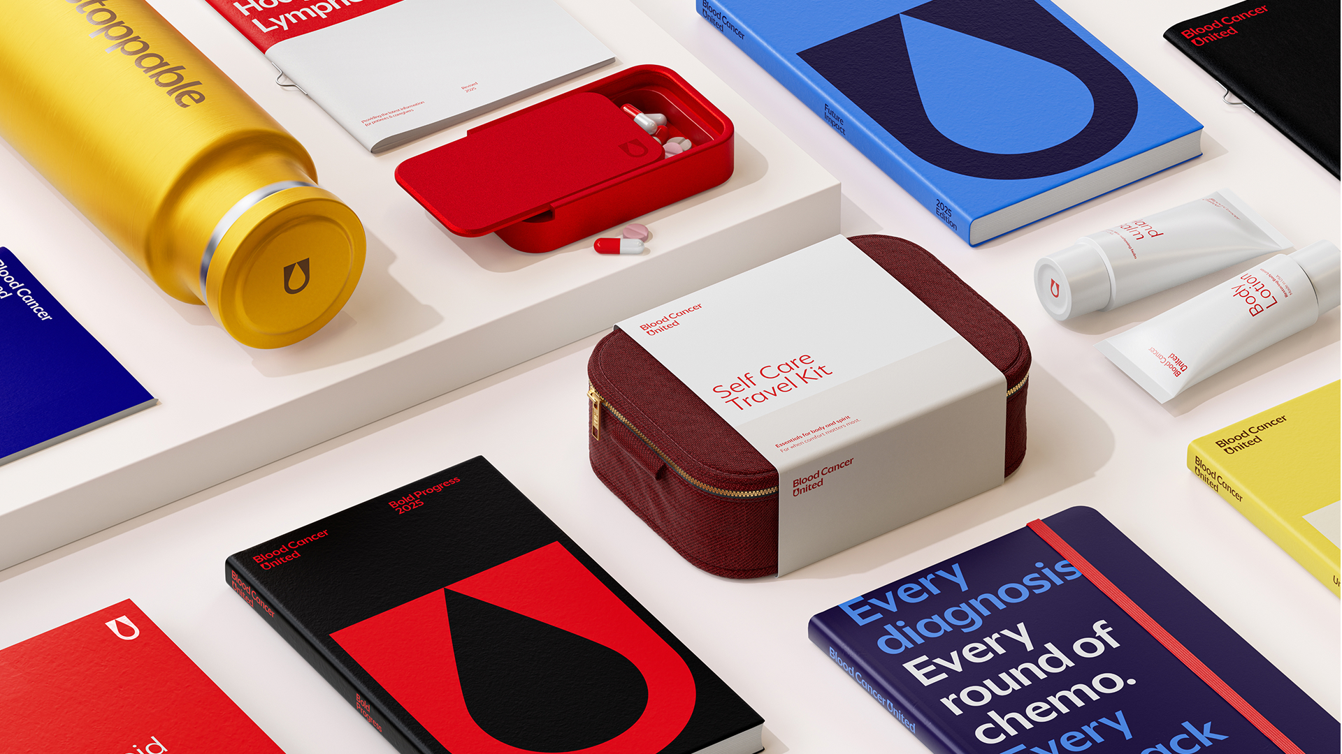
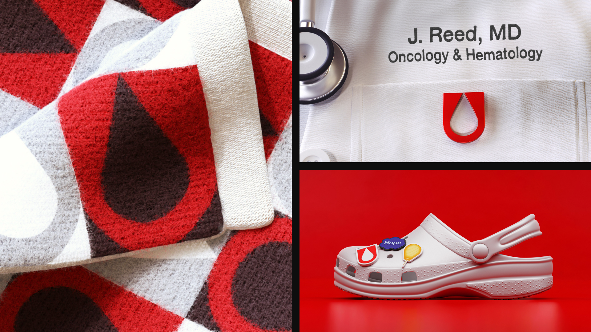
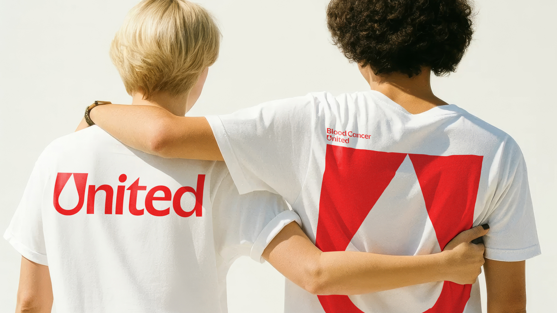
At the centre of the visual identity is a simple yet striking blood droplet motif. Shaped from the 'U' in 'United', the design is scalable and universal, reflecting the organisation's commitment to all types of blood cancer. Paired with a refined voice "rooted in real stories that create meaningful connections," the "clear and compassionate" tone gives the identity a distinctly human appeal.
Typography is kept simple and accessible, with the custom font, BC United Sans, giving the identity a clean aesthetic. The unified identity will appear across all touchpoints, from digital channels to events, creating a strong cohesion that embodies authority without feeling clinical or austere.
“We set out to create a brand that reflects the full scope of blood cancer and ensures every person feels seen and supported, whether newly diagnosed, navigating survivorship, or caring for a loved one," says Lynn Godfrey, chief experience officer at Blood Cancer United. "We believe Blood Cancer United does just that, and we’ve already had people tell us the change helped them see blood cancer more broadly and made them feel truly understood.”
Sign up to Creative Bloq's daily newsletter, which brings you the latest news and inspiration from the worlds of art, design and technology.

For more branding inspiration, take a look at JKR's bold new branding for Walmart. If you missed it, check our interview with JKR’s executive creative directors on how to build a standout brand in 2025.

Natalie Fear is Creative Bloq's staff writer. With an eye for trending topics and a passion for internet culture, she brings you the latest in art and design news. Natalie also runs Creative Bloq’s 5 Questions series, spotlighting diverse talent across the creative industries. Outside of work, she loves all things literature and music (although she’s partial to a spot of TikTok brain rot).
You must confirm your public display name before commenting
Please logout and then login again, you will then be prompted to enter your display name.
