Earlier this year Mastercard rebranded its iconic logo design which had been serving the company well for 20 years. We've already seen how designers reacted at the time, but now the dust has settled, what do the experts make of the new look?
It's all about the circles
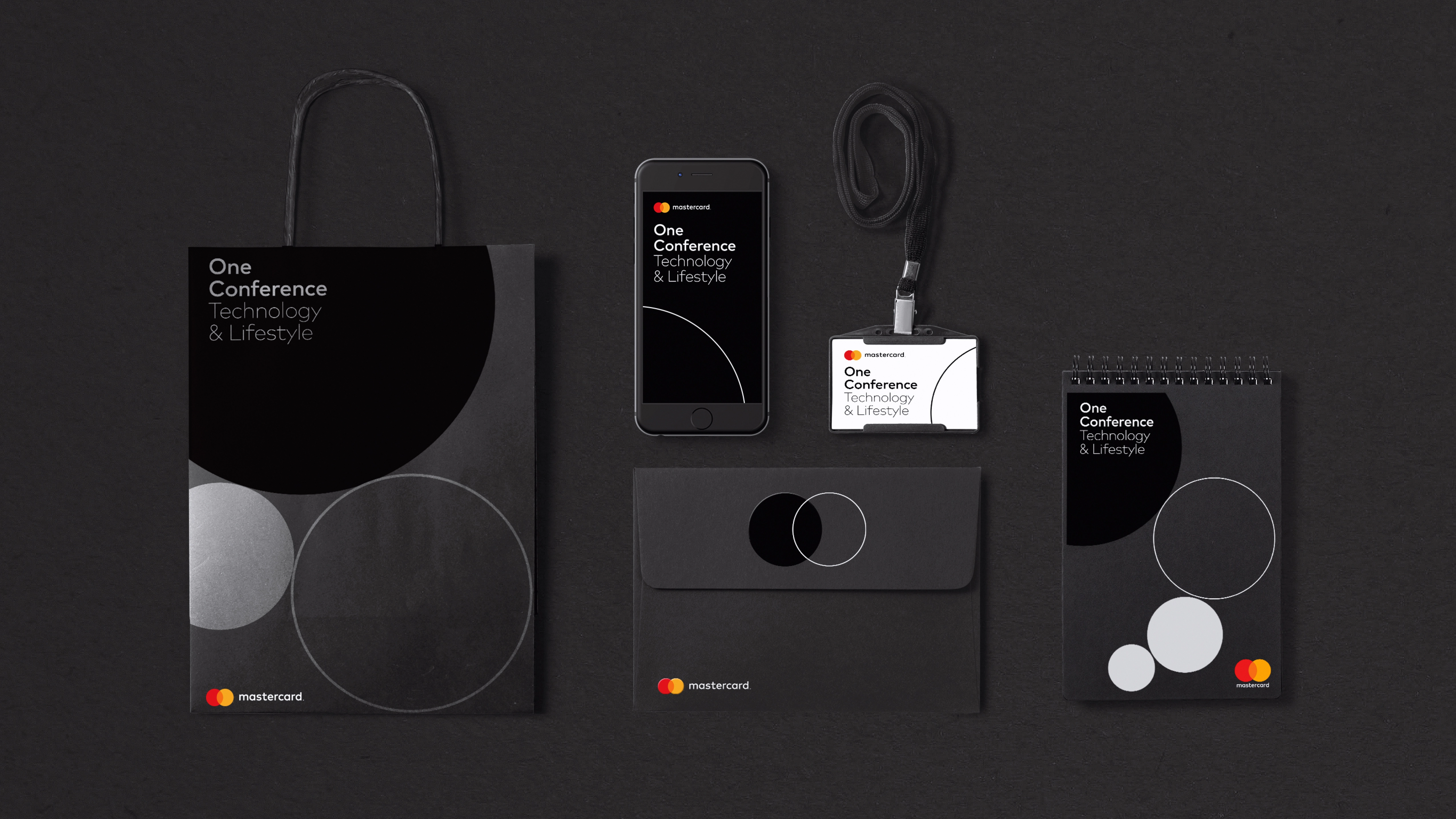
A focus on digital
Pentagram partner Michael Bierut comments: “As digital technology is a growing segment of Mastercard’s business, it needed an identity that would help position the brand as forward-thinking and people-centered, and could be used across every touchpoint. The new look builds upon Mastercard’s iconic interlocking circles, providing a crisper look that is more suited to digital applications. The use of an additive rather than subtractive colour mix for the overlapping circles – they now combine to make a brighter colour – makes the overall effect feel lighter, fresher and more optimistic.”
Progressive design
“This was a huge undertaking and a great opportunity to deliver progressive design for the payment industry," says freelance design director Tousue Vang. "The design neither expands into Mastercard’s visual potential for moving into digital, nor justifies the necessity for a minimalistic rebrand. The solutions presented only serve the needs of the current market. The type system is functional; the simplified circles are easily identifiable across platforms globally. Overall, not really exciting or inspiring, but safely gets the job done.”
This article was originally published in Computer Arts magazine issue 257. Buy it here.

Thank you for reading 5 articles this month* Join now for unlimited access
Enjoy your first month for just £1 / $1 / €1
*Read 5 free articles per month without a subscription
Join now for unlimited access
Try first month for just £1 / $1 / €1

