Responsive web design and web accessibility have come of age, and new modes of presenting text to online users have emerged. As a result, accessible type selection is more important than ever.
01. Typeface design
02. Type application
03. Type technicals
Fontsmith has worked with Mencap to research, test and design accessible typefaces for those with disabilities. Here are some of our findings.
01. Typeface design
Legibility vs readability
Legibility is concerned with questions like: Can you recognise this letter or word? Can you interpret and comprehend this word? Readability is concerned with: How comfortable is the reading experience? Accessible type design is both legible and readable.
Serif vs sans
Our research with Mencap indicates sans-serif fonts are the most accessible style, as the detailing within serifed letters is considered complex by those with reading disabilities.
Sans fonts have a simplified structure; they sit closer to our learned handwriting. Mono-linear sans forms display clearly and in a more robust fashion at small pixel sizes, even in the harshest rendering environments.

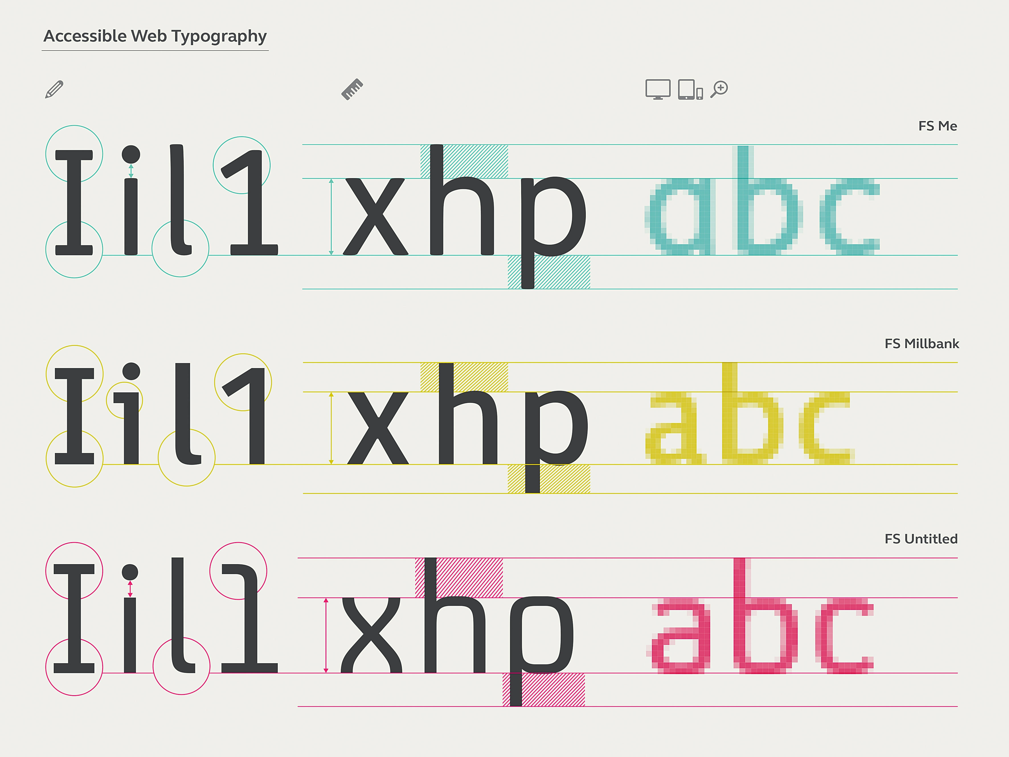
Letter shapes
Choosing a typeface with strong character recognition qualities aids legibility. Those with visual impairments can find certain letters confusing, so it is important those letter shapes are clearly defined. Common offenders are the ‘I’ (capital eye), ‘i’ (lower-eye), ‘l’ (el) and ‘1’ (one). A closed ‘C’ can look like an ‘O’.
Open counter shapes aid reading. The combination of ‘r’ and ‘n’ can read like an ‘m’. Long ascenders and descenders are important, too. They help to define outer word shapes that the eye can scan and interpret swiftly.
Font proportions
A large x-height and moderate-to-wide proportions are most accessible. A larger x-height often infers a greater white space inside a letter, which can aid definition and clarity. Often, condensed and compressed width styles are promoted as enabling a fluid and more responsive layout, but it is important to realise that by using a condensed font where space is limited (eg on mobile) you could also be reducing accessibility.
Hinting
Hints describe the degree by which pixels should be turned on or off to improve the quality of a letter at a specific pixel size. Despite improvements in screen resolution, font hinting is still an essential type design process. Most foundries automate hinting and achieve very good results, but keep expectations in check: no amount of hinting will make a heavy weight look good at 12px.
02. Type application
Size is important. Be mindful that actual sizes can vary hugely between fonts
Weight
Establish a hierarchy by assigning roles for each font. A hierarchy enables the eye to break down information into a clear experience. Use open, midrange weights for subheads and body. Set up a test to evaluate across browser platforms – weight can change dramatically from one environment to the next. If desired, implement Type Rendering Mix to balance out appearance.
Size
Size is important. Be mindful that every font sits at a different scale on the type-body, and actual sizes can vary hugely between fonts: 14px in one font can be equivalent to 18px in another. The average size for body ranges from 14px to 16px. As a general rule, 16px-plus is considered the most inclusive. Font size can also impact on rendering quality. Find the sweet spots that deliver the best rendering results for your primary platforms.
Line-height and length
Give type room to breathe. Your eye needs to be able to track from one line to the next with ease. The Web Content Accessibility Guidelines (WCAG) recommend a line height of 1.5 for body copy. Evaluate, reduce or increase as necessary. Scanning long lines of text is testing for your eyes. Research indicates that the average online line length is around 70-80 characters. Limit lines to no more than 16 words.
Colour
Like all visual elements, type must have adequate contrast. Grey type on a white background can be difficult to read if the greyness and font weight is too light. Fontsmith’s FS Untitled has finely ‘graded’ weights to help users balance its appearance. White type on a dark background will ‘glow’ on-screen making it appear tighter, and some fonts may require letter-space adjustments.
03. Type technicals

Font loading strategies
Slow connections and large font files make for slow text load times. A single WOFF file with a full European character set will size 36-50KB. The states of FOUT (flash of unstyled text) or FOIT (flash of invisible text) need consideration. FOIT is the predominant browser default and in aesthetic terms FOIT is desirable, but in accessibility terms FOUT is certainly the way to go.
That's because seeing some content is better than no content at all. Aim to show text in a fallback font until all web fonts load, which avoids any ongoing juddering of multiple elements on the page. Implement with Web Font Loader and set a cookie, as this minimises FOUT further into the site.
Fallback fonts
Selection is limited particularly on mobile. Jordan Moore’s mobile fallback compatibility table illustrates the problem. When selecting a fallback, shoot for similar weights and proportions. Tweak fallback metrics to match your chosen font size. Inform your selection decision by overlaying an accessible font on the fallback and judge.
Text-rendering
Use optimiseLegibility to enable kerning and improve rendering quality. This setting also enables ligatures, which you can disable if necessary by setting .classname { font-feature-settings: "liga" 0; } .
Protecting fonts
It takes years of effort and investment to develop a high-quality typeface. It’s only fair, given the important role that type has in all web projects, that you take steps to protect the investment in them. Use CORS to deploy fonts, ensuring only permitted sites have access to the files.
We aim to make type as accessible as it can be. We have worked with signage and environmental groups to create a 21st century wayfinding typeface, FS Millbank, aiming to aid navigation in busy environments. With FS Untitled we aim to create a more readable web, ensuring that accessible typography is open to all.
This article was originally published in net magazine issue 286. Subscribe here.
Related articles
