
Adobe InDesign is a great program to use when designing anything that uses type heavily. Throughout this InDesign tutorial, I'll run through the process of creating a typographical poster, showing you how to apply a document grid, and how to create and edit typography.
I'll be using the example of a poster I created for Computer Arts Brand Impact Awards, but many of the tips in this tutorial can be applied to any type-based work you create in InDesign.
01. Create a new document
Create a new print document and select your desired page size from the drop-down options. I’m choosing to work with an A3 document. For now, I'll set the number of columns to 1 with 0mm gutter and 0mm margins – this is because I’m going to add a document grid, so I can always adjust these measurements later. Un-tick 'Facing Pages', then hit the 'More Options' button in the top right and add 3mm bleed (this is the industry standard for printing).
02. Add a grid
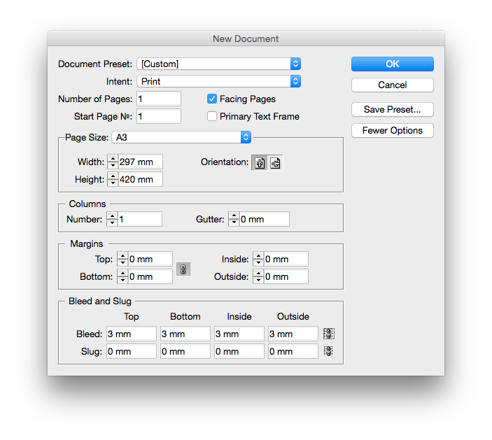
Now let's set up the document grid. Because of the nature of the design, I know I want to work with a grid of around 5mm. Draw a box the same width as the page, then take the measurement shown in the width field and divide it by 5. So my box is 297mm, which divided by 5 will give 59.4mm. I’m going to round this up to 60mm. Hit cmd+Z to undo this action and this time, divide the width by 60. The new measurement of 4.95mm can now be applied to the document grid.
03. Apply the grid
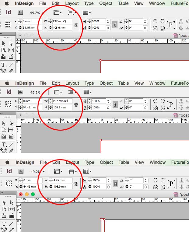
Go to the main menu InDesign > Preferences > Grids and apply the 4.95mm measurement to the document grid by entering this figure into the horizontal and vertical 'Gridlines Every' fields. Enter 1 to the 'Subdivisions' field, and also apply this measurement to the baseline in the 'Increments Every' field. Change the Start measurement to 0mm, and un-tick 'Grid in back' so the gridlines will still be visible when you add a background colour to your design.
04. Create marquees
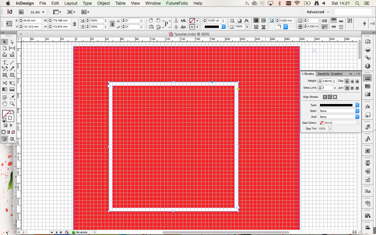
You’re now ready to start working on your poster. Show the document grid via 'View > Grids & Guides > Show Document Grid' (cmd + ‘) and turn on 'Snap to Document Grid' (shift+cmd+‘). Apply a red background to the document including the bleed area – in this case I’m using M:95 Y:100.
Select the Rectangle tool and draw a square by holding down shift to constrain the proportions as you drag; the marquee will automatically snap to the grid. Apply the 4.95mm measurement to the stroke width of the rectangle via the Stroke panel, then switch the Align Strokes to 'Inside' and change the colour to white.
05. Add text
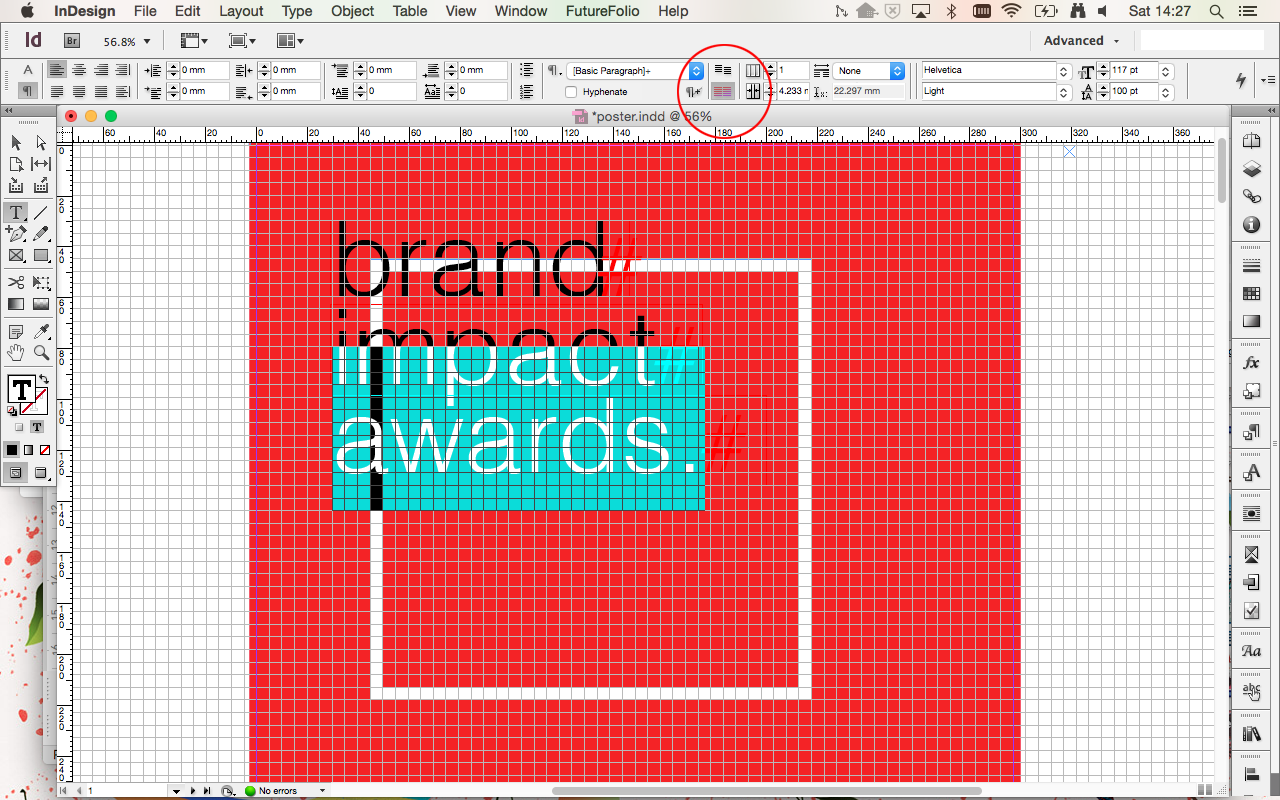
Next add the key text information to your poster. I'll be using Helvetica for all the type, as I already have a brand style to work to. Let's start with the main headline. Draw a text box and enter your heading copy ('brand impact awards.'). I’m using the document grid as a guide for the size of my copy, and increasing the size of the text so the ascender fits to the grid (in this case 117pt).
To give me better control over the placement of the headline, I’m going to split the three words into separate text frames and align the text in each to the baseline grid. This option can be found in the Control panel when the paragraph formatting controls are selected.
06. Adjust kerning and alignment
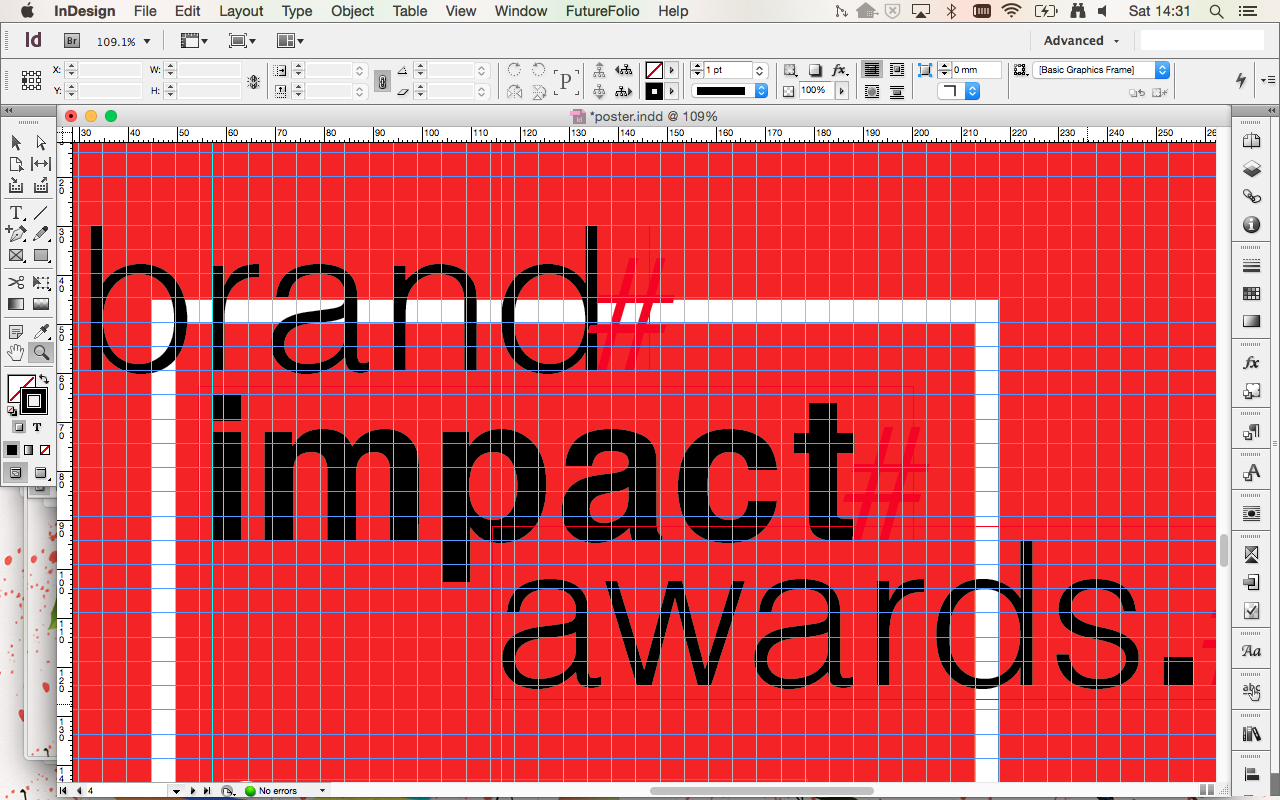
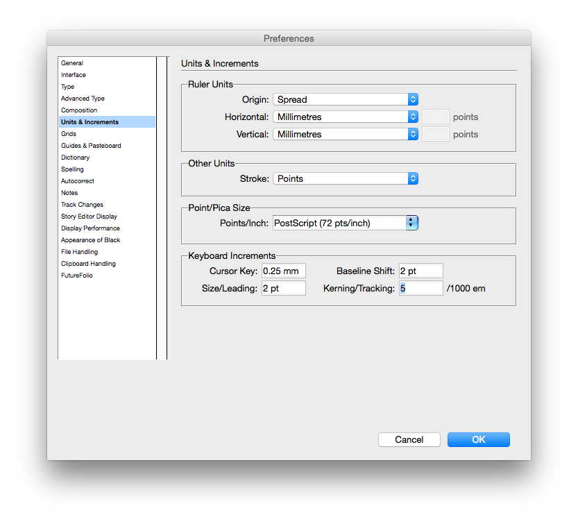
I’ve increased the tracking of my header to 20 and tidied up the spacing between the letters by manually adjusting the kerning (hold down alt and use the arrow keys to do this). To give you more control over the kerning, reduce the default kerning increment via 'InDesign menu > Preferences > Units & Increments', and enter 5 into the Kerning/tracking field.
Once you’re happy with the spacing of your type, you can look at adding some interest by playing with the placement and weight of each word. I’m using ruler guides to align the ‘i’ of 'impact', the stem of the ‘r’ in 'branding' and the first ‘a’ of 'awards' to the bowl of the ‘d’ of 'branding'.
07. Add more text
Next I want to add the strap in the bottom left corner of the square frame we created in step #4. Again I’m using the document grid as a guide for the text size. Draw a text box and add your copy, then align the copy to the baseline. Use the shortcut cmd+shift+< or > to adjust the size of your copy while constraining the frame size. Increase the tracking to 10 and manually adjust the kerning until you’re happy with the result.
08. Introduce hierarchy
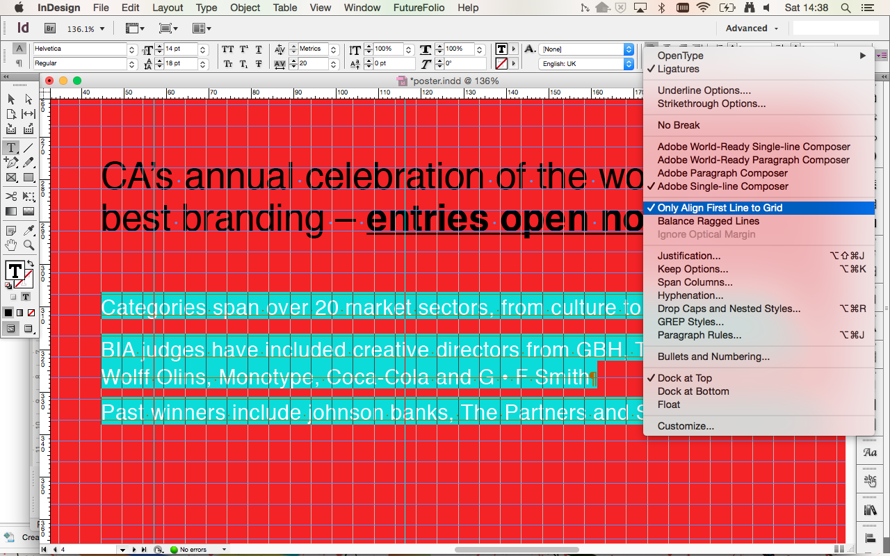
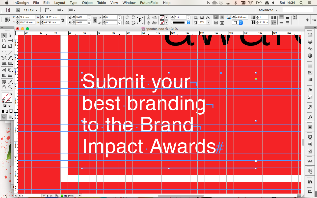
Now I’m going to add some additional text. I'll start by drawing a text box the same width as the square frame, this time fitting the x-height of the text to the grid, adjusting the tracking and kerning, and aligning the text to baseline.
Draw a second text box the same width as the square frame, and this time align the text to the baseline and then select 'Only Align First Line to Grid' in the Control panel flyout menu. This is because I want this text to be smaller than the strapline, which means it won’t fit to the document grid. Altering the sizing in this way will help create a hierarchy of information.
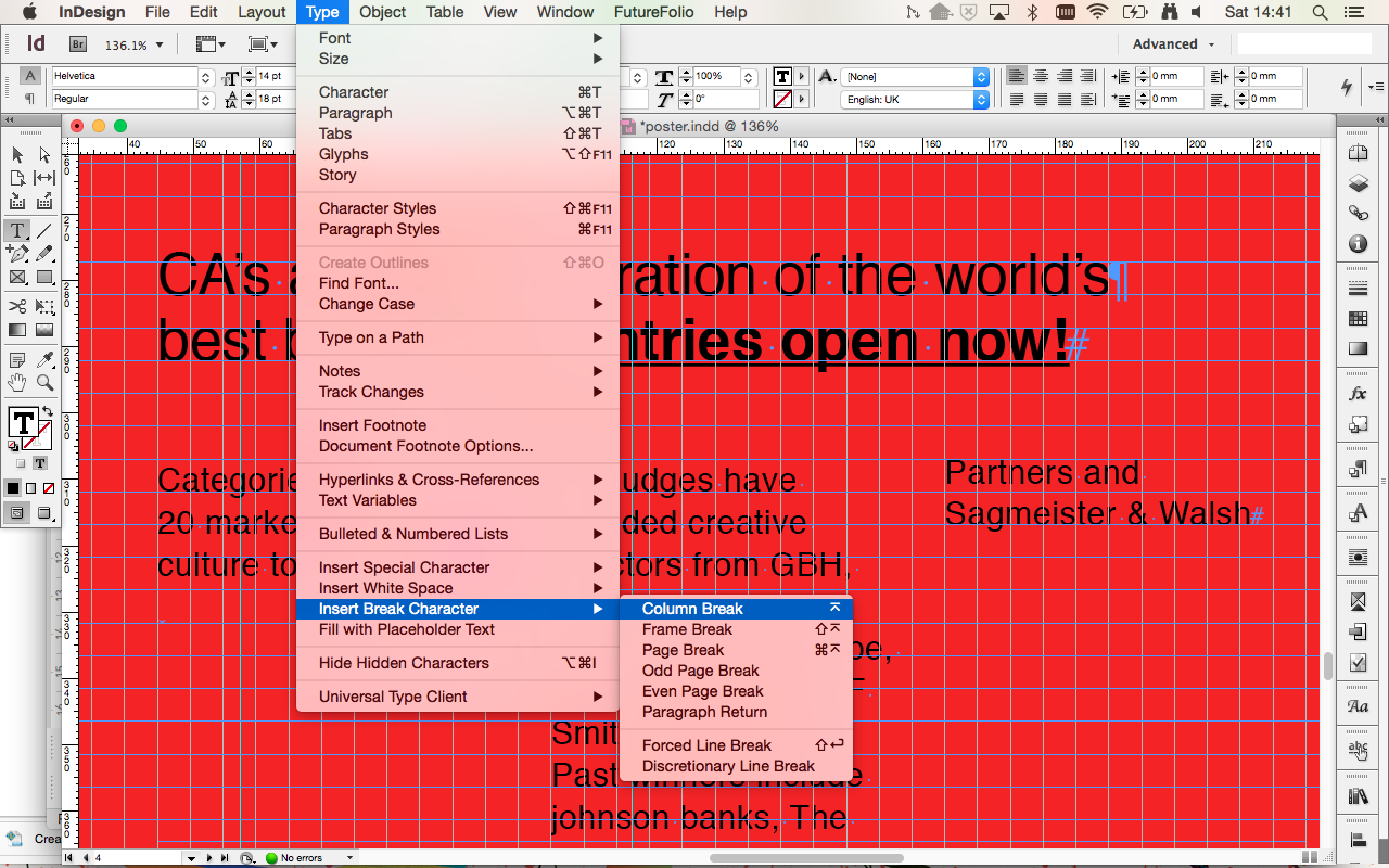
09. Work in columns
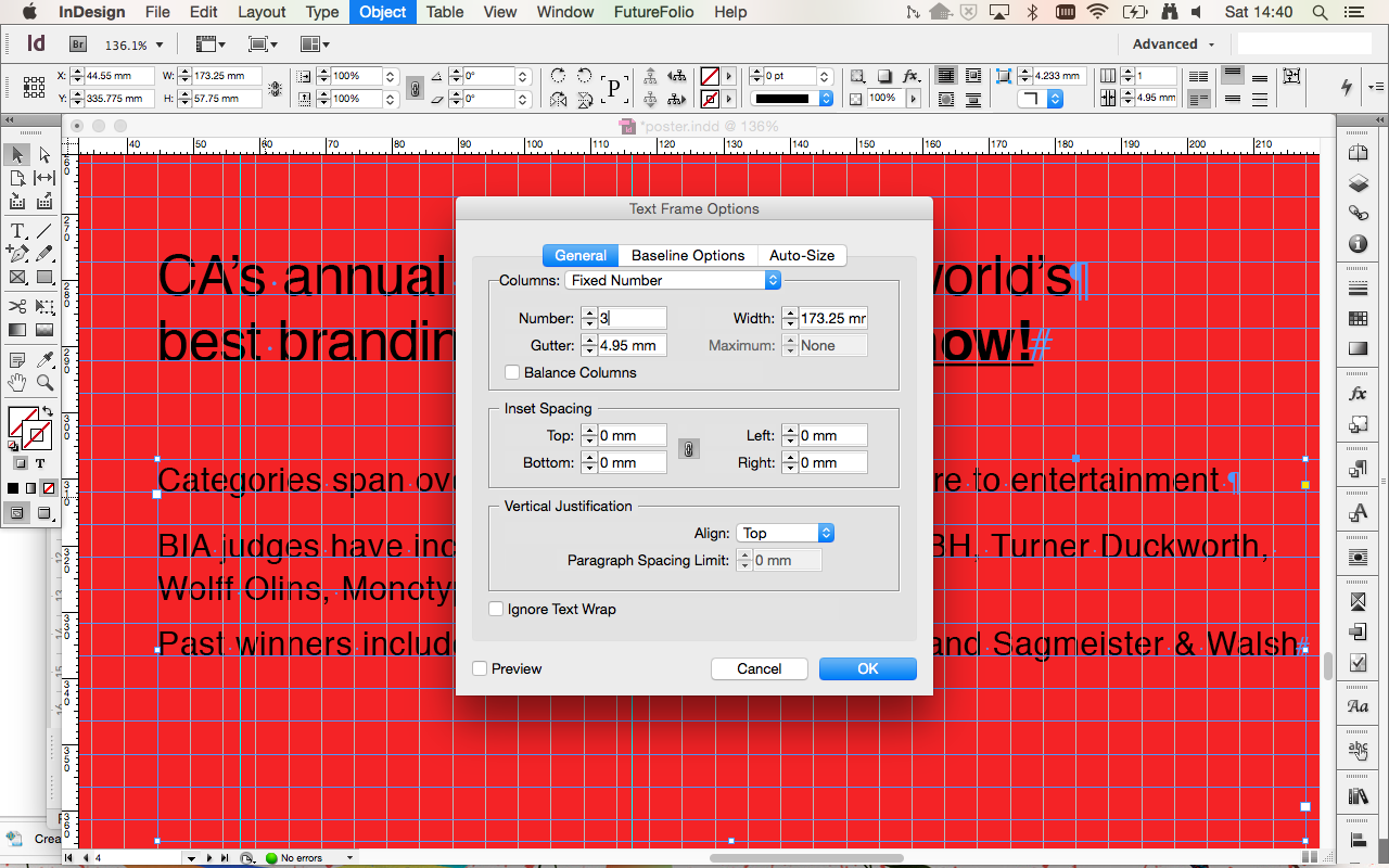
Split the new text frame into 3 columns via the Text Frame Options panel, (cmd+B) and enter 4.95mm into the gutter width field. I have three pieces of text I want to sit in each of the columns. The easiest way to fit the copy to the columns is to use a Column Break. To apply this, place the cursor at the point you want the text to break at, and in the Type menu select 'Insert Break Character > Column Break' (or use the enter key, or fn+return).
10. Finish up
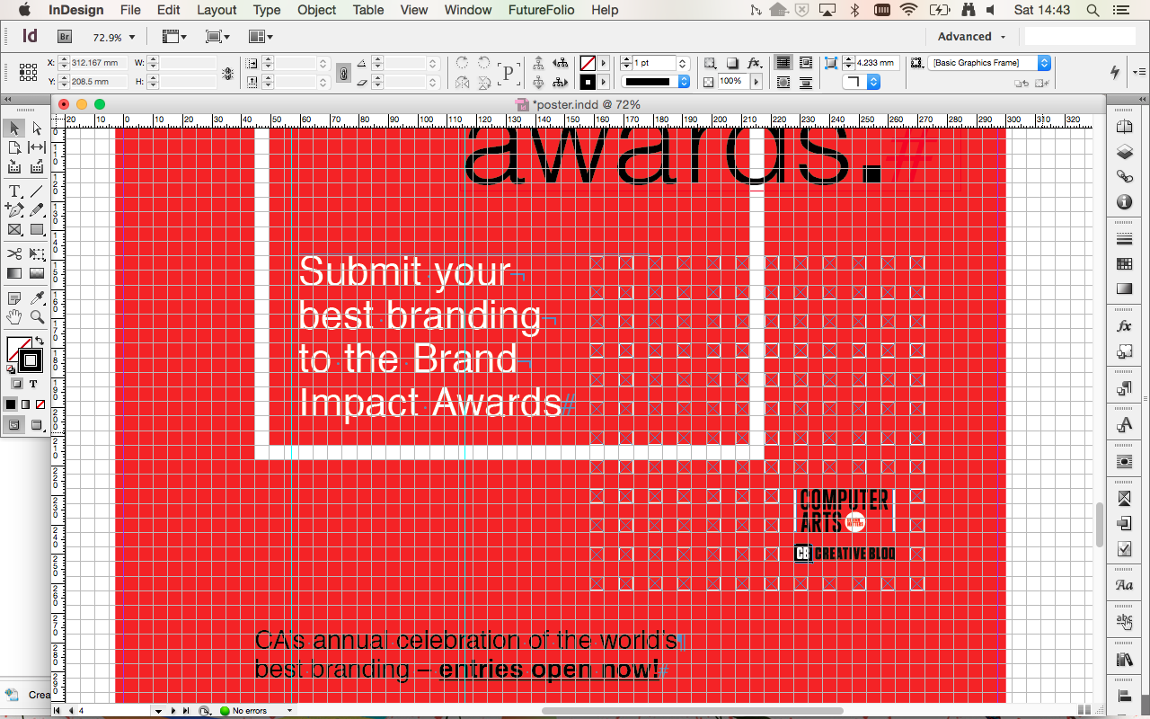
I want to add a grid pattern to the poster, so I'm going to draw a frame the same size as one of the document's grid squares, with a white outline and a stroke weight of 1pt. To create a square pattern I'll duplicate this frame using the shortcut alt+cmd and drag, and snapping a frame to every other square in the document grid.
Finally, I need to position the grid pattern so it aligns with the strap added in step #7. To finish things off, I'll add some last pieces of info and the logos needed to complete the poster.
Related articles:

