Just when you thought the internet might go a day without having a meltdown over something seemingly innocent, Slack came along and revealed its new logo. The workplace chat app unveiled its redesign yesterday as part of a general refresh, but judging by the negative reaction of social media, it looks like the multicoloured hashtag logo is going to be missed by many.
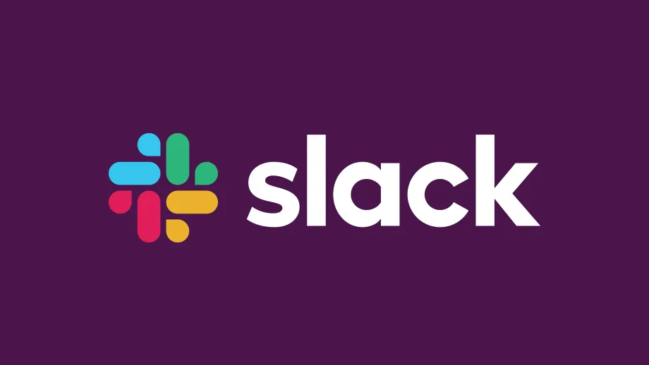
Created by the app's in-house design team in partnership with Michael Bierut and the team from Pentagram, the new logo design keeps the colourful palette we've come to associate with Slack, but it's traded the hashtag motif for a design that more closely resembles a pinwheel.
Sold by the Slack team in a blog post as an evolution rather than an overhaul, the new logo is designed to be easier to use and more cohesive across multiple platforms. Meanwhile the previous logo, which is either a hashtag or an octothorpe depending on your vocabulary, worked okay on a screen, but struggled to perform elsewhere.
"It was also extremely easy to get wrong," the Slack team explain. "It was 11 different colors – and if placed on any color other than white, or at the wrong angle (instead of the precisely prescribed 18º rotation), or with the colors tweaked wrong, it looked terrible. It pained us."
Ta-da! From today, Slack has a new logo, the start of a general refresh of our look. A little simpler, a little clearer, and (we think) a little better. Read more about this change in the handy blog post we’ve written about it: https://t.co/LT1ju7kGxw pic.twitter.com/aceZMCb5StJanuary 16, 2019
This clunkiness makes sense when you consider that Slack's original logo was created before the company was even launched. How many first draft logos could you imagine working seamlessly once they've hit the big time? And as for the updated identity, Slack wants it to look new but also reassuringly familiar.
"It uses a simpler color palette and, we believe, is more refined, but still contains the spirit of the original," says Slack. "It’s an evolution, and one that can scale easily, and work better, in many more places."
Makes sense, right? Well, try telling that to the legions of online commentators currently tearing strips off the redesign. Search for the Slack logo on social media or give it a quick Google, and you'll see articles saying it's 'simply awful', 'really wrong', and one even comparing the new icon to penis swastikas.

This sort of kick-back isn't anything new, even the best logos can be met with a frosty reception. As Slack explains though, this isn't change for the sake of change. The old design, while recognisable and distinctive, simply wasn't fit for purpose.
The Slack team put it perfectly when they said that "a good reason to change a logo is that it’s not doing the job you want it to do – and because a simpler, more distinctive evolution of it could do that job better."

Yes, a hashtag logo for an app that's all about hashtags makes sense, but isn't the whole point of logo design to try and find an imaginative, sophisticated and succinct way to represent a brand? The hashtag worked well enough for Slack's early days, but looking back on it, the design was perhaps too straightforward and weighed down by its colour palette.
The new design, on the other hand, calls to mind a flurry of speech bubbles coming together to communicate. A pretty good summary of the app if you ask us. And by working in the core colour basics and they way they're laid out in the hashtag logo, the transition from the old look to the new is made as smooth as possible.
Related articles:

Thank you for reading 5 articles this month* Join now for unlimited access
Enjoy your first month for just £1 / $1 / €1
*Read 5 free articles per month without a subscription
Join now for unlimited access
Try first month for just £1 / $1 / €1

