An animated typeface made by 110 designers
110 different motion graphics designers contributed a second-long glyph for this animated typeface, a huge collaboration masterminded by Animography's Jeroen Krielaars.
Typefaces always follow very specific rules in the design process, as that's what makes a typeface coherent. When the b is designed, you already have the d, p, q, and with a little extra work, the n, h and m too. Each letter dictates the shape of the next. This has also been the case with the animated typefaces that I've been working on. I've been creating coherent animation systems according to rules that I've set up. Keeping things consistent is in my nature, but too much consistency is just boring.
It can be even more dull with an animated typeface because you have to sit through the whole film when you already know how each letter is going to animate. You're just waiting and that's a terrible thing, because its important that an animation draws you in and makes you excited about what's coming next.
Franchise Animated is an effort to explore how much surprise I could fit into an animated typeface, while still making it coherent. I set up a few simple rules, and decided to let my peers take care of all the pieces of the puzzle. This ensured I would not fall back into my comfort zone. It opened the door to a wide array of styles and techniques that I would never be capable of on my own. This approach did come with a risk – I had very little control over the outcome.
Article continues belowI knew the file had to be completely self-contained, with no external assets like imported 3D sequences, so that everyone with just a basic version of After Effects could open it. It had to be exceptional, as one of the aims was to generate buzz around Animogaphy. I also wanted the typeface to be a useful learning resource for students and other animators. The file is completely open source so you can see all the layers and all the artwork, and you can see how 110 different animators have achieved different effects.
Animography's founder, Jeroen Krielaars, walks us through the project from start to finish:
01. The concept
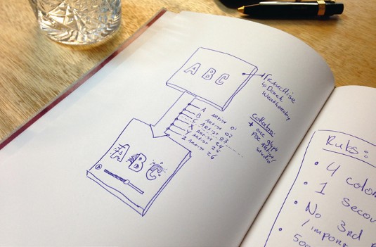
First I thought about animating the entire typeface myself, but I was concerned I might fall into a predictable pattern. it was the perfect project to throw out there to lots of different animators. With a project this huge, it was important to be organised from the start.
02. Setting the rules
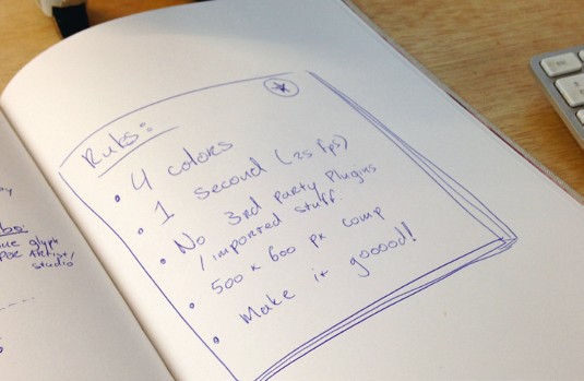
Each second-long animation could only use a maximum of 25 frames and four colours. The first frame must be blank and the last glyph in one colour. The animators couldn't use third-party plugins and everything had to fit in a 500x600px template (which I provided).
Sign up to Creative Bloq's daily newsletter, which brings you the latest news and inspiration from the worlds of art, design and technology.
03. Typeface selection
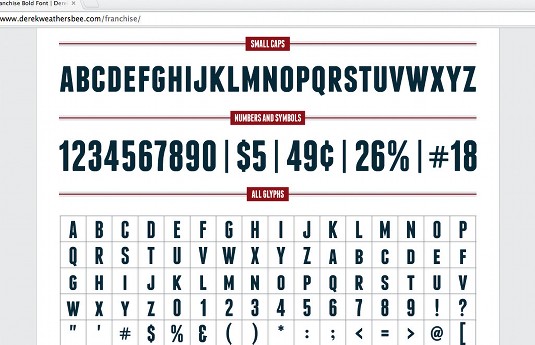
Searching for a suitable free typeface, I found Franchise by Derek Weathersby. The typeface itself is neutral and strong enough to let the animations take all the att ention for a bit, and claim it back when they're finished. The shapes would be interesting to work with.
04. Invitation process
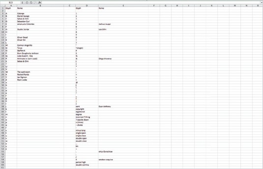
First I invited peers that I already knew from the online motion community. then I asked some of my long-term heroes. I got a lot of people on board this way, but 110 is a large number so many of the remaining animators were recommended by the people who had already got involved.
05. Getting work back
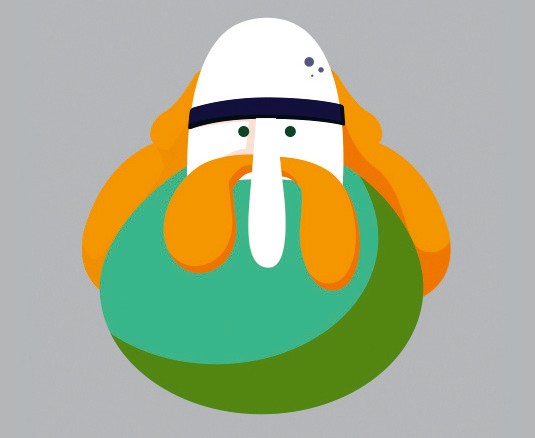
Receiving work from 110 artists without paying them proved to be a challenge. I had to extend the deadline to make sure everyone had time to deliver quality work in between their commercial projects. This step involved a great deal of emailing back and forth between everyone.
06. Making the masterfile
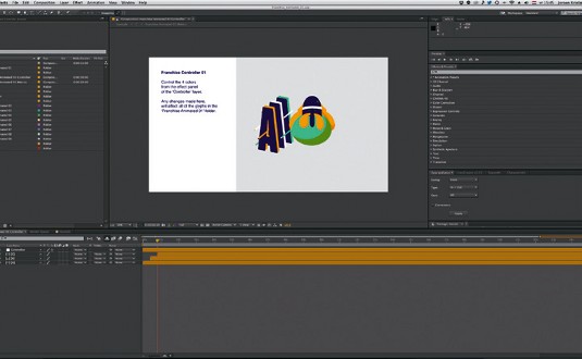
At the end of each week, I took some time to include all the contributions in the masterfile, checking people off of the list, renaming layers, gett ing rid of unused layers. It was important to be on top of things in order to get a clean file that anyone could navigate.
07. Creating the promo
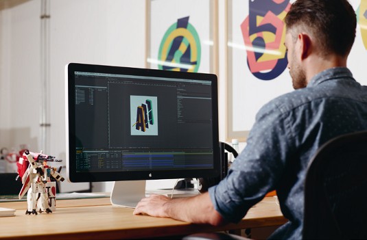
With the animated typeface being so diverse and vibrant, I tried to keep the promo as simple as possible. It features a short explanation of the project, and then a showcase of all the contributions. With the masterfile all good to go, this proved to be a relatively simple step.
08. Sound and music
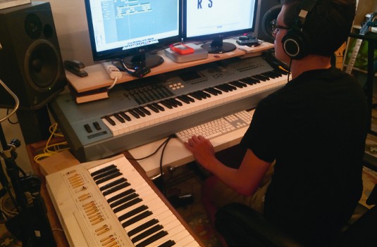
I invited Wesley Slover and Clark Rhee to work on the music and sound design. Those two are always willing to help out on cool projects and deliver top quality audio. Daft Punk's latest album was in full effect at that time, so you might hear some musical reference to that.
09. The release
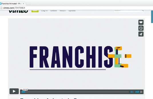
As well as me launching it through the Animography site, a lot of the contributors posted it on their blogs and social media. This helped a lot. I was constantly refreshing the Vimeo stats, reading the flood of tweets, and comments around the web. It was awesome and addictive.
Words: Jeroen Krielaars
Jeroen set up type foundry Animography in 2012 as part of Dutch studio Calango, where he is also motion design director. This article originally appeared in Computer Arts issue 231.

The Creative Bloq team is made up of a group of art and design enthusiasts, and has changed and evolved since Creative Bloq began back in 2012. The current website team consists of eight full-time members of staff: Editor Georgia Coggan, Deputy Editor Rosie Hilder, Ecommerce Editor Beren Neale, Senior News Editor Daniel Piper, Editor, Digital Art and 3D Ian Dean, Tech Reviews Editor Erlingur Einarsson, Ecommerce Writer Beth Nicholls and Staff Writer Natalie Fear, as well as a roster of freelancers from around the world. The ImagineFX magazine team also pitch in, ensuring that content from leading digital art publication ImagineFX is represented on Creative Bloq.
