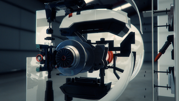
Artillery's DMAX idents
Chunks of 3D metal, a futuristic machine and an arty lighting installation were created by this UK studio for Discovery's DMAX channel
Sign up to Creative Bloq's daily newsletter, which brings you the latest news and inspiration from the worlds of art, design and technology.
You are now subscribed
Your newsletter sign-up was successful
Want to add more newsletters?
The Brighton-based studio Artillery have thrown their creative skills into three new idents for Discovery's DMAX Channel. In each the broadcaster's logo is assembled from various elements, both digital and real world, with various touches of finesse in the animation.
The look and feel of each piece of motion graphics varies to bring out different aspects of the channel's remit - science, engineering and exploration. Magnetism features gritty chunks of animated ore that assemble the letters DMAX, whilst Mechanics is slick and technological. "Sometimes with brand identity it's not just about the overall immediate look but also about the ideas behind them. Minimal and glossy doesnt always say much," says Artillery founder Richard Tilley. "So these differences really reflect on the channel's values of hands on exploration and discovery that come in many mediums. A scientist and an engineer walk similar path but only one will get his hands dirty."

Light meanwhile takes on an arty and almost magical aesthetic, playing with space and perception. It was the hardest to pull off with two art directors collaborating with two carpenters to build a full scale installation. The DMAX brand was cut out of a wall panel and with grid of vertical neon light tubes in different colours behind it. The team were so pleased with it they wanted to bring it back to their studio but the creation was too big, and the hired lighting had to be returned.
Article continues belowIt was two different 3D packages they turned to for the digital work. "Mechanics was done in Cinema 4D where as Magnetism was created using 3D Studio Max, mainly because of it better ability with Particle generation. Partilces are a dark art at times and I'd say this ident needed a lot more devlopment and research into magnetic properties and behaviour," adds Tilley.
Sign up to Creative Bloq's daily newsletter, which brings you the latest news and inspiration from the worlds of art, design and technology.

The Creative Bloq team is made up of a group of art and design enthusiasts, and has changed and evolved since Creative Bloq began back in 2012. The current website team consists of eight full-time members of staff: Editor Georgia Coggan, Deputy Editor Rosie Hilder, Ecommerce Editor Beren Neale, Senior News Editor Daniel Piper, Editor, Digital Art and 3D Ian Dean, Tech Reviews Editor Erlingur Einarsson, Ecommerce Writer Beth Nicholls and Staff Writer Natalie Fear, as well as a roster of freelancers from around the world. The ImagineFX magazine team also pitch in, ensuring that content from leading digital art publication ImagineFX is represented on Creative Bloq.
