10 beautiful examples of iPhone app navigation
Creating intuitive navigation for your iPhone app can be a nightmare. The folks behind iPhone app gallery MobileMozaic select 10 examples of apps that get it right.
If you're an application designer or developer, we're sure you've come across the tough task of organising and creating a navigation menu for your app.
The competition is fierce, so coming up with a visually attractive and effective way to make your app stand out is a challenge. Even the slightest design or usability detail can be a make or break point.
When working on a navigation system for your app you need to be cautious of creating something that follows certain design rules such as clarity, simplicity, consistency and context within the app - all along taking into account the space limitations of a smartphone screen.
Article continues belowHere we take a close look at a selection of beautiful custom tab navigations, where the designers have managed to create a unique character and feel without compromising on usability and function. You can find all these apps and even more on Mobile Mozaic - a gallery of the best designed iPhone applications - under the Custom Tab Navigations UI pattern.
01. Zara for iPhone
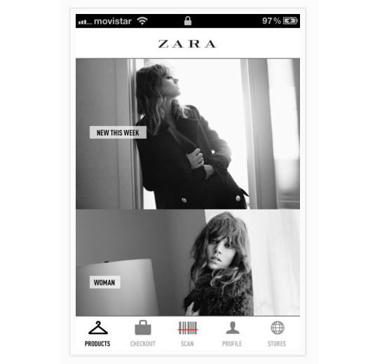
In this app for fashion retailer Zara, the designer has successfully integrated the navigation into the distinctive look of the entire UI. We see a minimal design with no heavy graphics using a black and white colour scheme. The navigation has simple and clear appealing icons. They are combined with wording that supports the app’s general style, by using the same typography and enhancing usability by clearly stating what each navigation element is about.
02. The Cocktail App
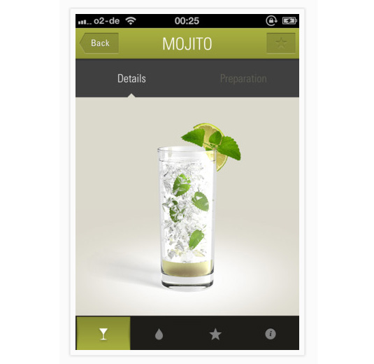
The Cocktail app has a very simple task for its users: choose the cocktail you like from its selection, then view the recipe, ingredients and preparation details. In the same vein the main navigation has been designed with just four plain icons. Notice how well the designer makes use of ‘white space’, even in the small area of the buttons, giving the navigaton a minimal, elegant touch that is nicely integrated with the overall app.
03. Snapette
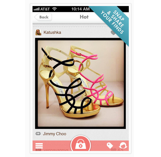
Snapette is a fashion oriented app addressing mainly a female audience. The navigation is therefore very feminine with a curved (almost circular) main button in the middle, which in a very clever way depicts a camera that also looks like a woman’s purse. Another nice touch is the pink transparent background that subtly allows the content to show through.
Sign up to Creative Bloq's daily newsletter, which brings you the latest news and inspiration from the worlds of art, design and technology.
04. ChoreMonster
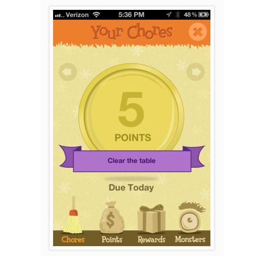
The ChoreMonster app has a unique and strong illustrative style that the designer has rightfully chosen to follow through the navigation too. Unlike most apps they have devoted a rather large part of the screen to the navigation, providing users with strong, detailed illustrations for each menu option. The size of the clickable area and the playful typeface reminds us that this app is mainly aimed towards children.
05. Netrobe
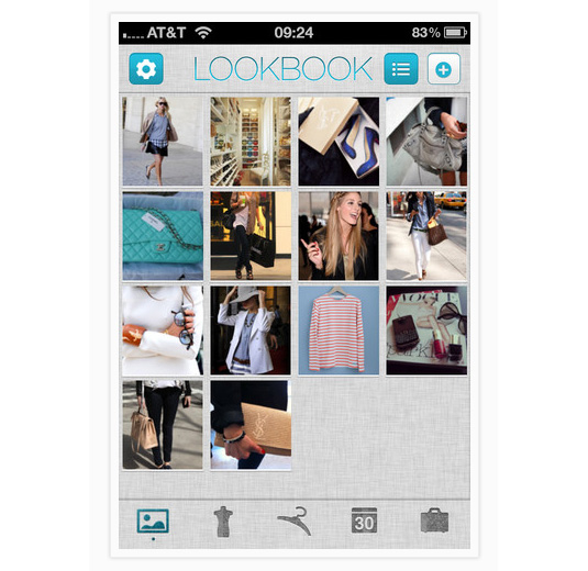
Netrobe is another beautiful fashion oriented app. What's interesting here is the great textured navigation. The designer has used a fabric texture to reflect the clothes appearing in the app and match that with the navigation elements. Most of the icons representing the menu options are also cleverly connected with fashion apparel.
06. Headspace
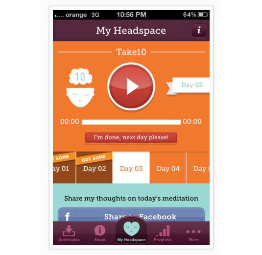
Headspace is an app that offers meditation tips to users. The designer has used a deep purple colour for the navigation, a colour that is considered highly spiritual so it enhances the purpose of the app quite effectively. It is a simple and clear menu using both icons and typography for each element, a very subtle but beautiful approach.
07. Diacarta Planner
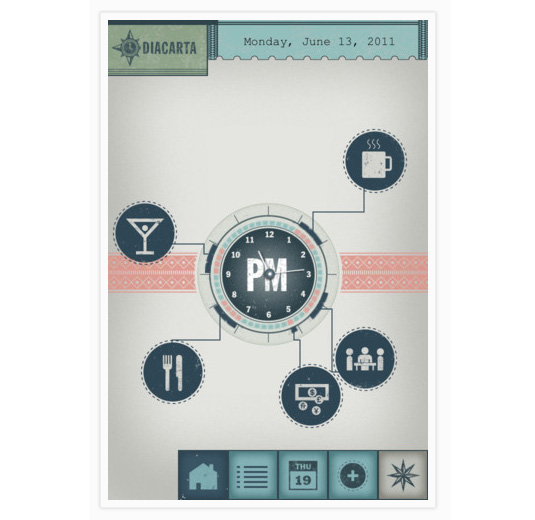
The Diacarta Planner app has a very unique design overall and we can also see this followed through its tab menu. The use of distinct icons with a light texture and faded colours give it a retro, old-school feeling. Another navigation that succeeds in blending in very well with the rest of the app.
08. Fishidy
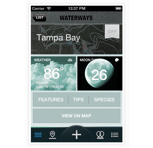
Many designers choose to go with a navigation solution similar to the one we see in Fishidy. This involves focusing on and enhancing the middle button of the navigation as the main element they'd like the users to click on. It's a small difference but it gives it enough distinction here for the user to effortlessly click on. Other than that nicely executed factor we also like the cute custom icons.
09. The Alaska App
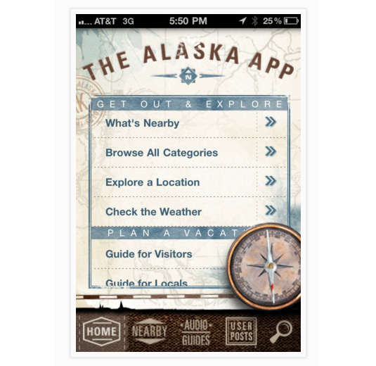
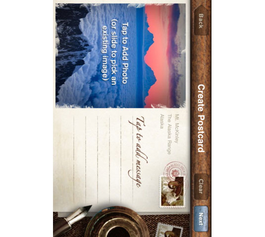
This application giving information about the state of Alaska benefits from the textures the designer has used give it a retro feel. Plus each of the elements has a custom layout with clever use of typography that really makes this app stand out.
10. Let’s learn how to draw
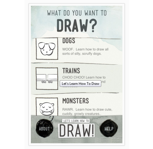
The Let’s learn how to draw app has a navigation that seems a little out of the ordinary. Differentiating between the menu choices is a smart move. The use of a post-it like element, not straight lines, the little marker smudges, typography and uneven textures all make this navigation look very interesting.
- MobileMozaic is an online gallery of the very best designed iPhone applications from around the world. A rich source of inspiration for iOS designers and developers, it categorised all submissions not just based on UI patterns but based on their attributes as well, so anyone aiming for specific design solutions will find it as a great resource.
Also read:
- The 20 best iPhone apps for designers
- 40 best iPad apps for designers
- 10 best apps for art on the iPad
- The 20 best iPhone and iPad apps for typefaces and fonts
Have you seen a great example of app navigation? Tell us about it in the comments below!

The Creative Bloq team is made up of a group of art and design enthusiasts, and has changed and evolved since Creative Bloq began back in 2012. The current website team consists of eight full-time members of staff: Editor Georgia Coggan, Deputy Editor Rosie Hilder, Ecommerce Editor Beren Neale, Senior News Editor Daniel Piper, Editor, Digital Art and 3D Ian Dean, Tech Reviews Editor Erlingur Einarsson, Ecommerce Writer Beth Nicholls and Staff Writer Natalie Fear, as well as a roster of freelancers from around the world. The ImagineFX magazine team also pitch in, ensuring that content from leading digital art publication ImagineFX is represented on Creative Bloq.
