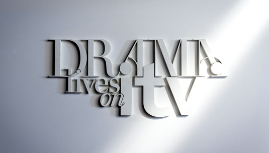
Typography adds drama to TV ident
Downton Abbey-makers ITV have created a typographical treat for its latest ident for UK television. We speak to its creator, Craig Ward.
Sign up to Creative Bloq's daily newsletter, which brings you the latest news and inspiration from the worlds of art, design and technology.
You are now subscribed
Your newsletter sign-up was successful
Want to add more newsletters?
In the UK, ITV drama has made something of an impact on the British public - with the likes of Downton Abbey being a particular hit. With a season of 'unmissable' drama on its way, ITV Creative was looking for a simple, yet effective ident. It turned to renowned typographer Craig Ward. "The brief came about very simply after ITV Creative approached my UK agent - Blink Art - about the possibility of me working on some idents for them," recalls Ward. "I was into it off the bat because I’m trying to do more motion work right now, and this was pretty high profile so I wanted to make it happen."
Ward explains that the brief was to develop a typographic treatment of the text 'Drama lives on ITV' with a view to creating something that could live in three dimensions, and be filmed so as to create a series of vignettes, interstitials and ad bumpers for broadcast.

"It had to be simple as it was something that was going to live both on TV and at much smaller sizes online," he says. "We went through a number of rounds of design and concept stages to arrive at the type treatment. I should say up-front that ITV Creative were kind of a dream to work with, and the whole process was very fluid."
Article continues belowWatch this! ITV's dramatic new ident:
Remarking on how the idea was conceptualised, Ward explains: "The idea of 'drama' always makes me think of black-and-white films, and long shadows like in Hitchcock - so I suggested we try and create something simple and tonal using just light and shadows to define the type. My first visuals were created using Cinema 4D - and crikey, it would have been so much easier to just do it in that software.

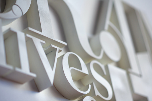
"But, the brief was always to create something for real and I really respect that, so I had the type laser-cut from wood, and we built a 16:9 ratio set at 8x5 foot and painted it all white at my studio here in New York. It’s cool because it’s not perfect, and it would have been if I’d rendered it in C4D. It’s the grit in the oyster that gives it character."
Now read:
- The art of print ads: 50 stunning examples
- The ultimate guide to logo design: 25 expert tips
- How to brand a logo: 15 design trends for 2012
Sign up to Creative Bloq's daily newsletter, which brings you the latest news and inspiration from the worlds of art, design and technology.

The Creative Bloq team is made up of a group of art and design enthusiasts, and has changed and evolved since Creative Bloq began back in 2012. The current website team consists of eight full-time members of staff: Editor Georgia Coggan, Deputy Editor Rosie Hilder, Ecommerce Editor Beren Neale, Senior News Editor Daniel Piper, Editor, Digital Art and 3D Ian Dean, Tech Reviews Editor Erlingur Einarsson, Ecommerce Writer Beth Nicholls and Staff Writer Natalie Fear, as well as a roster of freelancers from around the world. The ImagineFX magazine team also pitch in, ensuring that content from leading digital art publication ImagineFX is represented on Creative Bloq.
