Google reveals its design principles
Flat design and minimalism get the thumbs up as Google officially publishes its visual branding style guidelines.
Sign up to Creative Bloq's daily newsletter, which brings you the latest news and inspiration from the worlds of art, design and technology.
You are now subscribed
Your newsletter sign-up was successful
Want to add more newsletters?

To ensure a strong brand identity, every organisation needs a design style guide, to ensure that all its visual assets adhere to consistent principles. And that applies just as much to the planet's biggest company, Google, as anyone else.
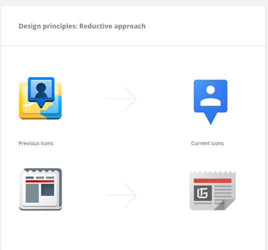
Since January 2012, under the leadership of team manager Christopher Bettig and design/project lead Roger Oddone, Google has been working on creating a solid, yet flexible set of guidelines for using its visual assets for both its vendors and its own designers. And it's now released the results.
As you can see from the extracts shown here, Google's been very much influenced by the current flat design trend, but there's also a huge amount of detail on everything from recommended colour combinations to typography at small sizes. You can see the full guidelines, which cover product icons, logo lockups, user interface icons and illustrations here. It's a fascinating read for any designer - how does it compare to your company's style guide?
Article continues below 
Liked this? Read these!
- Create a perfect mood board with these pro tips
- The ultimate guide to designing the best logos
- Useful and inspiring flyer templates
Have you seen any great examples of design style guides? Tell us about them in the comments below?
Sign up to Creative Bloq's daily newsletter, which brings you the latest news and inspiration from the worlds of art, design and technology.

The Creative Bloq team is made up of a group of art and design enthusiasts, and has changed and evolved since Creative Bloq began back in 2012. The current website team consists of eight full-time members of staff: Editor Georgia Coggan, Deputy Editor Rosie Hilder, Ecommerce Editor Beren Neale, Senior News Editor Daniel Piper, Editor, Digital Art and 3D Ian Dean, Tech Reviews Editor Erlingur Einarsson, Ecommerce Writer Beth Nicholls and Staff Writer Natalie Fear, as well as a roster of freelancers from around the world. The ImagineFX magazine team also pitch in, ensuring that content from leading digital art publication ImagineFX is represented on Creative Bloq.
