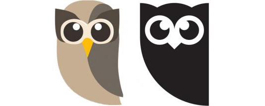
Hootsuite unveils sophisticated new Owly logo
For the first time since launching HootSuite has changed its logo for a more refined design.

Hootsuite are one of the most iconic brands on the internet at the moment, providing almost any company the kind of social media management that's required these days. Launching six years ago, they've never changed their look - until now.
Today, they've unveiled a simpler, sleeker look. Owly, the brand mascot, has been stripped of his colour and instead given a more serious look to represent the overall sophistacted rebrand. "There’s a magic to the HootSuite culture, and we want to hold on to that while also becoming a sophisticated organisation," VP of marketing Dee Anna McPherson told The Drum.
Coming ahead of a push into the European and Asian markets, the new black and white take on the logo has been rolled out across their website. What do you make of the redesign?
Article continues below 

What do you think of the new look? Let us know in the comments box below!
Sign up to Creative Bloq's daily newsletter, which brings you the latest news and inspiration from the worlds of art, design and technology.

Sammy Maine was a founding member of the Creative Bloq team way back in the early 2010s, working as a Commissioning Editor. Her interests cover graphic design in music and film, illustration and animation. Since departing, Sammy has written for The Guardian, VICE, The Independent & Metro, and currently co-edits the quarterly music journal Gold Flake Paint.
