New logo and branding for Glenfiddich whisky
Take a look behind the scenes of this rebranding by London agency Purple Creative.
Sign up to Creative Bloq's daily newsletter, which brings you the latest news and inspiration from the worlds of art, design and technology.
You are now subscribed
Your newsletter sign-up was successful
Want to add more newsletters?

Independent UK design agency Purple Creative has unveiled the new global visual identity for Glenfiddich single malt Scotch whisky, including a redesign of its iconic stag icon (below).
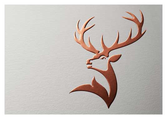
The stag first appeared on Glenfiddich bottles in 1968, and has remained unchanged until its last redesign in 2007 (see below).

The new design (below) simplifies the icon and makes it more anatomically correct, says founding partner at Purple Creative, Gary Westlake. "The antlers were too small for his body and the face looked slightly feminine. We also wanted to elevate the icon's status – to ensure it wasn't recessive within the overall brand logo."
Article continues below 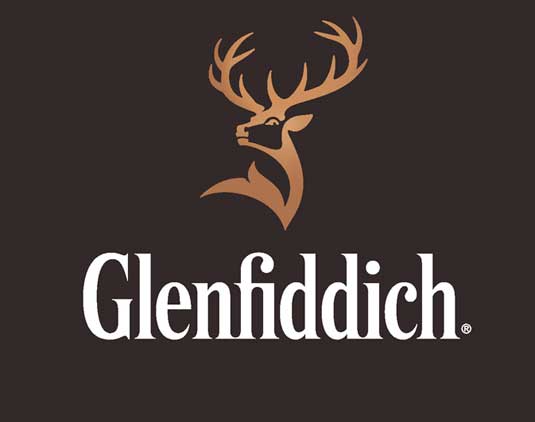
The icon was introduced originally by Charles Gordon, Glenfiddich's Life President, who based it on the 19th century oil painting 'Monarch of the Glen' by Sir Edwin Landseer. The new version is more in keeping with the original, returning the full 12 points to the antlers.
"Based on his antler points, the previous stag was 8 years old, a young male within a herd," explains Westlake. "We wanted to turn him back into a royal stag – a majestic 12 pointer, which denotes the alpha male, masculinity, power, confidence and maturity."
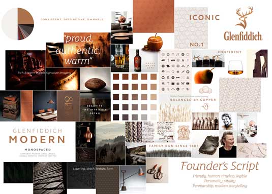
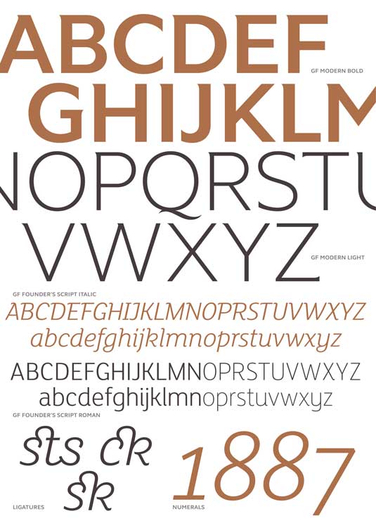
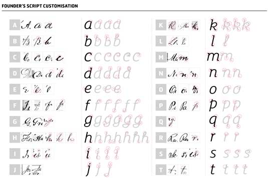
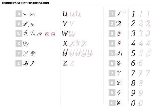
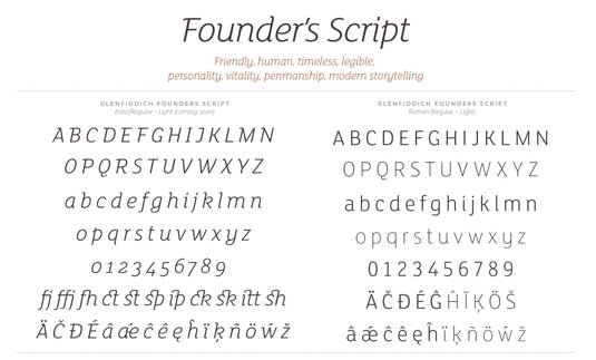
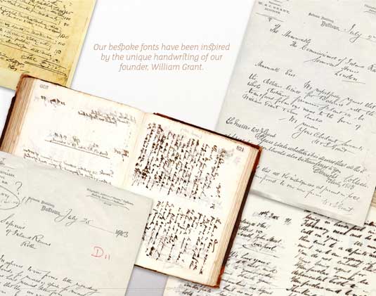
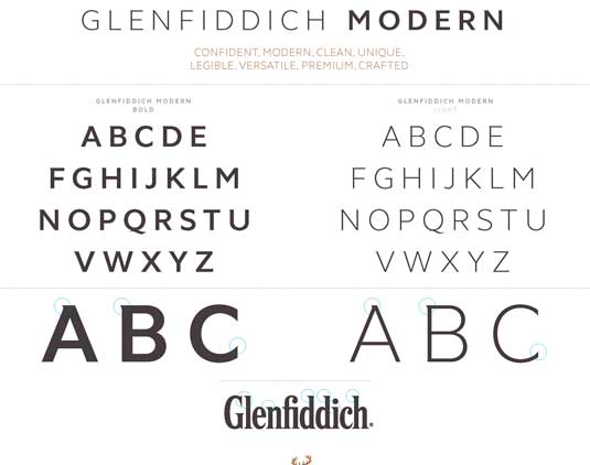
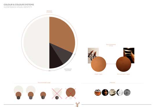
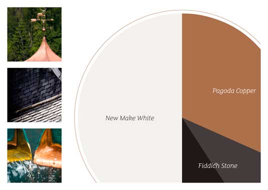
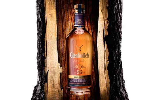
Below you can take a behind-the-scenes look at the development of the new branding, including moodboard, type system and colour system.


Have you seen an inspiring example of a rebrand? Let us know in the comments below!
Sign up to Creative Bloq's daily newsletter, which brings you the latest news and inspiration from the worlds of art, design and technology.

Tom May is an award-winning journalist specialising in art, design, photography and technology. His latest book, The 50 Greatest Designers (Arcturus Publishing), was published this June. He's also author of Great TED Talks: Creativity (Pavilion Books). Tom was previously editor of Professional Photography magazine, associate editor at Creative Bloq, and deputy editor at net magazine.
