Branding for Japanese sword school is right on point
Corey James has created some cutting-edge branding for the Japanese Sword School. Check out his inventive approach.
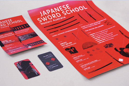
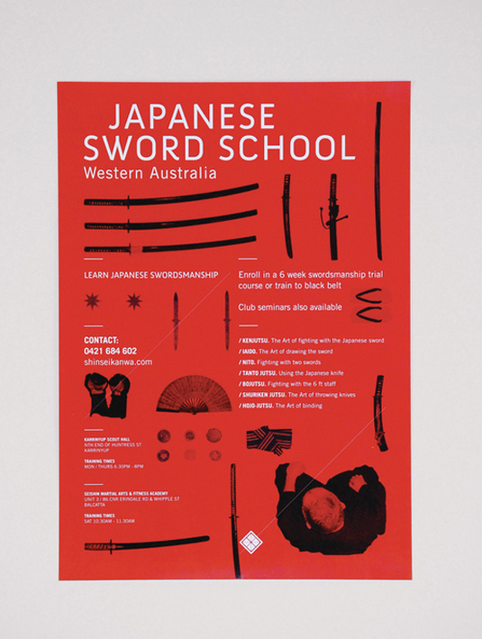
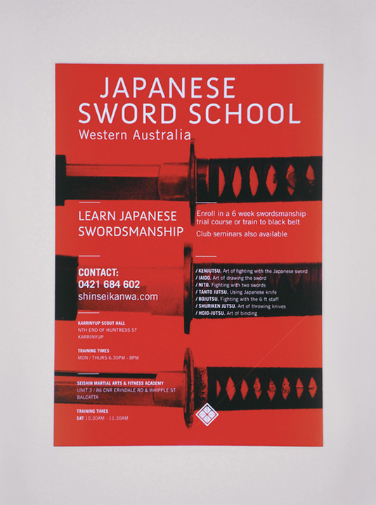
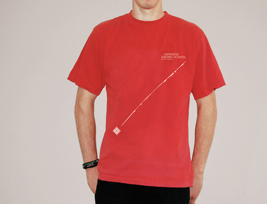
Who wouldn't want a brief like this? Designer Corey James was asked to create a branding identity for the Japanese Sword School of Western Australia. And he's risen to the challenge, with a superb design that makes particularly good use of colour and typography.
“I worked with Sensei Peter James to rebrand the school, which needed a fresh visual identity to attract both tertiary students and middle-aged business professionals," James explains. "My solution involved integrating elements of refined combat with Zen-like balance and precision, producing an engaging and interactive brand identity”.
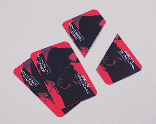
Reminscient of martial arts uniforms and movies, the red, black and white colour scheme makes an instant impact. And we love the attention to detail, which includes a ninja star business cards, as well as a sliced offering that makes us want to rush home and watch Kill Bill!
See more of Corey's work over on his website.
Like this? Read these!
- Brilliant Wordpress tutorial selection
- Free tattoo fonts for designers
- Free Photoshop actions to create stunning effects
Have you seen some beautiful branding? Let us know in the comments box below!
Daily design news, reviews, how-tos and more, as picked by the editors.

The Creative Bloq team is made up of a group of art and design enthusiasts, and has changed and evolved since Creative Bloq began back in 2012. The current website team consists of eight full-time members of staff: Editor Georgia Coggan, Deputy Editor Rosie Hilder, Ecommerce Editor Beren Neale, Senior News Editor Daniel Piper, Editor, Digital Art and 3D Ian Dean, Tech Reviews Editor Erlingur Einarsson, Ecommerce Writer Beth Nicholls and Staff Writer Natalie Fear, as well as a roster of freelancers from around the world. The ImagineFX magazine team also pitch in, ensuring that content from leading digital art publication ImagineFX is represented on Creative Bloq.
