Riffle: a restaurant rebranded
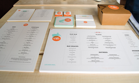
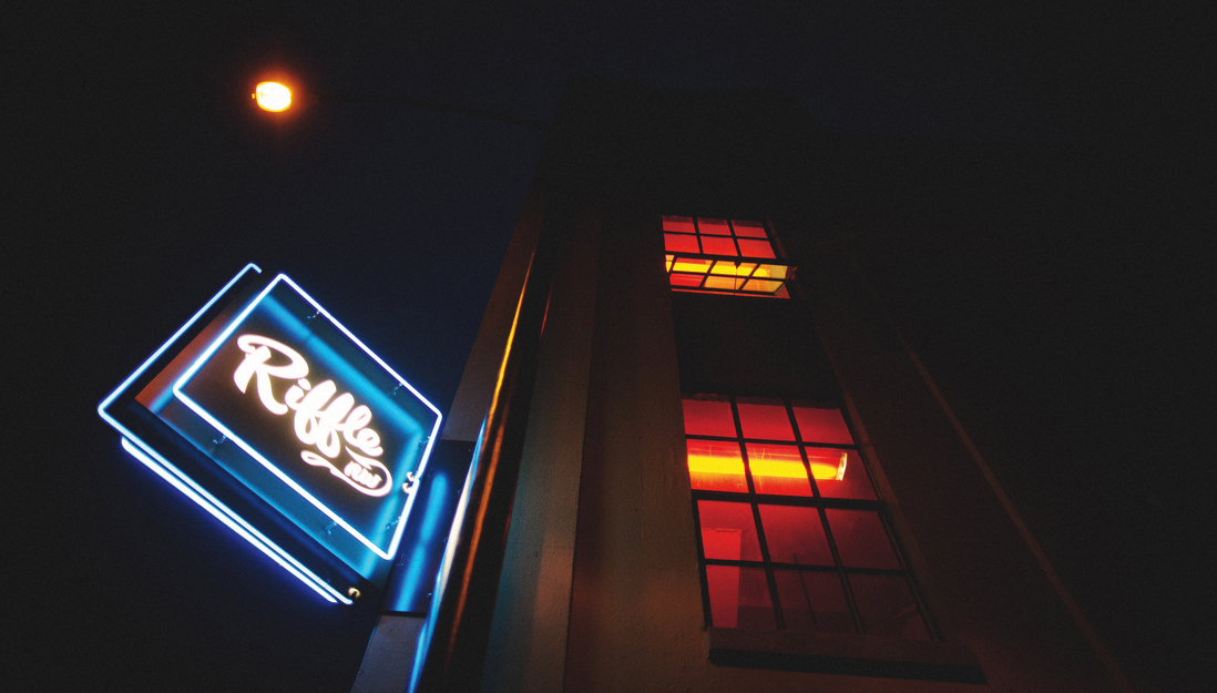
Creative agency Hovercraft has created a complete brand experience for upmarket restaurant Riffle NW - from menus and business cards, to uniforms and an HTML5-driven website.
Sign up to Creative Bloq's daily newsletter, which brings you the latest news and inspiration from the worlds of art, design and technology.
You are now subscribed
Your newsletter sign-up was successful
Want to add more newsletters?
When respected restaurant Riffle NW, located in Portland USA, decided it was time for a total rebrand, it turned to Hovercraft, a local full-service creative agency that has worked for Nike and Magners, among other clients.
Part of Riffle's attraction is that it serves sustainable, locally caught seafood and river fish in an upmarket but unintimidating atmosphere, and that needed to be reflected in the branding.

"Riffle NW is in the unique position of being very high-scale as far as food is concerned," explains Hovercraft's Ryan Haaland, "but it needed the very friendly, approachable personality of the executive chef, Ken Norris, and his wife and restaurant director Jen, to come through in all materials."
Article continues below 
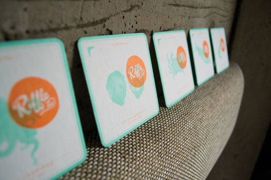
The result was a refined system of branding, spreading across multiple elements, from matchbooks and menus to kitchen staff uniforms and the restaurant website - all completed in six weeks from start to finish.
"It's quite friendly, approachable and even a little quirky at times," says Haaland. "The mark is a clean, round form but isn't a perfect circle. Even the typeface selection of Eames Century Modern and Brandon Grotesque makes a nod to a refined feel while still being approachable."

Although the studio had comprehensive freedom during the brief, there were certain elements that inevitably presented specific restraints: "The major thing being that the menus change daily," Haaland explains. "Basically all menus are treated like a blank letterhead.
"The orange and light blue are printed offset beforehand and the menus get run through the digital printer at the restaurant daily to fill in the content. Then it gets finished with a nice little stamp of the date at the top."
Sign up to Creative Bloq's daily newsletter, which brings you the latest news and inspiration from the worlds of art, design and technology.
This showcase was originally published in Computer Arts issue 205.
Now read:
- How to brand a logo: 15 top logo and branding trends for 2012
- 20 top tips for great logo design
- The art of print advertising: 40 stunning examples

The Creative Bloq team is made up of a group of art and design enthusiasts, and has changed and evolved since Creative Bloq began back in 2012. The current website team consists of eight full-time members of staff: Editor Georgia Coggan, Deputy Editor Rosie Hilder, Ecommerce Editor Beren Neale, Senior News Editor Daniel Piper, Editor, Digital Art and 3D Ian Dean, Tech Reviews Editor Erlingur Einarsson, Ecommerce Writer Beth Nicholls and Staff Writer Natalie Fear, as well as a roster of freelancers from around the world. The ImagineFX magazine team also pitch in, ensuring that content from leading digital art publication ImagineFX is represented on Creative Bloq.
