Secrets of a branding agency's website redesign
Redesigning your own site can often be more challenging than doing it for others, says Adam Gallacher.
Sign up to Creative Bloq's daily newsletter, which brings you the latest news and inspiration from the worlds of art, design and technology.
You are now subscribed
Your newsletter sign-up was successful
Want to add more newsletters?
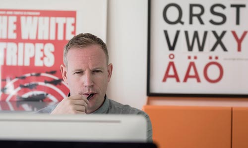
At branding, design and communications agency Wemakedesign, bringing to life a brand's story is what we do best. But what about when we decided to turn the spotlight on ourselves, and redesign our own website?
It's often hard to have a clear vision of who you are, what you do well. You often cannot see the woods for the trees and you often ignore the very advice that you gave to your clients, avoid your own processes and methodologies.
Back to basics
Bearing all that in mind, we went back to basics. We researched all the agencies we could think of, all our favourites, all of our competitors, who is doing it well, who isn't. We looked at content; how did people talk about themselves?
Article continues below 
We found that some agencies place huge focus on strategy, so that when it comes to creative, the outputs can often be dull. Some, in contrast, place their focus on the creative so it's all about the design - but they simply don't have a clue about strategy.
We felt that what we offered was genuine strategy tied closely to an energized creative output that delivers results for our clients, rather than awards for ourselves. But how do you get this point across to prospective clients? How do you show you're different when everyone is saying the same thing?
Focus on the work
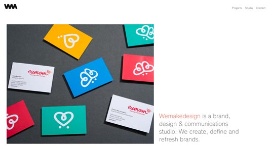
We decided that what we had to show our focus through our work and how we spoke about it.
We didn't want to show pictures of sketches to show we sketched. We didn't want to show pictures of workshops to show we did strategy. We wanted to write as succinctly as possible about the project, with a focus on its intent - not a description of actions - and endorse this with clear, visual examples that would let people see what we did and how we did it. In other words, we didn't want to drown them in information but provoke and intrigue them into getting in touch.
Sign up to Creative Bloq's daily newsletter, which brings you the latest news and inspiration from the worlds of art, design and technology.
So we set down a list of parameters:
- All copy must be as short as possible, focused on the challenge not descriptive of outputs and it should also be warm, because we are.
- All imagery should be as clear as possible, describing not every output or even our favourites but again the project focus.
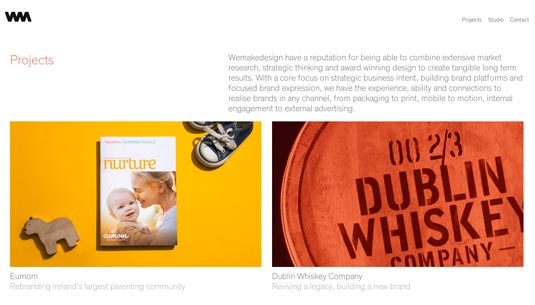
We were fortunate in having two long time collaborators who were generous to the extreme with their time and expertise, with Matthew Thompson taking all the team pics and Trevor Hart applying the craft to our projects. We wanted everything to be caught in camera and avoid Photoshop if at all possible.
The smartest thing we did was we engaged an outside partner who could help us to develop the site, enable us to see the wood from the trees, we gave a clear indication of the site areas, the above parameters, we wanted it to work on all devices.
Site elements

The site needed to appear to be simple but it also had to reflect our love of typography and gridded layouts. So again we set strict parameters, spending a lot of time to select the right font, the right weights and font sizes. We kept all of these things as tight as possible, if something looked like it was trying too hard or not having clarity we killed it.
Finally we did the hard work. We really looked at ourselves, we trimmed away all that was not us and focused in on what we did best. And we looked to use that lens through everything. So regardless of the client or the medium, you knew what we did and got a sense of how we did it and why. We rewrote everything from the smallest heading to our overarching story and then wrote it again… shorter.
The process of working hard at the content with the focus of who we were and how we wanted to say it meant that when it came to actually building the site it went very smoothly and quickly with very few snags or deviations on the way. So it pays to take your own advice and to apply your process to your own work.


Do you have any tips for redesigning your own site? Let us know in the comments!

The Creative Bloq team is made up of a group of art and design enthusiasts, and has changed and evolved since Creative Bloq began back in 2012. The current website team consists of eight full-time members of staff: Editor Georgia Coggan, Deputy Editor Rosie Hilder, Ecommerce Editor Beren Neale, Senior News Editor Daniel Piper, Editor, Digital Art and 3D Ian Dean, Tech Reviews Editor Erlingur Einarsson, Ecommerce Writer Beth Nicholls and Staff Writer Natalie Fear, as well as a roster of freelancers from around the world. The ImagineFX magazine team also pitch in, ensuring that content from leading digital art publication ImagineFX is represented on Creative Bloq.
