Type takes centre stage in new cosmetic identity
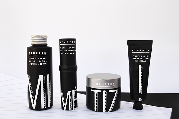
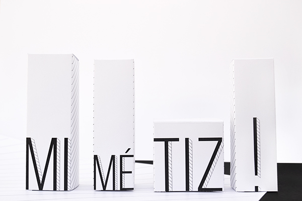
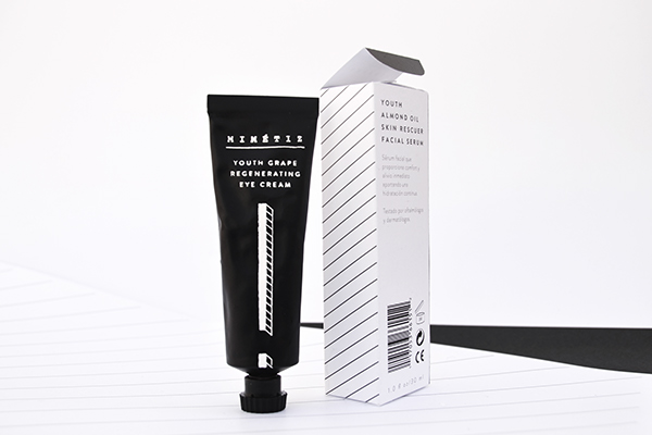
This branding for new cosmetic company MIMÉTIZ showcases a contemporary handmade approach.
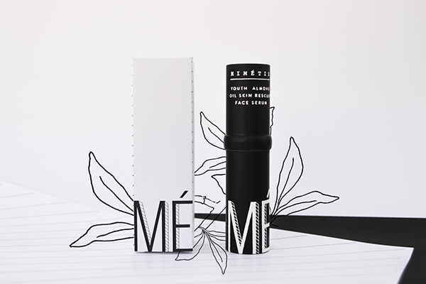
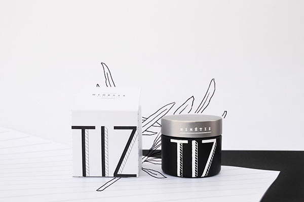
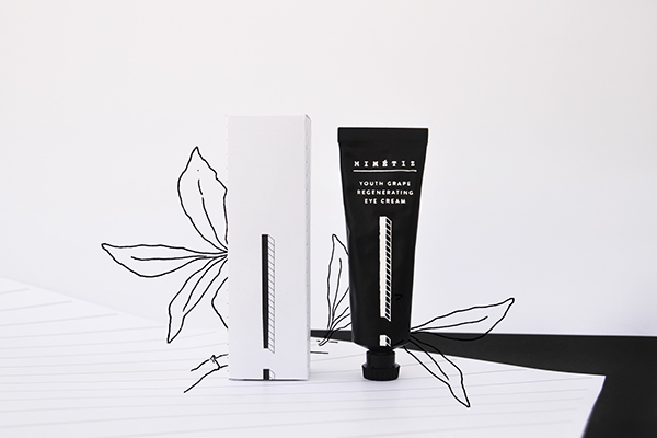
Any new brand needs a strong and engaging identity design. MIMÉTIZ is a new cosmetics brand that focuses on natural ingredients. Spanish graphic designers Nicole Mcleish and Helena Artola were tasked with creating a functional packaging set for a new luxury cosmetics brand.
Discover 21 outstanding uses of colour in branding
Whilst the brief needed the pair to showcase the natural approach of the products, the pair were keen to shy away from previously outdated 'handmade' looks. "The ingredients are natural and hand-harvested in the most traditional way, but the brief was to keep the presentation in a contemporary style," they explain.
"Our principal aim was to make the products work together, so they function in a step-by-step manner, which is why the name is divided into syllables and adds an exclamation mark for the last step." Keen to avoid the traditional ‘handmade’ aesthetic, the pair ditched the original plan of hand-drawn illustration on the bottles, in favour of clean graphic patterns.

Liked this? Read these!
- 4 golden rules of branding
- Candy store branding is a real sweet treat
- 21 outstanding uses of colour in branding
This article was originally featured in Computer Arts issue 239. The interview was previously printed alongside the wrong images and this is now the correct version.
Daily design news, reviews, how-tos and more, as picked by the editors.

Thank you for reading 5 articles this month* Join now for unlimited access
Enjoy your first month for just £1 / $1 / €1
*Read 5 free articles per month without a subscription

Join now for unlimited access
Try first month for just £1 / $1 / €1

The Creative Bloq team is made up of a group of art and design enthusiasts, and has changed and evolved since Creative Bloq began back in 2012. The current website team consists of eight full-time members of staff: Editor Georgia Coggan, Deputy Editor Rosie Hilder, Ecommerce Editor Beren Neale, Senior News Editor Daniel Piper, Editor, Digital Art and 3D Ian Dean, Tech Reviews Editor Erlingur Einarsson, Ecommerce Writer Beth Nicholls and Staff Writer Natalie Fear, as well as a roster of freelancers from around the world. The ImagineFX magazine team also pitch in, ensuring that content from leading digital art publication ImagineFX is represented on Creative Bloq.
