10 tips for kawaii character design
These great tips will help you to incorporate kawaii style into your own creative work.
Kawaii style is too often seen as a genre aimed at children or the young-at-heart adult. However this design direction has far deeper roots and potential than its innocuous appearance gives it credit for. If design history could be compared to natural evolution, then kawaii style adapted to survive in a competitive environment where capturing attention was paramount to success.
Just think of Tokyo, where dizzying urban life is punctuated surprisingly often by childlike mascots for mundane things. Using eye contact to establish connection is a basic trick when designing for fast-paced surroundings. Combine that with the innate human empathy towards cuteness, based on an evolutionary need to protect offspring, and you can see how kawaii art starts ticking the boxes.
Cute characters
However this doesn’t mean that any smiley face would do. A good character design should be memorable and make people want to stop, laugh, covet, or share what they’ve just seen. Graphic brands like TokiDoki, Kidrobot, TADO, Noodoll, Artbox, and Momiji have successfully boosted the popularity of cute character art across all types of markets.
Article continues belowWe have an article from Jon Burgerman offering general character design tips, but if you’re feeling inspired by kawaii the following 10 tips will help you to incorporate some of that style into your creative work.
01. Distinct silhouette

Aim to give your character a unique outline that makes it recognisable even as a silhouette. It’s easiest to come up with unusual shapes by drawing freehand so try brainstorming by doodling on paper or a graphics tablet. Once you have something good, you can use the sketch as a template for vector art.
02. Head-to-body ratio

The basic formula for making something appear cute is to enlarge the head and shrink the body. This gives the figure a mascot-like appearance and also creates more room for the all-important facial features. Making the body fatter and rounder is another common kawaii device because baby animals tend to have endearingly truncated proportions.
03. Facial Features
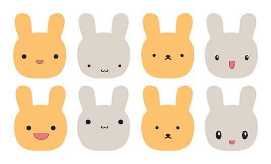
This is where the difference between good kawaii and mediocre kawaii is most pronounced. Finding the right shape and distance between facial features can be surprisingly complex and worth putting extra effort in. Always test out many faces on your character and narrow it down to the most appealing one.
Sign up to Creative Bloq's daily newsletter, which brings you the latest news and inspiration from the worlds of art, design and technology.
04. Avoid perfect circles

Using a perfect circle as a base for the face is done everywhere and the result is fairly predictable and unexciting. The same applies for perfectly concentric eyes, body or accessories. So whenever the need for a roundish shape arises, give it that extra bit of individuality by playing around with oval, square-oval, egg, and other organic curves.
05. Asymmetry and irregularity
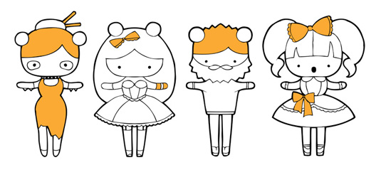
A completely symmetrical figure can appear quite sterile or at worst, like the lazy result of a copy, paste, and flip. Introducing a few irregular elements, however subtle, makes the image more visually appealing. If your line-art has to be symmetrical, then adding shading on different sides or drawing the character from a slight angle will also create an illusion of asymmetry.
06. Texture

Similar to irregularity, adding texture makes your character more tangible and interesting to look at. This can range from a woolly, fluffy, or furry body to a distinct clothing pattern. Even a neat row of teeth or highlights in the eye can act as texture.
07. Outline variation

Many kawaii characters created in Adobe Illustrator are at risk of 'same style syndrome', namely various coloured vector shapes stroked in a uniform black outline. If you have a great character concept, don’t diminish its impact by cutting corners with technical execution. Some easy ways to make your style pop is to change the width, colour, or texture of your lines over different parts of the illustration.
08. Livetrace function
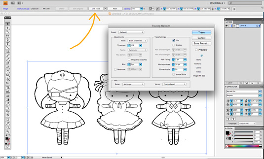
There’s a popular branch of character design which celebrates hand-drawn aesthetics. If you’d keen on this style, that’s where Livetrace comes in handy. Simply ink your image on paper, then scan. Place the image in a new Illustrator CS6 document, select Livetrace and then Expand. Use the Magic Wand to select any white areas and then delete. Now you can still go back and touch up details by deleting or adjusting anchor points.
09. Look beyond what already exists
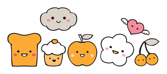
Kawaii style contains many archetypal themes and imagery which can make it tricky to produce something original. So instead of trying to imitate what already exists, use your personal knowledge and interests to create something new. You can selectively combine themes from your favourite animals, foods, fashion, memories, music, people, or places.
10. Stay inspired
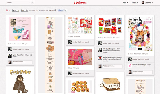
The more you immerse yourself in kawaii art, the easier it becomes to distinguish its nuances and find a niche for your own design. Think of names and back stories for you characters, and eventually you can create a world populated by your imagination.
Words: Joanna Zhou
Joanna Zhou is an award-winning manga illustrator and graphic designer. She currently runs her own design label Maqaroon. This is an updated version of an article that previously appeared on Creative Bloq.

The Creative Bloq team is made up of a group of art and design enthusiasts, and has changed and evolved since Creative Bloq began back in 2012. The current website team consists of eight full-time members of staff: Editor Georgia Coggan, Deputy Editor Rosie Hilder, Ecommerce Editor Beren Neale, Senior News Editor Daniel Piper, Editor, Digital Art and 3D Ian Dean, Tech Reviews Editor Erlingur Einarsson, Ecommerce Writer Beth Nicholls and Staff Writer Natalie Fear, as well as a roster of freelancers from around the world. The ImagineFX magazine team also pitch in, ensuring that content from leading digital art publication ImagineFX is represented on Creative Bloq.
