Bold typography and linocut brings Constantine's poems to life
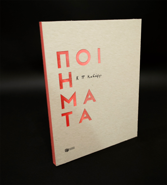
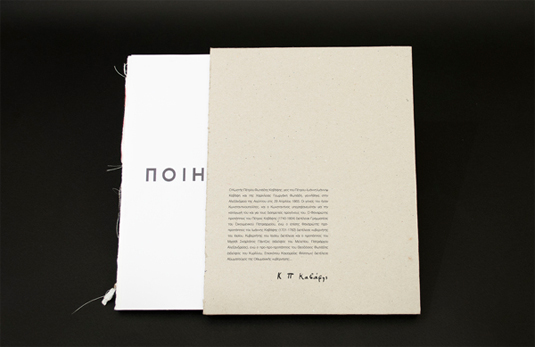
This gorgeous editorial design for iconic Greek poet Constantine P Cavafy showcases the beauty of his words using colour and typography.
Sign up to Creative Bloq's daily newsletter, which brings you the latest news and inspiration from the worlds of art, design and technology.
You are now subscribed
Your newsletter sign-up was successful
Want to add more newsletters?
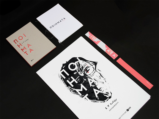
Creating an editorial design for any kind of respected wordsmith is a huge task. With better book design happening all the time, editorial design is at the peak of the industry. One such wonderful example, is this project from Greek designer Thomas Kiourtsis.
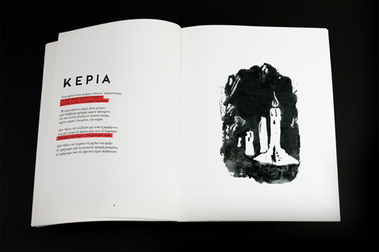
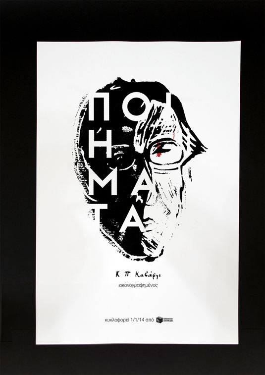
"Constantine Cavafy is one of the most important Greek poets, hides deep sadness and evidence of strong internal struggle in his poems," he explains. "I chose the engraving on linoleum because I was making something very unpretentious - just like his poems - with strong contrasts while quite modern."
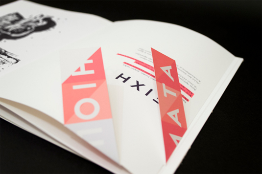
Using bright constrasting colours and bold typography allows for Constantine's word to really come through the pages. "The colours used are in conflict of the language in the poems, which also influenced my choice of fonts," reflects Kiourtsis. Have a look for yourself at the photos below.
Article continues below 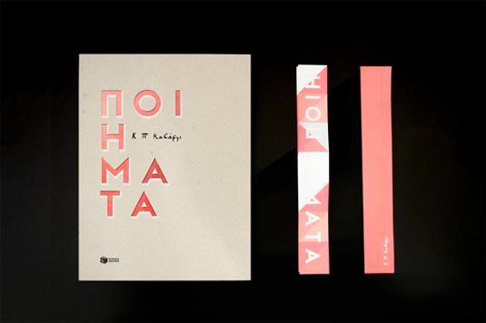
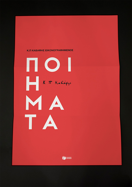
See more editorial design work on Thomas Kiourtsis' Behance.
Would you like us to see your latest project? Let us know in the comments box below!
Sign up to Creative Bloq's daily newsletter, which brings you the latest news and inspiration from the worlds of art, design and technology.
Sammy Maine was a founding member of the Creative Bloq team way back in the early 2010s, working as a Commissioning Editor. Her interests cover graphic design in music and film, illustration and animation. Since departing, Sammy has written for The Guardian, VICE, The Independent & Metro, and currently co-edits the quarterly music journal Gold Flake Paint.
