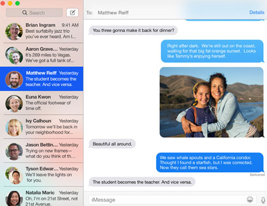
Is Helvetica the wrong choice for Mac OS?
Apple's caused controversy by introducing Helvetica Neue as the new system font for Macs. We look at both sides of the argument.
Apple's products are loved around the globe – but what about their font choices? There's been a wave of controversy surrounding Apple's recent decision to dump Lucida Grande as the system font in the forthcoming version of OS X, Yosemite. It's going to be replaced by Helvetica Neue, which is also the iOS system font.
Many feel this is a mistake that will adversely affect readability and usability for the 80 million-plus Mac users worldwide. Here, we'll hear arguments for and against Apple's font choice, starting with one of the leading opponents of the move, Thomas Phinney...
01. Case for the prosecution

Typography expert Thomas "my other car is a sans serif" Phinney lives in Portland, Oregon and is VP at FontLab. His blog Phinney on Fonts is packed full of geeky troubleshooting and info for font developers and users.
Article continues belowHelvetica has no business being a user interface and default text font at typical text sizes or smaller. It is bordering on criminal that Apple has used it for these purposes on iOS, and sad that they are doubling down on this error for the next Mac OS.
Why all the Helvetica hate? For use at larger sizes, Helvetica has a distinctive feel and can make a fine logo. The only problem in that regard its overuse, not any inherent unsuitability to the task. So you might wonder, why is it unsuited for user interface usage?
Muddy and confused
Legibility should be the paramount concern for a user interface typeface. At small sizes or under poor viewing conditions, certain characters are muddy or easily confused with others in Helvetica because of how they are drawn: 369 are too close to 8, C is too close to O, a and e tend to close up and be hard to make out.

These nearly-closed shapes in Helvetica are stupid bordering on criminal in a user interface typeface. There is a reason that most other typefaces specifically designed for user interfaces have used very open apertures, and that is because there is considerable evidence that tells us, other things being roughly equal, these shapes are more legible (see for example the research cited in Sofie Beier’s book on the subject).
Sign up to Creative Bloq's daily newsletter, which brings you the latest news and inspiration from the worlds of art, design and technology.
Apertures
If you look at typefaces custom-designed for UI usage, one of the things that 90 per cent of them have in common (with the notable exception of Google's Roboto) is that they have very open apertures for the letters I mention above.
Look at Lucida Grande (Apple), Droid Sans (Google), Fira Sans (Mozilla), Tahoma (Microsoft) or Segoe UI (also Microsoft). Although there are many design differences, one thing they all have in common is open apertures for higher legibility.
Of course, they also have many similarities with Helvetica. They are all relatively mono line sans-serif typefaces with a moderately high x-height. If Apple had picked a typeface that deviated from these other features, we might be ragging on it for different reasons. But they didn't.
Resolution
Some people have argued that Helvetica is bad at low resolutions, but is fine on retina screens. Although low resolution exacerbates the problems of Helvetica, it does not create them; the problems are inherent in the closed-aperture shapes.

Part of the problem is that when you are talking mobile UI, you are talking about variable and sometimes just abominable reading conditions.
The text is usually very small, half or two-thirds the visual-arc-size of body text on a big desktop screen. The text is often being read on an LCD under bright light outdoors. Sometimes in a moving or jittery vehicle. Sometimes at arm's length because the device is mounted on the dash of your car (either built-in or temporarily), or because you are glancing down at the thing in your lap while seated at dinner.
I personally currently hit the issue of the confusability of numbers in Helvetica under iOS pretty nearly every week – daily when traveling and using my iPhone for navigation.
I even jailbroke my iPhone for several months. Not for any other reason than to change the system UI font. I substituted Myriad, and yes, my problems went completely away for that time. Myriad isn’t even as good as any of the UI typefaces I mentioned above! It is just massively better than Helvetica for this purpose.
02. Case for the defence

Neil Robert Leonard is web and print designer, design writer and design educator living in Dorset, UK. He's worked for clients including BT, John Lewis, Sony, Shell and The Dept for Business, Innovation & Skills.
Apple's choice to use Helvetica Neue for its new OS has caused some controversy. Criticisms have ranged from issues of legibility, pure aesthetic values to criticising their lack of originality. Erik Spiekermann spoke recently (and very eloquently) about the issues surrounding the choice and many other designers have been more outspoken and in some cases venomous. However, how many everyday users have found Helvetica to be a bad choice?
The Apple Maps app can be widely regarded as a disaster because when it was launched people got lost when they used it. Helvetica Neue may not be the most original choice, but (largely) people can read the buttons and it doesn't look at odds with the overall presentation.
Was it the worst choice Apple could have made? Probably not. We all know there are far worse typefaces they could have picked. Imagine the reaction if they'd used Arial…

Is Helvetica overused? Perhaps, but why does that matter if it does the job? We know it is a workman like font, and this is probably why they selected it.
Was Helvetica Neue a bad choice, or do we just expect more from Apple? You can argue these points from many different angles, but I believe their intentions were right, and this is a positive move.
Styling and context
I'd argue that the typeface is not the problem, but it is the particular styling and context. Firstly, Apple designers are most likely a group of young hip people. They probably all have 20/20 vision, or a set of really good glasses. The design team might like to think they are representative of the user base, but they are not.
The original 'stylish' choice of Helvetica Neue Light was the wrong choice as so many customers (with a range of ages and sight ability) found it difficult to read, so Apple listened and swapped the weight for a regular version. The numbers of moans from the public at large have gone down as most can now read the text on screen. The way the text is presented could still be looked at a teeny bit more, but you can read it.
Company ethos
So, why was this a good/reasonable choice? My defence is the intent of Apple and how this fits in with their ethos, recent approach and overall style.
Not many people will argue that Apple make ugly products. In fact, the many devices Apple manufacture are incredibly stylish, carefully considered and well crafted – this has always been the key to their success. They pay great attention to detail, from the power button to the packaging, but recently have fared worse when it comes to interface design.

Over recent years the company have stripped back layers of unnecessary skeuomorphic fuss and have attempted to replace this with a cleaner aesthetic that is more akin to the simplicity of their products.
Elegant simplicity
It has become a mantra amongst many designers that Helvetica is a simple typeface that benefits from its lack of character. The letters do not stand up and sing, they just present information, therefore it can be placed into any context and it should work. There are documentaries that have celebrated the Helvetica's plainness and adaptability.
Apple have attempted to bring this perceived simplicity to their interfaces, and that can only be seen as a good move. They are trying to match the sleek, beautiful and efficient design of their products with a typeface. Ten or 20 years ago, Helvetica Neue would have been the unrivalled candidate.
Things have changed and Apple are a bit behind the times on this one. Designers are fed up with Helvetica for the same reason a teenager becomes angered when their favourite band gets a top 10 hit – because everyone else knows about them and they are no longer yours. It is now one of the few typefaces that Joe Public can name, but possibly not identify.
It's easy to pick holes in what is quite a solid typeface design. I'm pretty sure you could level similar criticism at a range of fonts, but Helvetica has dared become populist, therefore it deserves our outright disdain.
Style above substance
I'm not 100 per cent sold on the usage of Helvetica, but I'm not appalled by it either. Yes, we know the contrast of the letters is low, the tracking is a bit tight and perhaps they could go up a few point sizes, but it's not an ugly or offensive choice. What offends me more is the unquestioning following of the current 'flat design' trend. Had they tried to achieve something more original would we have noticed the font choice?
I do feel that this is an interim choice. Apple are still developing their new approach to interface design, and once this is more established they might have the courage to go with a bespoke design, or something with more character.
So, what are we really arguing about? When we listen back to Eric Spikerman's critique it's not so much about the choice of Helvetica, but more the approach of the designers and that they are putting style ahead of the end user.
His argument was that the design team (and designers generally) had not taken the time to read the text they were presenting and therefore do not consider legality as a first concern when surely should be the marker of a successful information design project. Perhaps if we were all more inclined to put effective communication above styles and trends we could be more forgiving?
Even Alan Harper in an episode of Two and a Half Men once singled out Helvetica for its style, and who can argue with that for high praise?
So what do you think? Has Apple made the right choice or not? Let us know your comments below!

The Creative Bloq team is made up of a group of art and design enthusiasts, and has changed and evolved since Creative Bloq began back in 2012. The current website team consists of eight full-time members of staff: Editor Georgia Coggan, Deputy Editor Rosie Hilder, Ecommerce Editor Beren Neale, Senior News Editor Daniel Piper, Editor, Digital Art and 3D Ian Dean, Tech Reviews Editor Erlingur Einarsson, Ecommerce Writer Beth Nicholls and Staff Writer Natalie Fear, as well as a roster of freelancers from around the world. The ImagineFX magazine team also pitch in, ensuring that content from leading digital art publication ImagineFX is represented on Creative Bloq.
