Inject great depth into flat colours
Neil Stevens explains how to give a simple vector image a touch of dynamism with shading and textures
Sign up to Creative Bloq's daily newsletter, which brings you the latest news and inspiration from the worlds of art, design and technology.
You are now subscribed
Your newsletter sign-up was successful
Want to add more newsletters?
08 Select the Eraser tool and give it a width of 700 pixels, a soft edge and 50% opacity. Now simply erase the outer edge of the keylines so that they appear to fade into the background. This gives the shape a slight 3D feel.
09 At this point, the circular graphic has a colour palette of greens and blues. You can change this to your own preferences by selecting the Circle Graphic layer and moving the Hue and Saturation sliders until you’re happy with the colour scheme. You could even rotate the Circle Graphic layer – I rotated mine so that the brighter green is central at the top.
10 Now add some subtle highlights on and around your circular graphic. Create a new layer and position it just above the Circle Graphic layer. Select a brush with a pixel width of 400, opacity of 70% and white colour, and simply brush around the centre of the circle in one circular motion. Next, change the blending mode to Soft Light to create a subtle shading effect.
11 Now give the circle more definition by adding highlights to the background of the picture too. Once again add a new layer above your Dark Blue Background layer, and simply reuse the same brush that you set up from the previous step to brush around the outside edge of the circle. Once you’ve finished it, change the blending mode to Soft Light – this gives the circle more definition.
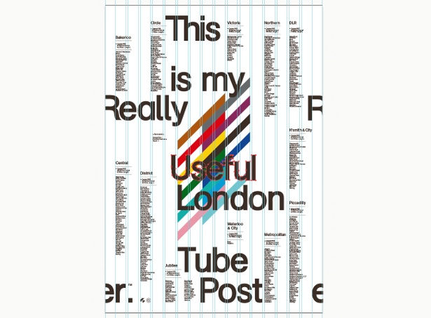
12 You can now add some extra elements around the circle if you wish. Go back to the original Illustrator graphic and select the fine white lines that surround the image. Simply copy and paste these into the Photoshop document and slightly decrease the opacity so that it matches the main image and isn’t too bright – about 20% should do it. Call this fine detail layer ‘Outer Lines’.
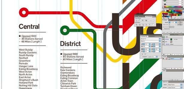
13 If you’re happy with how your file looks, you can now flatten the whole image. But remember to save the Photoshop file with all the final layers before it’s flattened, in case you want to edit it in the future.
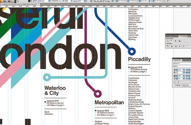
14 The image might look quite dark at this stage, so play around with Photoshop’s numerous filters to add the final touches. Adding a sepia tone can help: go to Image>Adjustments>Photo Filter, and choose Sepia. I set the density to 90 per cent.
Sign up to Creative Bloq's daily newsletter, which brings you the latest news and inspiration from the worlds of art, design and technology.
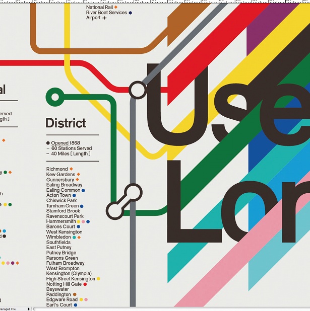
15 Lastly, if you play around with the Hue/Saturation panel options a little at this point you can lighten, re-colour and tint the final image until you’re happy with the overall results. Be careful, though – make sure you know when to stop.

The Creative Bloq team is made up of a group of art and design enthusiasts, and has changed and evolved since Creative Bloq began back in 2012. The current website team consists of eight full-time members of staff: Editor Georgia Coggan, Deputy Editor Rosie Hilder, Ecommerce Editor Beren Neale, Senior News Editor Daniel Piper, Editor, Digital Art and 3D Ian Dean, Tech Reviews Editor Erlingur Einarsson, Ecommerce Writer Beth Nicholls and Staff Writer Natalie Fear, as well as a roster of freelancers from around the world. The ImagineFX magazine team also pitch in, ensuring that content from leading digital art publication ImagineFX is represented on Creative Bloq.
