Intricate designs from found materials
Andrea Stark demonstrates how to transform everyday, throwaway objects into uniquely detailed decorative artworks
Sign up to Creative Bloq's daily newsletter, which brings you the latest news and inspiration from the worlds of art, design and technology.
You are now subscribed
Your newsletter sign-up was successful
Want to add more newsletters?
Pattern, repetition, symmetry and balance are all principles of design that are inherently attractive to the typical human eye.
My final-year university project explored the value of decoration, and during my research I wondered why we so often create decorative patterns out of things that we already consider to be beautiful (such as flowers, organic forms, geometric shapes and so on), when the same effect could be achieved by applying those same design principles to almost anything.
In this tutorial, I'll show you how you can use Photoshop to transform everyday materials by manipulating colour and using layers, masking and blending modes. The process is unpredictable - it requires a bit of exploration, and you'll never get the same result twice. I'll also show how to add a flexible process to your workflow so that you can go back and adjust your designs at any stage.
Article continues below 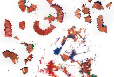
01 First, select a range of materials to use as your content; for this design I've chosen pencil shavings. Don't worry about your objects looking particularly spectacular to start off with - the point is to transform any ordinary objects. Scan them in at least 300dpi and open Photoshop. The higher the resolution at this stage the more detail you'll have to work with - I've scanned mine at 1800dpi.
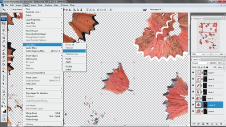
02 Divide up your objects and apply layer masks to hide the background (Layer>Layer Mask>Reveal Selection). The nature of your items will determine which selection technique you use. For larger shapes, I use a combination of the Polygonal Lasso tool and the Magnetic Lasso to trace around highcontrast edges. For the finer shavings, I use the Magic Wand tool to select the white background, then invert the selection and tweak it with Select>Refine Edge.
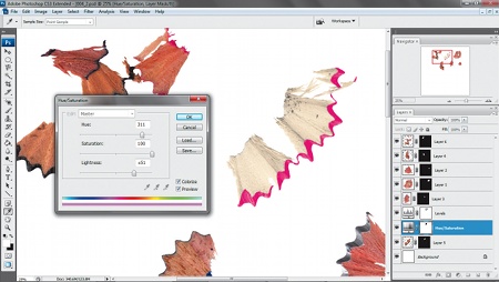
03 Create a new document with a plain background and drag your objects onto it. Now you can start manipulating the colours of your objects by using adjustment layers to get the effect you want (Layer>New Adjustment Layer). I've played with the Levels options and with the Hue/Saturation. Just like the layer masks, the adjustment layers won't change the original image, so the file remains flexible to enable you to go back and make changes further along in the process if you want to.
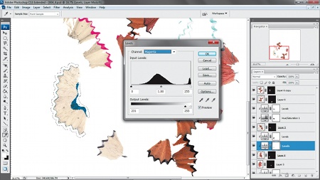
04 With an adjustment layer highlighted, select Layer>Create Clipping Mask so the adjustments will be applied only to the layer directly beneath it. I've also added layer masks to my adjustment layers to separate the coloured edge of the shavings from the rest of the wood, so that I can manipulate these sections independently. I've increased the saturation of the outer edges and changed their hue, while lightening and decreasing the saturation of the rest of each shaving.
Sign up to Creative Bloq's daily newsletter, which brings you the latest news and inspiration from the worlds of art, design and technology.
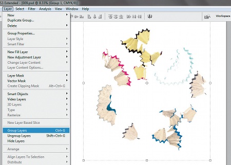
05 There's no need to go overboard with colours because you'll be duplicating these layers, which will add complexity and density as the colours overlap. It's best to group each layer with its adjustment layers to avoid confusion and to keep things tidy when you start duplicating. Once you're happy with your colour adjustments, arrange your objects randomly and group them together by selecting Layer>Group Layers.
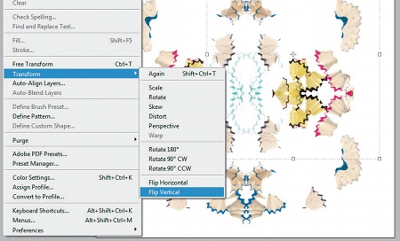
06 Set the group's blending mode to Multiply (from the drop-down menu in the Layers window) so that the layers look integrated as they overlap. Duplicate the group by choosing Layer>Duplicate Group, and then flip it horizontally by clicking Edit>Transform>Flip Horizontal. Hold Shift while dragging the new group across the document until you're happy with the overlap position. Duplicate both groups and flip them again, this time vertically. Hold Shift as you drag them upwards into position. Now group everything together as one.
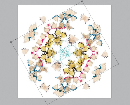
07 Duplicate your main group, then rotate this new one 60 degrees clockwiseb (Edit>Transform>Rotate). Duplicate it again and rotate this layer another 60 degrees. Make sure the blending modes of all groups are set to Multiply. At this stage, if you're happy with your composition you can merge all the layers into one (Layer>Merge Layers). But save a version of your file first, in case you need to go back and edit pieces later.
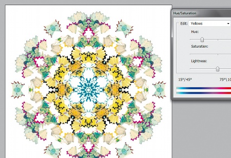
08 Although you've already edited the colours of your original objects, you might want to make some further adjustments now that you've combined all the layers. For this, create a new Hue/Saturation adjustment layer. Now select individual colour presets from the Edit drop-down menu in the Hue/Saturation dialog box so that you can go in and alter various colours individually.
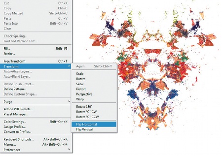
09 To add more detail and variation in the texture of the piece, I'm now going to incorporate some of the finer pencil shavings from my original scan. Begin creating a separate design, using a similar process to earlier. Duplicate your layer, reflect it horizontally and move it into position while holding Shift.
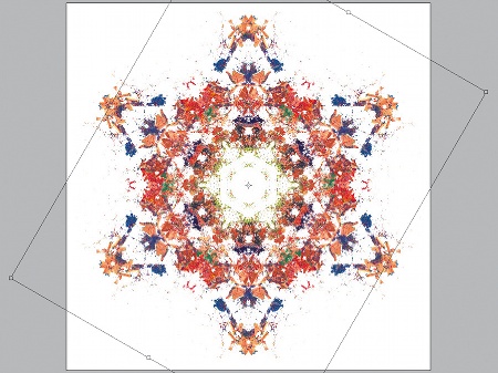
10 Continue with the same processes used in Steps 6 and 7 until you have a design in the same format as your first one. The colour scheme of your initial shape will determine which colours you choose for this second layer, so you don't need to worry about editing it until you've combined the two, when you'll see what works well.
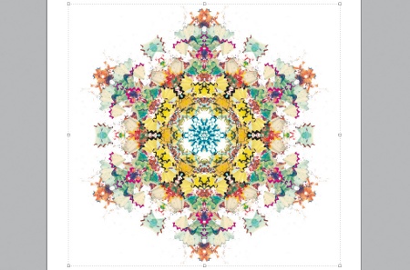
11 Drag the new design in behind the first layer of your original document and align it with your composition. The combination of your two designs will probably look a bit too complex so you'll need to edit it to co-ordinate the overall image. Add an adjustment layer and change the hues of your new layer so that they complement the original colour scheme.
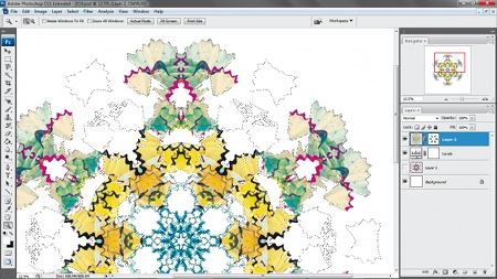
12 Add a layer mask to hide a few sections of your top layer so that more of the new pattern will be seen coming through from underneath. Work systematically around the whole composition so that it remains symmetrical.
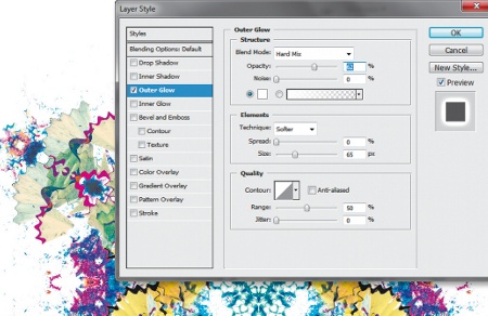
13 Add an outer glow to your top layer (Layer>Layer Style>Outer Glow). This will define the edge and stop it becoming lost among the details of your second layer. You should then play around with the Opacity, Spread and Size settings until you find the right balance for your glow. I've set the blending mode of my outer glow to Hard Mix so that it complements the sharp texture of the fine shavings beneath.
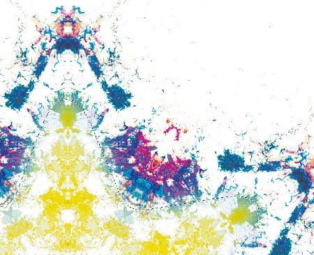
14 To tone down the second shape, add a Hue/Saturation adjustment layer, with a mask that reveals only its inside. In Hue/Saturation select Colorize, then match it to your first layer.
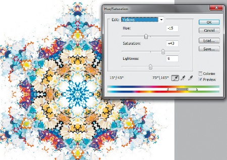
15 Finish it off by making some final small adjustments to bring your design together as a whole piece. Use Hue/Saturation to adjust the individual presets and simplify your colour scheme. Unify your design by choosing the same selection of colours for both layers.

The Creative Bloq team is made up of a group of art and design enthusiasts, and has changed and evolved since Creative Bloq began back in 2012. The current website team consists of eight full-time members of staff: Editor Georgia Coggan, Deputy Editor Rosie Hilder, Ecommerce Editor Beren Neale, Senior News Editor Daniel Piper, Editor, Digital Art and 3D Ian Dean, Tech Reviews Editor Erlingur Einarsson, Ecommerce Writer Beth Nicholls and Staff Writer Natalie Fear, as well as a roster of freelancers from around the world. The ImagineFX magazine team also pitch in, ensuring that content from leading digital art publication ImagineFX is represented on Creative Bloq.
