MuirMcNeil on making fonts out of systems
Don't fight the system, say the founders of ultra-modern-minded studio MuirMcNeil. Use it to design typefaces instead.
Sign up to Creative Bloq's daily newsletter, which brings you the latest news and inspiration from the worlds of art, design and technology.
You are now subscribed
Your newsletter sign-up was successful
Want to add more newsletters?
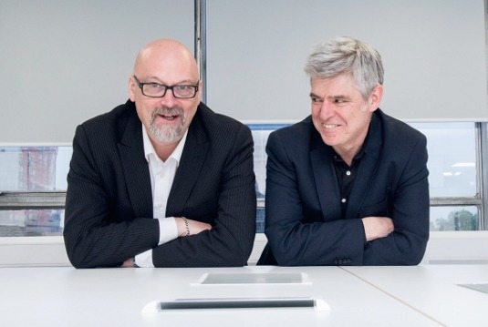
One thing that's striking about Paul McNeil and Hamish Muir is how precisely they use words. Not just on the gorgeous typographic posters they design, but when they speak. Every utterance seems to be measured and chosen with care and attention. It may also strike you that they create typefaces in a very similar manner to how they express themselves – with the utmost precision and a very clear set of parameters.
"Our aim is to explore parametric design for visual communications," says Paul McNeil. "What that means is we develop work that explores the dynamics of space and hierarchy in systematic ways. We establish rules or conditions to generate form that can be played out in a wide range of permutations or iterations."
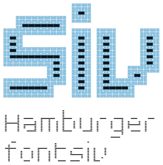
Their focus thus far has been typeface design, and the ThreeSix fonts provide the best example of this. The letters you see here weren't created with the elegance of hand-drawn cursive script in mind. Nor do they owe a debt to Roman inscriptions, or signs the designers might have seen in New York or San Francisco. To Muir and McNeil, the sorts of typefaces that hark back to these ideas are too derivative. Instead, the basis of ThreeSix is a set of rules delineating how the letters are formed, and how they can expand and contract when they're applied. A limited set of strokes in the form of dots and oblongs comprise the letters. These are set horizontally and vertically, with no diagonal options.
Article continues belowThere are six versions of the typeface, each using slightly different base forms in different configurations. There are also eight numbered weights for each font. And it's when you step up through the weights from thin to thick that the beauty of the system is revealed. Muir and McNeil have drawn a simple set of evenly spaced contour lines around each base shape within the letters. Go from the 018 weight to 036 and one contour line is filled in. Go from 018 to 144 and seven gradations are filled. As the weight increases, the lack of diagonal strokes is compensated for by an optical effect as the dots and oblongs that form the letters begin to overlap.
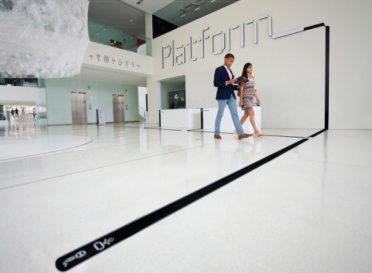
What begins as a skeletal, almost brutal-looking collection of dots and lines grows in arithmetic progression into wonderfully elegant letters in the middle weights. At their heaviest, characters in the ThreeSix fonts can look cushiony, and maybe even flabby – overweight, if you will. But that's what's so sublime about the system Muir and McNeil have developed. As a designer, you have a type system with the scope to express very different feelings or aesthetics simply by changing weight. It's not just a case of being bolder or louder or more legible at a distance.
Unexpected outcomes
The ThreeSix fonts seem to fulfil the studio's other main aim, as articulated by Hamish Muir: "We want to make things that surprise and delight us and hopefully others – these are usually typographic and are driven by 'conditional' design. We're interested in making components and then using 'systems' to build things with them. The things we build are type-based, language driven. The pleasure is in seeing unexpected outcomes – things that can't be imagined but can only be discovered."
Yes, ThreeSix is based on a system rather than on human handwriting, but what's surprising is how readable it is – both as display type and body text. As Paul McNeil explains, discovering a system that led to good legibility was part of the aim. "The design process was a strategic exploration seeking to achieve legibility by means of visual testing, so it was planned at the outset," he says. "However, each version of the typeface was the product of a dialogue made in response to the previous version as we discovered more by looking, evaluating and talking."
Sign up to Creative Bloq's daily newsletter, which brings you the latest news and inspiration from the worlds of art, design and technology.
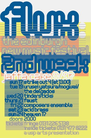
Because they experiment with grids within certain parameters, some commentators have lumped MuirMcNeil's work in with generative art and processing, where number-crunching software renders unexpected forms. While there is certainly a mathematical element to what they do – for instance, the contour lines and letter spacing are evenly proportioned – everything is measured and reviewed visually. It's never just a case of running algorithms over letterforms, letting controlled chaos ensue, and then curating the results.
The pair are based in London and, in addition to their design work, both lecture at the London College of Communication (LCC ). Although they founded the studio in 2010, they don't actually sit together in a studio space. Each works from his own work area. "Mine is a small room, lined with books from floor to ceiling and with two large desks," says McNeil. "Although I'm running out of shelf space, there's nothing I don't like about it. The only way it could be improved would be if it were transplanted to somewhere exotic like Berlin."
"I work at home and in my office at the LCC , and on trains or wherever I happen to be," adds Muir. "Paul and I meet frequently after teaching at the LCC and we work together via email, phone and Skype."
McNeil continues: "We would like to set up a shared studio space though, when the time is right."
Both the partners are well-established designers with more than 60 years' experience between them. McNeil worked for various agencies on corporate identity and visual communication projects for many years before setting up his own consultancy. Disillusioned with the commercial imperatives of graphic design, he started teaching at the LCC – where he is the course leader for MA Contemporary Typographic Media – and looked for ways to do more meaningful work. "The highlight of my earlier career was the decision to end it before it ended me. It wasn't easy to move on but I had begun to feel deeply uncomfortable with the constraints of commercial expectations," he says.
Swiss influence
Hamish Muir, meanwhile, was influenced by the likes of Kurt Hauert, Armin Hofmann, André Gürtler and Wolfgang Weingart when he studied for a year at the Basel School of Design. Back in the UK, he co-founded 8vo along with Mark Holt and Simon Johnston. The studio's influential design journal Octavo is something McNeil admired before they began working together.
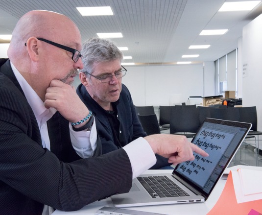
Some of Muir's favourite past work includes the posters and identity design 8vo did for the Flux Festival – an Edinburgh music event – back in 1997 and 98. You can certainly see traces of what MuirMcNeil do now in those old posters. Another highlight was being commissioned by the great Wim Crouwel to create posters for the Museum Boijmans Van Beuningen in Rotterdam.
Eventually, Muir and McNeil met at the LCC. "In 2008/9 we started collaborating on a research project I had started a little earlier, to generate a geometric type system that would be suitable for setting long texts in small sizes," says Muir. "But I had not progressed very far, as I soon found myself out of my depth and more than a bit lost. The collaboration with Paul was very rewarding and it was clear we shared a lot of common interests."
That project then became the basis for what is now ThreeSix, and after MuirMcNeil formed in 2010 they worked to release it. In 2011, ThreeSix was recognised with an International Society of Typographic Designers Premier award. It went on sale at FontFont in 2012 as FF ThreeSix.
New directions
They've also created several other typefaces, four of which were released on their own site earlier this year. Nine is a cleaner, less complex face that also grows in arithmetic proportion as you increase its weights. Interact is similar to ThreeSix, but without the curves it can have a harsh and jagged look. Intersect features letters formed from vertical bars that, ironically, do not intersect.
Panopticon is the most complex of the four new faces – here the letters are formed from the shadows that blocks might cast if light were hitting them from 45-degree angles. Abstract and unusual, it appears to be from a different galaxy because it uses such odd parameters. All four of the new releases have been accompanied by collectible posters that combine MuirMcNeil's extremely modern typography with some equally extreme colours.
"It's challenging working with Hamish – in the best possible ways," says McNeil. "He's the most accurate and fastidious designer I've ever known and he has impeccable taste. There are times when he will select the most terrifyingly impossible colour combinations, which always turn out to be, unerringly, exactly right."
For his part, Muir adds: "Paul is the more adept at turning our type designs into proper working fonts and to compensate for that I do most of the leg work on the website. I would say Paul is the more reflective and more analytical, and he knows a lot about the history of type and graphic design culture in general."
With the release of Panopticon, Nine, Intersect and Interact still fresh, it will be interesting to see how designers absorb them into their work. Meanwhile, MuirMcNeil is looking to the future, finding new systems to test. "We initiate most of our own projects, but are currently exploring new collaborations for commercial opportunities to apply our ideas," says McNeil.
Words: Garrick Webster Photography: Rob Monk
This article originally appeared in Computer Arts issue 229.

The Creative Bloq team is made up of a group of art and design enthusiasts, and has changed and evolved since Creative Bloq began back in 2012. The current website team consists of eight full-time members of staff: Editor Georgia Coggan, Deputy Editor Rosie Hilder, Ecommerce Editor Beren Neale, Senior News Editor Daniel Piper, Editor, Digital Art and 3D Ian Dean, Tech Reviews Editor Erlingur Einarsson, Ecommerce Writer Beth Nicholls and Staff Writer Natalie Fear, as well as a roster of freelancers from around the world. The ImagineFX magazine team also pitch in, ensuring that content from leading digital art publication ImagineFX is represented on Creative Bloq.
