New project from Mercy
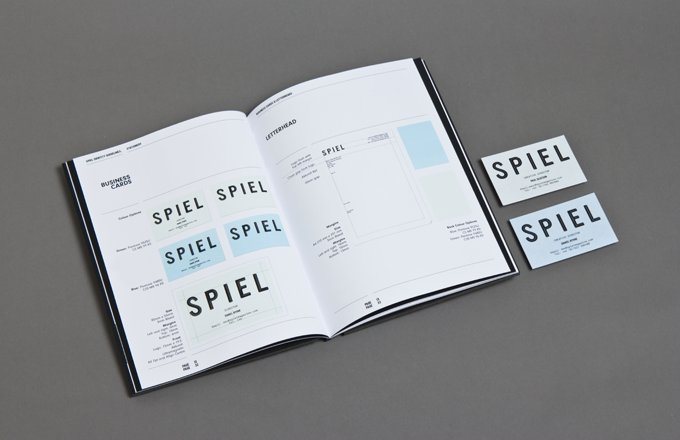
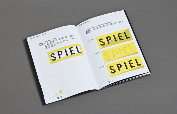
The guys at Mercy were approached by Spiel magazine to design the overall identity, guidelines and style sheets for the football and lifestyle publication, which will form the basis of Textbook’s ongoing design work.
Sign up to Creative Bloq's daily newsletter, which brings you the latest news and inspiration from the worlds of art, design and technology.
You are now subscribed
Your newsletter sign-up was successful
Want to add more newsletters?
We spoke to Matt at Mercy who gave us the spiel for Spiel...
"The Spiel lads came to us full of enthusiasm, and a great eye for magazine design. We collaborated with them, producing many ideas until we final created something we were all happy with. It was quite a enjoyable process. I'd been itching to design a magazine identity and layout for some time, so admittedly I went a bit over the top with the guidelines."
"With the layout we wanted to create a flexible grid and system that was strict enough to keep each issue consistent, but also adaptable. We achieved this in a number of ways: one was introducing an issue colour, a prominent colour defined by the cover illustration which followed into the layout through the colouring of the quote copy; the use of duo toned images, and as full bleed page backgrounds."
Article continues below 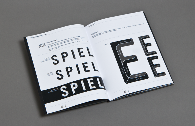
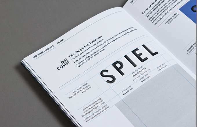
The mag size is B5, it uses a three-column grid, and its headline typeface is Ultramagnetic, underlined.
Textbook studio in Manchester now manage Spiel's monthly design and are doing a brilliant job. The first copy is now on the streets of Liverpool or available to buy from their website
You can check out more of Mercy's work and exhibitions here
Sign up to Creative Bloq's daily newsletter, which brings you the latest news and inspiration from the worlds of art, design and technology.

The Creative Bloq team is made up of a group of art and design enthusiasts, and has changed and evolved since Creative Bloq began back in 2012. The current website team consists of eight full-time members of staff: Editor Georgia Coggan, Deputy Editor Rosie Hilder, Ecommerce Editor Beren Neale, Senior News Editor Daniel Piper, Editor, Digital Art and 3D Ian Dean, Tech Reviews Editor Erlingur Einarsson, Ecommerce Writer Beth Nicholls and Staff Writer Natalie Fear, as well as a roster of freelancers from around the world. The ImagineFX magazine team also pitch in, ensuring that content from leading digital art publication ImagineFX is represented on Creative Bloq.
