How Non-Format designed the typography for the CAC Branding Annual
Behind the scenes of the typography for the Computer Arts Collection: Branding Annual 2014.
Expressive typography, stunning illustration and a bold graphic style that knows no boundaries – sound familiar? Non-Format is one of the world's most exciting design studios, known for its innovative creative direction and striking body of work.
Ever since British designer Jon Forss and Norwegian Kjell Ekhorn joined forces in 2000, the pair have been producing pioneering design and branding for clients ranging from commercial giants like Coca-Cola to independent record labels, publishing houses and more.
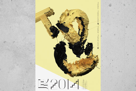
Earlier this year, Forss and Ekhorn designed a beautiful bespoke typeface and progressive set of patterns for the Computer Arts Collection: Branding Annual 2014. Here, they tell us what inspired them - and when to expect their next commercially available font...
Article continues belowThis extract is taken from the Computer Arts Collection: Branding Annual 2014. To read the full interview, you can buy the print issue here or the digital version here: UK and US.
What feel were you going for with your custom typeface for the Branding Annual?
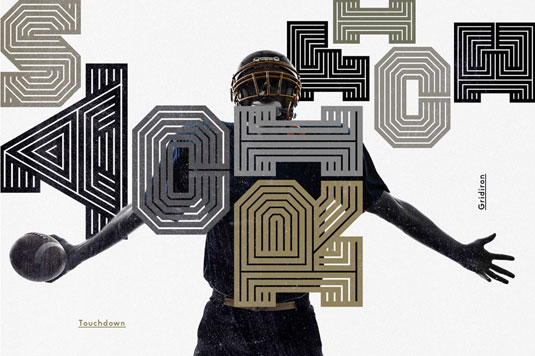
Kjell Ekhorn: We knew right away that we wanted to explore the idea of taking the type into a 3D space and play around with extreme light and dark, so we had to make sure that the custom typeface wasn't too quirky or illegible, otherwise we might not have been so free to experiment with the composition and textural treatments.
We started with quite a simple structure for the letter shapes, but it wasn't until we settled on the pattern distortion idea that we realised the characters would benefit from having rounded ends to the strokes.
After a few experiments, we decided that a kind of hybrid of rounded and flat terminals was the most visually pleasing solution. It's slightly schizophrenic. Rather like Non-Format.
Sign up to Creative Bloq's daily newsletter, which brings you the latest news and inspiration from the worlds of art, design and technology.
The section openers have an almost retro feel. What inspired you?
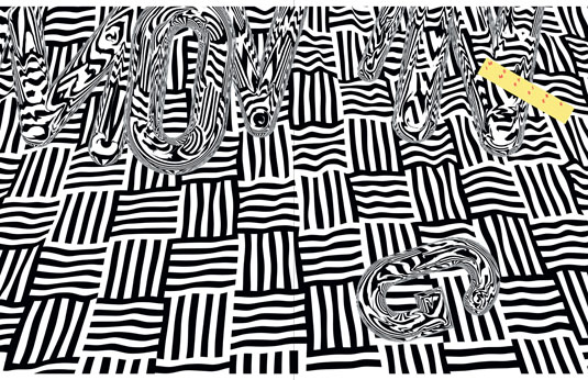
Jon Foross: We're interested - and fairly amused - to see the revival of the sort of textures and grid patterns that were used a lot in the late 70s and early 80s. They found their way into a lot of graphic design of the period, and the same can be said of today.
We thought that it might be possible to use some of these grids and patterns as a way of both disguising and defining our typeface and, subsequently, this magazine's section openers.
Once this was tested out and it seemed promising, we decided it would work best if we chose the operative word from each headline as the focus for this treatment. So, for example, we chose to use only the word 'systems' from 'Identity Systems'.
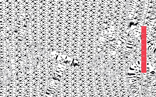
Of course, we needed to include all of the heading somewhere, so we introduced the coloured blocks that cut through the images and add a strong hit of colour to the otherwise uniformly black-and-white spreads.
There's clearly a retro feel to the pages, but the technology used to achieve these images is firmly rooted in this century.
What was the most challenging aspect of the Branding Annual 2014 brief?
KE: Working with new software [Cinema 4D] is always a daunting prospect. We're well aware that it can take upwards of 10,000 hours before you can really declare yourself proficient at something, but we're firm believers in the power of ignorance.
We've always worked on the assumption that quite a lot can be achieved with even a little knowledge. We test things out. Our only goal is to surprise each other and hope we're creating something that looks a little different from everything else.
Otto was your first commercially available font. Do you plan to release any more?
KE: One of the reasons why we haven't released many of our custom typefaces as fonts is because once they're out there in the world for anyone to use, they cease to be unique to our own designs.
That being said, we do have plans to release a few more of our typefaces as fonts very soon, starting with Gridiron, which we originally created for ESPN magazine. There are a few more in the pipeline.
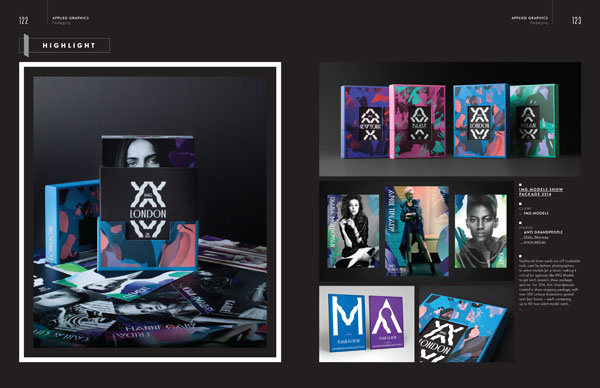
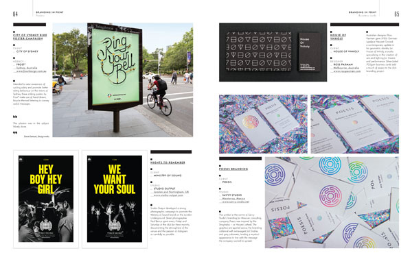
To read the rest of this interview, pick up your copy of the Computer Arts Collection Branding Annual: a stunning 130-page celebration of branding brilliance, meticulously curated by a panel of industry experts and your essential source of inspiration for 2014.



Julia is editor-in-chief, retail at Future Ltd, where she works in e-commerce across a number of consumer lifestyle brands. A former editor of design website Creative Bloq, she’s also worked on a variety of print titles, and was part of the team that launched consumer tech website TechRadar. She's been writing about art, design and technology for over 15 years.
