Typography and food combine in these delicious poster designs
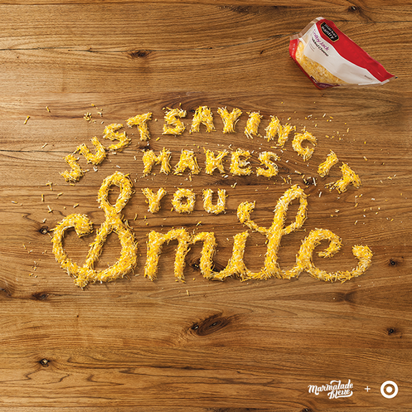
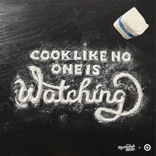
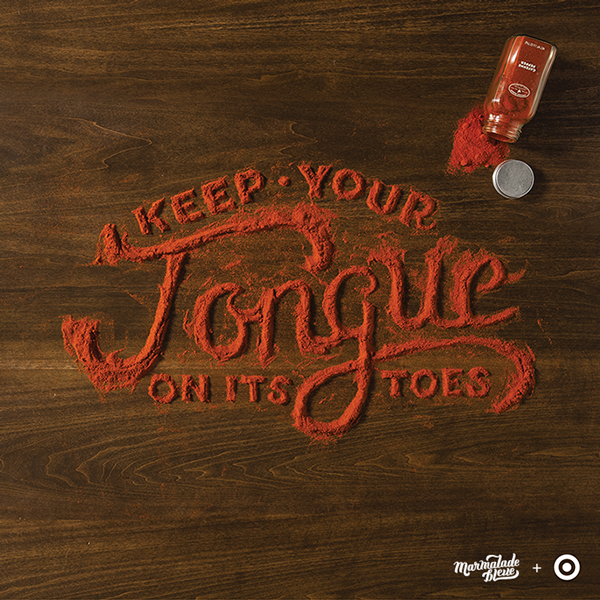
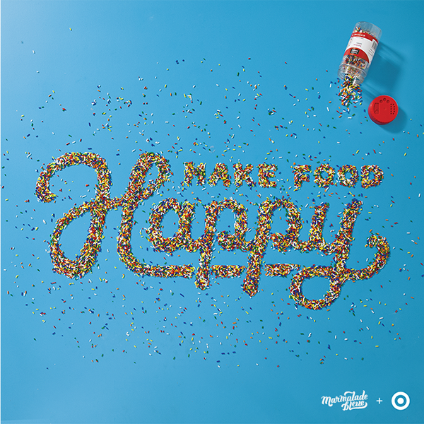
These brilliantly devised typography posters were created for an advertising campaign for Target.
Many of you will see typography as art and rightly so - the practise is one of the most creative in the entire design industry. Danielle Evans is one such typographer that crafts some of the most uplifting and inspiring works of type. Here, she puts her skills to use in an advertising campaign.
"Target devised a tasty 'Food for Thought' social media campaign to herald the opening of their Canadian stores," Evans begins. "To satisfy both Franco and Anglophone residents, phrases were devised bilingually in a myriad of food groups. The advertised Archer Farms product was subtly pictured in the top corner of each piece."
Each project rotated on Target's social media channels and proved hugely popular throughout the campaign. It's easy to see why, as Evans' effortless creativity is uniquely and brilliantly put across throughout the entire project.
Article continues below 

What do you make of these posters? Let us know in the comments box below!
Sign up to Creative Bloq's daily newsletter, which brings you the latest news and inspiration from the worlds of art, design and technology.

Sammy Maine was a founding member of the Creative Bloq team way back in the early 2010s, working as a Commissioning Editor. Her interests cover graphic design in music and film, illustration and animation. Since departing, Sammy has written for The Guardian, VICE, The Independent & Metro, and currently co-edits the quarterly music journal Gold Flake Paint.
