Typography as art: 15 beautiful examples
Typography isn't just for body copy! Take a look at these clever uses of lettering to create beautiful art.
Sign up to Creative Bloq's daily newsletter, which brings you the latest news and inspiration from the worlds of art, design and technology.
You are now subscribed
Your newsletter sign-up was successful
Want to add more newsletters?
Typography and font design isn't just for content - here, these artists and designers have taken the art of letters and turned them into their own works of art. Whether it's words making up a beautiful image or using typography as a beautiful piece of craftsmanship, it just goes to show that the art of font can go a long way.
01. Anamorphoses
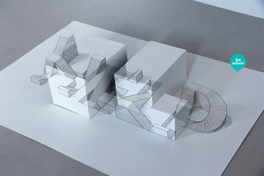
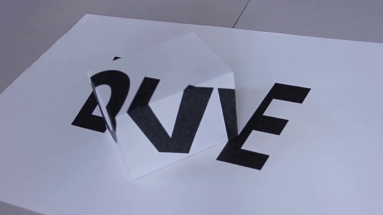
We've seen some incredible examples of 3D typography in our time here at Creative Bloq, however we've never seen it created using 2D methods. Anamorphoses is a series created by illustrator Lex Wilson that puts a new spin on perspective.
Using clever 2D illustrations to make the viewer think that they are in fact 3D is something that Wilson relishes. "When you look from the right vantage point it looks 2D (but it's a 2D image of 3D typography). Written down like that, it seems quite an odd thing to be doing." Odd or not, we absolutely adore this series and can't quite seem to tear our eyes away.
Article continues below02. Baron Fig
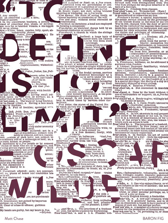
This is part of a motivational poster series from the folks at Baron Fig, which take quotes from some of the best thinkers of our time and portray them in a creative and inspiring way. This Oscar Wilde typographical poster is our favourite - and they certainly help to improve the reputation of the often-uninspiring world of motivational poster design.
03. Typography superheroes
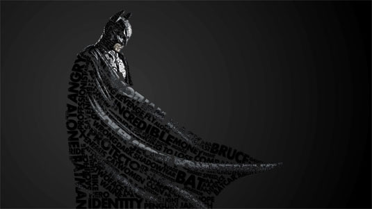
Moldova-based artist Midu1995 has illustrated various superheroes and villains with typography in spectacular. Reinventing the likes of Batman, Iron Man and Bane, he uses words that are often attributed to the character, arranging them until it forms the silhouette. Check out more of his work here.
04. Of Mice & Men
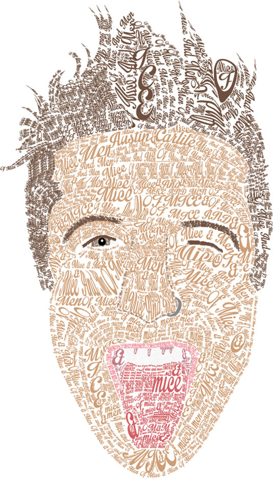
This typography art of musician and lead vocalist Austin Carlile of Of Mice & Men was created by Australian designer Jesse Wilds. The words that make up the face feature the band's name as well as the singer's - showcasing a wonderful way to use typography to produce a creative portrait.
05. You Talking To Me?
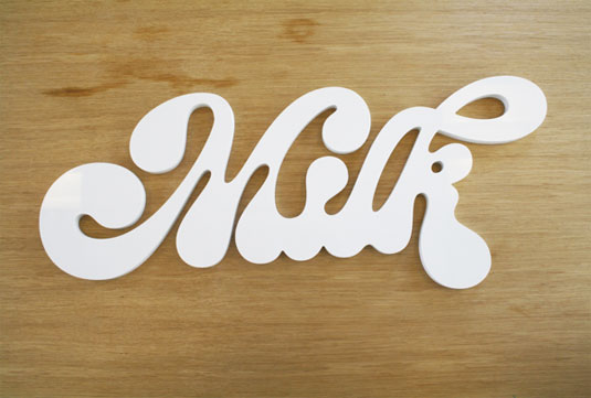
Paris-based company You Talking To Me? have tapped into the font-lovers market and produced an array of beautiful, customised typography sculptures.
Sign up to Creative Bloq's daily newsletter, which brings you the latest news and inspiration from the worlds of art, design and technology.

Taking inspiration from the choosen words, sculptures are often crafted to represent the object itself, including apples and bicycles. Sculptures are made of spruce, PVC or aluminium, with the different thematic collections completed with either rough finishes or gloss paint.
06. Daily dishonesty
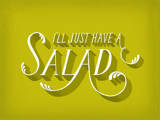
New York based graphic designer and illustrator Lauren Hom is the creator of this typography project 'Daily Dishonesty'. Her blog documents the lies we all tell ourselves on a regular basis. Not to be viewed by anyone who wants to face the truth about themselves!
07. Blind Spot
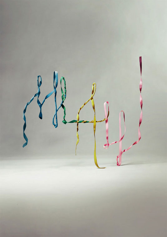
This monogram was created for Mary Louise Amala Williams by artist and illustrator Charles Williams. The piece is part of his Blind Spot collection - a project that sees him collaborate with photographers through a variety of artworks. This particular photo was the handiwork of Danny Allison.
08. Collision of words
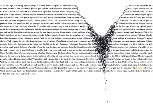
This artwork created by designer Lorianne Barclay is an in-depth study on the natural phenomena of collision shown through type. These words literally fall from the page - creating a beautiful example of typography as art. Although not exactly readible, it's certainly wonderful to look at!
09. Sagmeister & Walsh
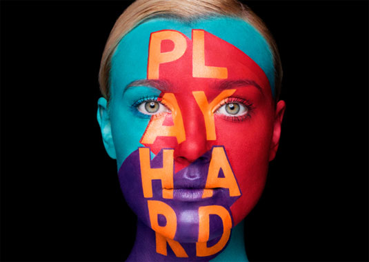
The Aizone Fall/Winter 2013 campaign was focused on bold colorful typography and positive and exuberant energy which reflected the dynamic, vibrant nature of the brand. Sagmeister & Walsh debuted the typography through colorful face painting with help from renowned body painter Anastasia Durasova.
10. Typography bird
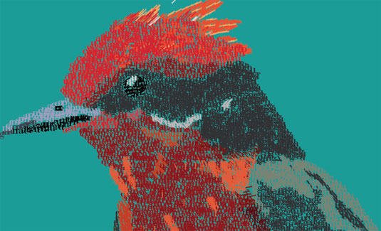
Putting a bit more colour into the art of typography, Venezuela based designer Pedro D Quintero M. created this bird entirely in with typography using Illustrator. We love the sizing of the type - ensuring a detailed execution and illustration of this beautiful bird.
11. The power of an idea
This gorgeous and highly creative site-specific typographic installation was produced for the ongoing 'Type Everything' Series by Camilo Rojas. His collaborative, idea-driven process strives for simplicity, playfulness and craftsmanship. Painting each letter individually, the final piece is as astonishing as you'd expect. This would certainly catch our eye!
12. Rock band alphabet

Based in Bristol, Jim Billy Wheeler wanted to combine his love of music and design into one crowd-pleasing project. He's certainly hit the nail on the head with these brilliant typeface designs for his favourite bands which include Grizzly Bear, Jack White, and Hot Chip.
13. Berlinische Galerie
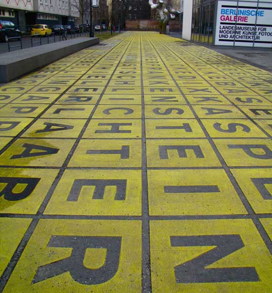
Photos from all over the globe have come in to Richard Garside's 'Font Sunday project on the theme 'wish you were here'. But so many have come from Berlin that typographically this is obviously the place to be. This picture tweeted by @ElenaKates shows yellow letters on the pavement outside the Berlinische Galerie.
14. I'm Comic Sans, Asshole
This animation features a short monologue from the perspective of the typeface comic sans."This was a class assignment for Paul Sahre's Typography class at SVA. Paul had asked us to write down our least favorite typeface and then make an animation about that typeface," creator Joe Hollier explains. *WARNING* Some strong language!
15. School of Visual Arts
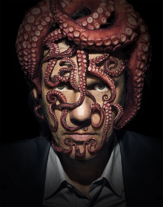
Sagmeister & Walsh have been responsible for some of the most exciting campaigns of recent years. So it comes as no surprise that the School of Visual Arts (SVA) in New York City asked them to take care of this semester's poster campaign. "We embraced the maxim by literally taking on the typography on our faces," they explain.
Have you seen an inspiring use of typography as art? Let us know in the comments box below!

Sammy Maine was a founding member of the Creative Bloq team way back in the early 2010s, working as a Commissioning Editor. Her interests cover graphic design in music and film, illustration and animation. Since departing, Sammy has written for The Guardian, VICE, The Independent & Metro, and currently co-edits the quarterly music journal Gold Flake Paint.
