Use actions to create organic imagery
Illustrator Cristian Boian demonstrates how to produce striking imagery using automated techniques and mathematical curves
Sign up to Creative Bloq's daily newsletter, which brings you the latest news and inspiration from the worlds of art, design and technology.
You are now subscribed
Your newsletter sign-up was successful
Want to add more newsletters?
In this tutorial we’ll look at how to generate organic-looking imagery using Photoshop actions and a variety of different tools in Photoshop.
From start to finish, I’ll guide you through my process of producing an abstract, balanced composition with a natural feel. We’ll use the Transform and Colour Adjustment options as well as a selection of filters to reproduce the piece used entitled ‘Attempts 6’, but, once mastered, these techniques can be used to add increased interest to both your personal and client work.
01 Set up a new Photoshop document with Resolution set to 300dpi (for print). Go to Edit>Fill and colour the background – I’ve chosen a mid-grey – then select Filter>Lens Blur, ensuring the Noise setting is low. Place the file main element.png from the disc, and duplicate it (Image>Duplicate). Next, create a new group of layers by clicking the ‘Create a new group’ folder icon at the bottom of the Layers dialog, and name it ‘Exercises’. Drag the duplicate file into this group.
02 Now, using the Elliptical Marquee tool, we’ll create a series of new items that are variations of our main element but have different thicknesses. We want some to be thin and elegant, and others a little wider. Play with the colours of the new elements (Image Adjustment> Colour Balance) but make sure that the main element layer has a duplicate before you cut it.
03 Using Edit>Free Transform on our new elements, we can compose interesting decorative forms. Use numerical values along the vertical (H) scale and horizontal (W) scale along the toolbar. I now create and work in a new group I name ‘Exercise T’.
04 Now we will create a new group called ‘simple line’. Using the Line tool at just 1 or 2 pixels thickness, go to Filter>Distort and select Twirl and Shear until you have smooth curves. Use some in your artwork as they are, and with others generate new elements.
05 In this step we’ll create and use some actions. Create an action that will enable you – starting from a single point on a single line – to create multiple lines in a trajectory on a flat surface. The ‘main element’ image we placed earlier was composed in this way – I started with a 1-pixel line, then generated more and grouped the results, before shrinking and rotating the group into my desired form. Be prepared: this takes time.
06 Now create some actions that will generate new and interesting elements, derived from the main element. In step two, the main element was duplicated. In this step we’ll create a new group in which to drag copies of newly generated elements, such as curves made from duplications of the main element, or new items created by repeatedly decreasing the size of the main element duplicate by 10%. Ensure that each action takes place in a root group, so that you can make a copy of the group and convert it to a Smart Object. The actions listed in the screengrab (full-size grabs are in the support files) are just my suggestions for guidance – have fun creating your own.
Sign up to Creative Bloq's daily newsletter, which brings you the latest news and inspiration from the worlds of art, design and technology.
07 Next we’ll create some digital flowers. After composing complex elements in the previous steps, this is a bit more relaxing as the forms are much simpler. The basic principle of these shapes is that they’re created by simply rotating the main element. You can experiment with the proportions and colours, preferably working from big to small so the smaller elements reflect and complement the colours of the larger ones.
08 I like to add bird-like shapes to my pieces – here I’ll add one that looks a little like a heart. To start, we need two curve shapes that are identical. Then flip one horizontally and place it alongside the symmetrical item. I decided to vertically skew one side, but you can further experiment with perspective and how much you skew your elements to create your own organic-looking shapes.

09 In this step it’ll become clear how important it is to manage your layers and groups throughout a project. Decide how you want your composition to look – the elements you’ve created should connect logically, giving the piece a natural, flowing feel. Use the Move tool to work and rework your composition. If you find there are too many layers to manage comfortably, begin with the larger elements. You can always return to the smaller elements and position them later.

10 Now take a look at what you’ve done so far, and decide what has worked and where there are inconsistencies. After positioning the elements, hone the colour of each so that they work with your composition as a whole. In images with a warm colour scheme, I use Colour Balance. You might want to make some elements slightly transparent by reducing the opacity of that layer, which in turn will create some new colours as items below show through.
11 Once you’ve confirmed the final positioning and colour of all your elements, lock them. Make sure you’re viewing your document at 100% so that you can see all the details, zooming in where you need to, then check the alignment of your elements closely. If there is any distortion on the elements, shift them very slightly.

12 If you have time, it can be very useful to save each of your new elements as individual PNGs (as this format won’t lose any detail). This will enable you to reuse the elements in new compositions. Another way to save the elements is to remove the image background then save the work in three or four different parts, which you could use again in future projects, either individually or together.
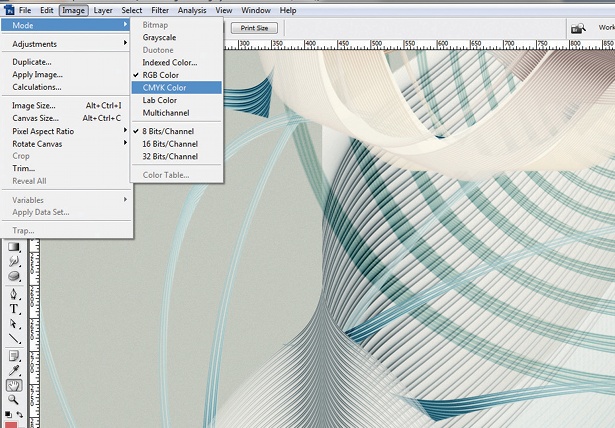
13 When you’ve finished saving all the various elements, flatten the layers. To print, we now want to move from RGB to CMYK (Mode>CMYK Colour).
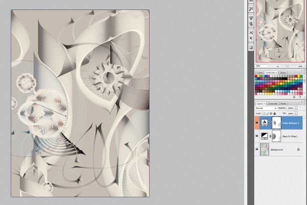
14 If you want to further tweak your colours, bear in mind that colour filters can negatively affect the quality of the work. Instead, we can work on a new Adjustment Layer (in RGB mode, with the image flattened). Go to Layer>New Adjustment Layer>Black & White and apply one Black & White Adjustment Layer to the image, then a Colour Balance Adjustment Layer. Use the Elliptical Marquee tool within all the shape elements to add and adjust your colours.
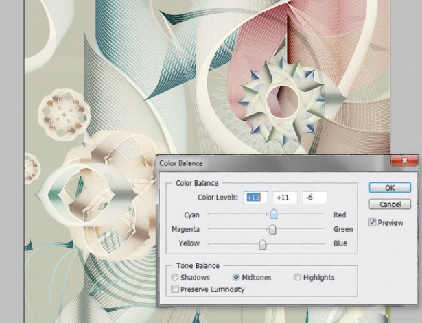
15 Note that if you’re working in CMYK, Black & White is not available – but you can choose Hue/Saturation>Colourize instead. And that’s it. Experiment with the different options and see what kind of imagery you can come with. Remember to always mange your layers, as this will benefit you in the long term.

The Creative Bloq team is made up of a group of art and design enthusiasts, and has changed and evolved since Creative Bloq began back in 2012. The current website team consists of eight full-time members of staff: Editor Georgia Coggan, Deputy Editor Rosie Hilder, Ecommerce Editor Beren Neale, Senior News Editor Daniel Piper, Editor, Digital Art and 3D Ian Dean, Tech Reviews Editor Erlingur Einarsson, Ecommerce Writer Beth Nicholls and Staff Writer Natalie Fear, as well as a roster of freelancers from around the world. The ImagineFX magazine team also pitch in, ensuring that content from leading digital art publication ImagineFX is represented on Creative Bloq.
