Slick design concept brings Wikipedia bang up to date
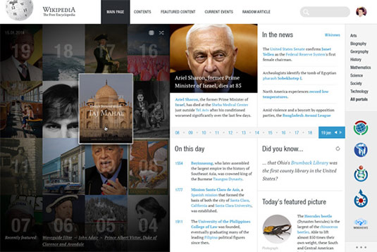
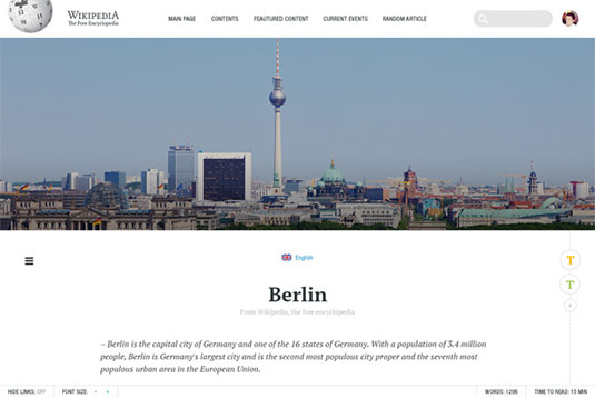
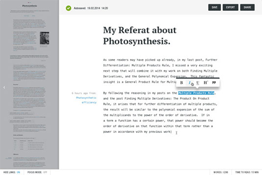
This vision of a new grid-based UI for Wikipedia has modernity and clarity at its heart.
Sign up to Creative Bloq's daily newsletter, which brings you the latest news and inspiration from the worlds of art, design and technology.
You are now subscribed
Your newsletter sign-up was successful
Want to add more newsletters?

When it comes to some of the most iconic applications in the world, it can be difficult to picture it with any other design. The likes of Apple's OS X, Gmail and Facebook have all had their fair share of concepts thrown at them but would any of them really work?
Here, German designer George Kvasnikov tackles one of the most popular sites and biggest web brands around. Wikipedia is known for its vast array of user-generated information and facts for just about anything, and less for beautiful or engaging design; Kvasnikov wanted to change that.
"Wikipedia is one of the most visited websites in the world," he explains. "It hasn't been changed or redefined during the last 10 years. This is my attempt to try to make Wikipedia more modern, readable, useful and personal"
Article continues below 


See more images from the concept on Behance.
What do you make of this design concept? Let us know in the comments box below!
Sign up to Creative Bloq's daily newsletter, which brings you the latest news and inspiration from the worlds of art, design and technology.

Sammy Maine was a founding member of the Creative Bloq team way back in the early 2010s, working as a Commissioning Editor. Her interests cover graphic design in music and film, illustration and animation. Since departing, Sammy has written for The Guardian, VICE, The Independent & Metro, and currently co-edits the quarterly music journal Gold Flake Paint.
