A new look for Facebook
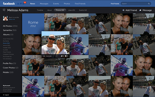
Swedish designer Fred Nerby created a systematic design concept for the social media platform. Will his ideas feature in Facebook's news feed redesign to be announced this week?
Just because you're the world's most famous social network, with a die-cast brand, a squillion members and a feature film, doesn't mean that you should sit on your laurels UX-wise. At least, that's what Brisbane, Australia-based Swede Fred Nerby believes about Facebook.

Art director and designer Nerby has outlined a completely new look and concept for Mark Zuckerberg's global giant on his Behance page, a new responsive desktop and iPad design that has elements of metro design language and a soupçon of the new MySpace, but it emphatically beats with Facebook's heart.

Nerby has designed new login, dashboard, profile and company profile screens, as well as creating an all-new news grid to replace Facebook's news feed and several other redesigned elements all with the purpose of modernising Facebook's tired interface.
Article continues belowMenlo Park will unveil a redesigned news feed on 7 March, with many people guessing whether that will be a mild refresh or a 'news grid' style redesign like Nerby's. We shall just have to wait and see...
Watch this! Fred Nerby's Facebook redesign concept:
Check out the full concept on Nerby's Behance page here.
Like this? Read these!
- Designers' New Year resolutions for 2013 - click here
- 5 free wallpapers for typography lovers
- 5 alternative Twitter clients for designers
What do you think of this new Facebook design concept? Tell us in our comments box below!
Sign up to Creative Bloq's daily newsletter, which brings you the latest news and inspiration from the worlds of art, design and technology.

The Creative Bloq team is made up of a group of art and design enthusiasts, and has changed and evolved since Creative Bloq began back in 2012. The current website team consists of eight full-time members of staff: Editor Georgia Coggan, Deputy Editor Rosie Hilder, Ecommerce Editor Beren Neale, Senior News Editor Daniel Piper, Editor, Digital Art and 3D Ian Dean, Tech Reviews Editor Erlingur Einarsson, Ecommerce Writer Beth Nicholls and Staff Writer Natalie Fear, as well as a roster of freelancers from around the world. The ImagineFX magazine team also pitch in, ensuring that content from leading digital art publication ImagineFX is represented on Creative Bloq.
