The best rebrands of the 1990s, as picked by the pros
The 1990s was a decade of technological revolution, cultural shifts and bold graphic design. As the world started to go digital, businesses raced to keep up, and many iconic brands seized the opportunity to reinvent themselves. These rebrands weren't just cosmetic changes, then; they were strategic moves built a solid basis for corporate survival into a new century.
In this article, we'll dive into the most successful and influential rebrands of the 1990s. These are the companies that didn't just introduce some of the decade's best logos, but redefined their entire identity for a new era, reimagining everything from colour palettes to sonic signifiers, ad campaigns to fundamental business strategies, and sometimes, even their name itself.
To compile this list, I've interviewed leading graphic designers, brand strategists and marketing experts about the '90s design scene. Their insights offer a unique perspective on what made these rebrands not just visually striking, but truly transformative. For further insights, don't miss our roundups of rebrands of the decades and logos by decade, or our ultimate best rebrands list.
01. KFC (1991)
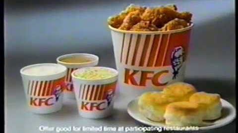
Founded in 1930 by American entrepreneur Colonel Saunders, Kentucky Fried Chicken built a reputation for serving up good, honest fast food that dripped in grease and had a super-high calorie count.
By the 1990s, though, the Western world was trying to lose weight and be more healthy, leave the company in somewhat of a dilemma. The solution was a groundbreaking redesign that led it officially changing its name from Kentucky Fried Chicken to KFC.
"Designed by Lippincott, the aim was to modernise the brand and appeal to ever-growing health-conscious consumers by downplaying the word 'fried', explains executive, mentor and speaker Vineta Bajaj.
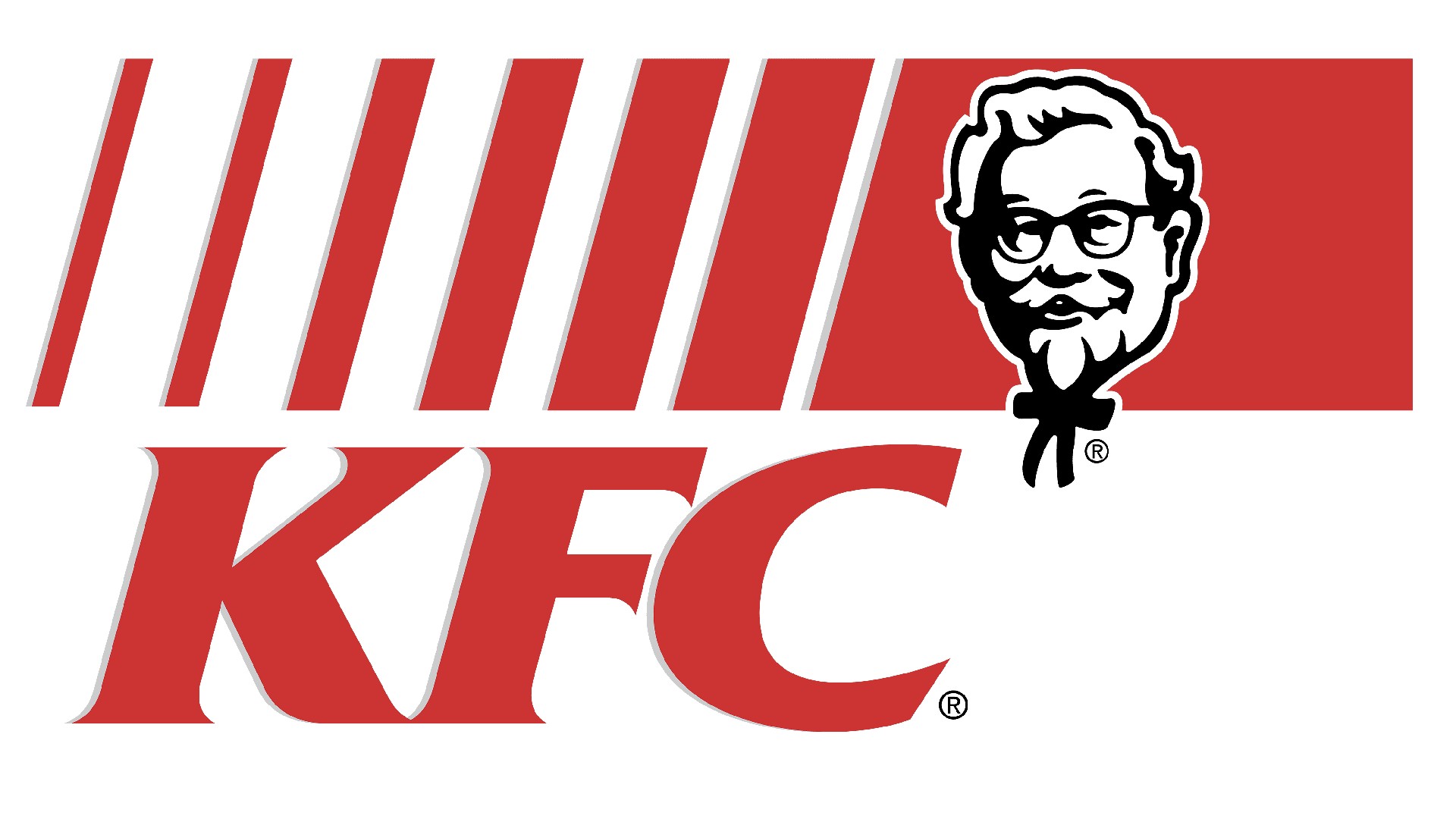
"During this period, KFC also updated its logo to a more contemporary design, featuring a simpler and more stylised version of Colonel Sanders. KFC headquarters decided to expand its menu around this time, too, including a wider variety of items beyond its traditional fried chicken, aiming to attract a broader customer base."
Sign up to Creative Bloq's daily newsletter, which brings you the latest news and inspiration from the worlds of art, design and technology.
To enter this new era, KFC launched new advertising campaigns focusing on the quality and taste of its food, as well as the convenience of its services, all behind this new logo and name. "Overall, these rebranding efforts worked as part of a broader strategy to revitalise the brand and maintain its relevance in the fast-food industry," she adds.
02. BBC2 (1991)
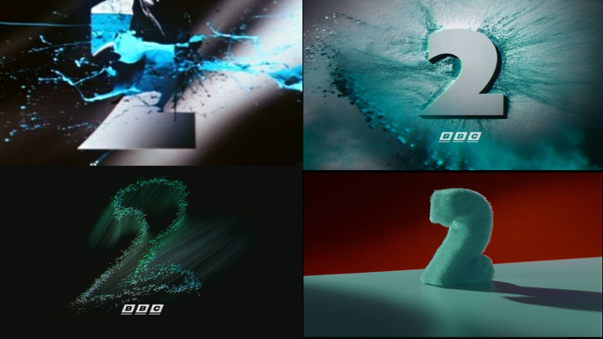
Back in the 1980s, the BBC's second TV channel was seen as stuffy, highbrow and well, a bit boring. After Alan Yentob became the new controller in 1987, he quickly recognised that its existing identity was negatively impacting its image and initiated a comprehensive review.
Market research conducted in 1990 revealed that many viewers perceived the current 'TWO' logo as stale and outdated. In response, branding expert Martin Lambie-Nairn was commissioned to reimagine the channel's identity.
Conceived by Martin Lambie-Nairn and Daniel Barber, the rebrand centred around a stylised, bladed numeral '2' with a verdian colour scheme. And it did a lot to transform public perception of BBC2... even though its programming remained consistent.
"The new design harnessed the iconic '2' shape to create a new look," recalls Abigail Baldwin, creative director at Buttercrumble. "For the station's idents, '2' would be shown in physical forms such as squishy balloons and animated zoetropes. It brought the channel to life. An instant antidote to the channel's reputation of being dull, the BBC retained this brand for over 25 years."
03. Starbucks (1992)
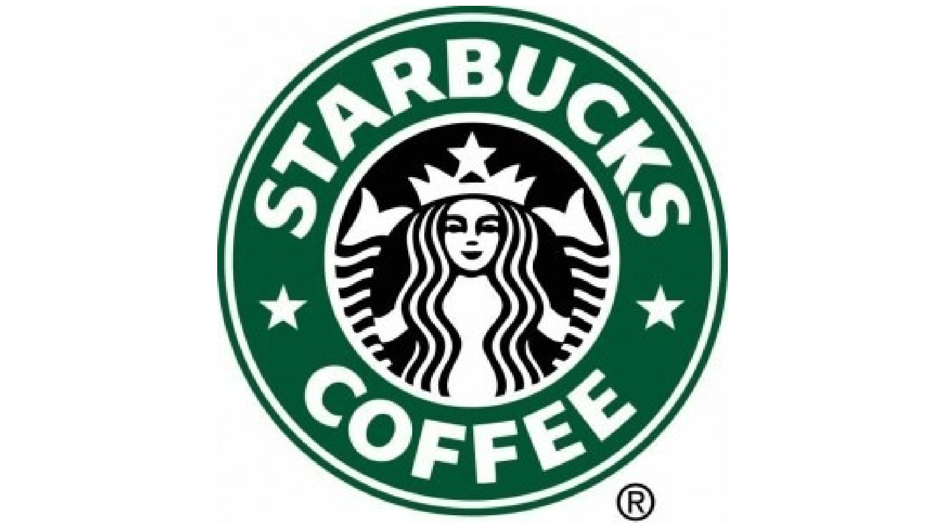
Opening its first store in 1971 in Seattle, by the start of the '90s Starbucks had a total of 84 stores. That figure would rise to 2,498 by the end of the decade, and part of that stellar success would be an iconic rebrand in 1992.
"Starbucks was already a successful company in the '80s, but by the time the '90s came rolling around it really came into its stride, owning the idea of ‘coffee’ in America," explains Matt Hauke, senior designer at Design by Structure.
"Coinciding with its first IPO, the brand introduced an updated version of the logo, zooming in on the already iconic mermaid, and making her clearer and more prominent."
This might have looked like a small update. "But when put in the context of Starbuck’s growing ubiquity on the streets of America, having a clearer and more recognisable logo would only benefit its pavement-presence," Matt adds. "With contrast and legibility improved, Starbucks was set to dominate the sector for decades to come."
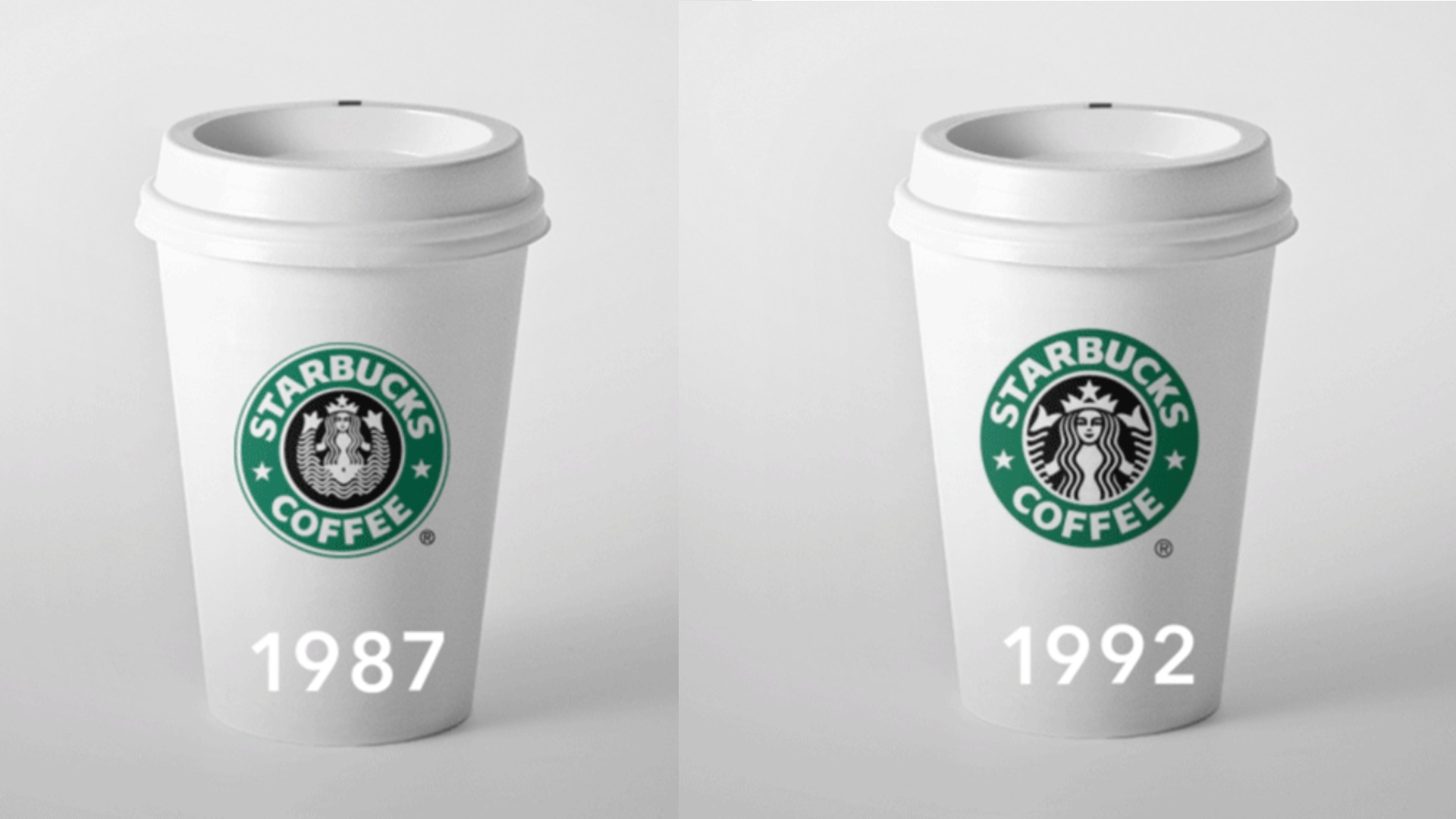
The new simplified design and its instantly recognisable brand colour Il Giornale green provided a solid visual basis for Starbucks as it continued to roll out new operations throughout the '90s, including its first drive-through location in 1994, its first store outside of the US (in Japan) in 1996, and its arrivals in grocery stores in 1998.
04. Champions League (1992)
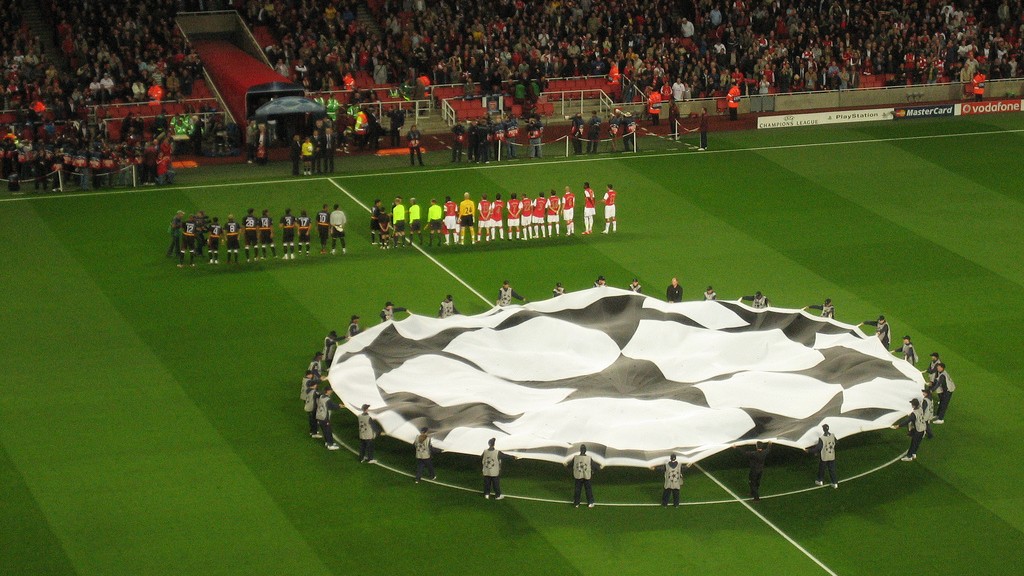
The football tournament now known as the UEFA Champions League was originally introduced in 1955 as the Coupe des Clubs Champions Européens (French for European Champion Clubs' Cup), and commonly known as the European Cup. The competition took on its current name in 1992, when it also took on a round-robin group stage.
The previous year, UEFA had asked its commercial partner, Television Event and Media Marketing (TEAM), to help brand the Champions League. This resulted in a new anthem, 'house colours' of black and white or silver, a logo, and the 'starball', which was created by Phil Clements of Design Bridge (now Design Bridge and Partners).
As TEAM wrote at the time, 'Irrespective of whether you are a spectator in Moscow or Milan, you will always see the same stadium dressing materials, the same opening ceremony featuring the 'starball' centre circle ceremony, and hear the same UEFA Champions League anthem.'
"The iconic starball, the evocative purple and ornate serif typography are unmistakable brand signifiers for the Champions League," enthuses Mike Goldsworthy, creative lead at ilk Agency. "It distinctively expresses these signifiers across each touchpoint of the brand.
"Ultimately, the brand hasn’t changed much since its introduction in 1992," he adds. "Despite minor tweaks, it’s maintained its relevance despite its longevity. The essence of the brand is so strong, that with only a quick glance I’m already hearing the iconic theme tune and the feeling I should really be spending my evening watching European football!"
05. Taco Bell (1992-4)
Taco Bell Corp is an American multinational chain of fast food restaurants founded in 1962 that serves a variety of Mexican-inspired foods, including tacos, burritos, quesadillas and nachos. The 1990s was a time of big change for the company, which went through two rebrands during the decade.
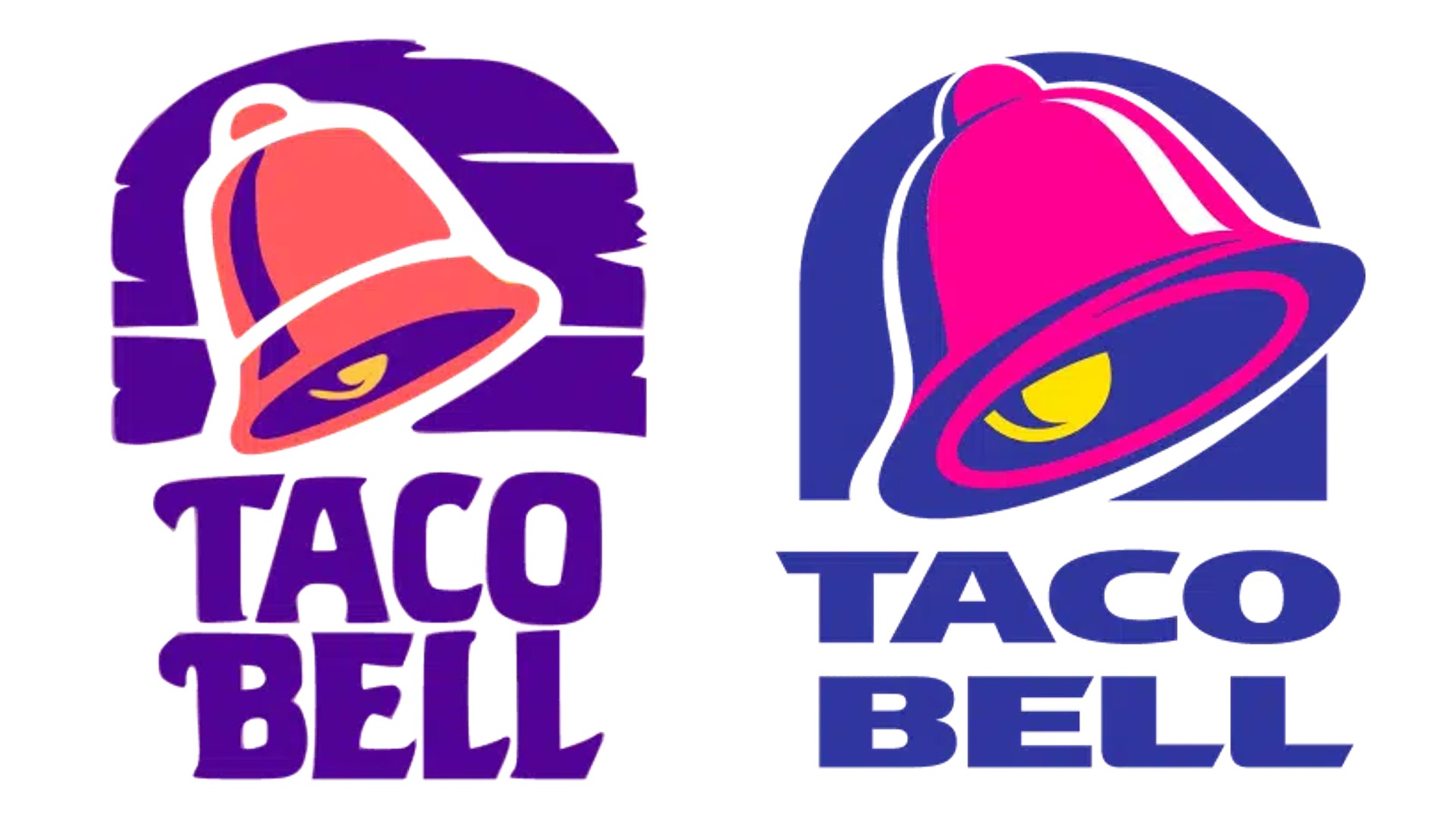
The first came in 1992, led by Lippincott alongside Taco Bell’s own design group. "The most significant change was the colour palette," says Sergiy Korelov, coach, trainer, mentor and educator at SKD.club. "While other fast-food chains used reds and yellows, Taco Bell opted for bright purple and hot pink. This choice reflected the '90s trend of vibrant jewel tones and neon hues, helping Taco Bell stand out on crowded highways and convey youthful energy and excitement.
"The logo was replaced with an updated design," he adds, "making the bell the central focus. It featured a hand-painted background and a restructured word mark with each word on a separate line."
Just two years later in 1994, the company released another redesign, again in collaboration with Lippincott. "This included refining its 1992 logo, which would become its longest-used design, lasting 22 years; probably the one you recognise best today," says Sergiy.
"The bell was updated to a brighter pink and placed against a solid purple arch, replacing the previous streaked background. The typeface was also modernised, shifting from elongated serifs to a bold, sans-serif font with diagonal cuts."
06. Oakley (1993)
The '90s saw a wave of brands making the transition from sports and outdoor wear to avant-garde fashion staples. "And perhaps the most dramatic of these was Oakley," says Oscar Warr, senior designer at Wolff Olins.
A sportswear brand based in California, Oakley had been launched by Jim Jannard out of his garage in 1975. Its first product was a new type of motorcycle grip. In 1980, Jannard they released a pair of goggles called the O-Frame, and in 1983, Oakley began selling ski goggles.
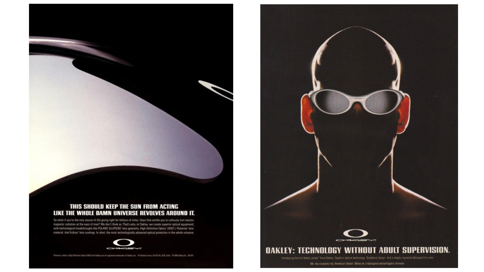
"The brand became known for a relentless pursuit of technological experimentation; rumour has it they were the first to bring a 3D-printed product to market," says Oscar. "In 1993 they applied this innovative spirit to their copywriting, art direction, and the creation of a bold new symbol. Here was an experimental brand for the new millennium that still feels future-facing today."
07. FedEx
Federal Express was founded in 1971 on an innovative business model developed by CEO Fred Smith. Instead of shipping packages directly between points, all packages were flown to a massive hub in Memphis, Tennessee, sorted overnight, and flown out the next day.
"The company's success was built on the insight that speed was becoming a key driver of business success," explains Allen Adamson, co-founder of Metaforce and previously chairman, North America for Landor. "As one ad proclaimed, 'When it absolutely, positively has to be there overnight.' This resonated with companies who understood that faster execution led to greater success."
But there was a problem. "The name Federal Express contradicted the company's core value of speed. 'Federal', associated with government, conveyed slowness and bureaucracy: the opposite of what the company stood for."
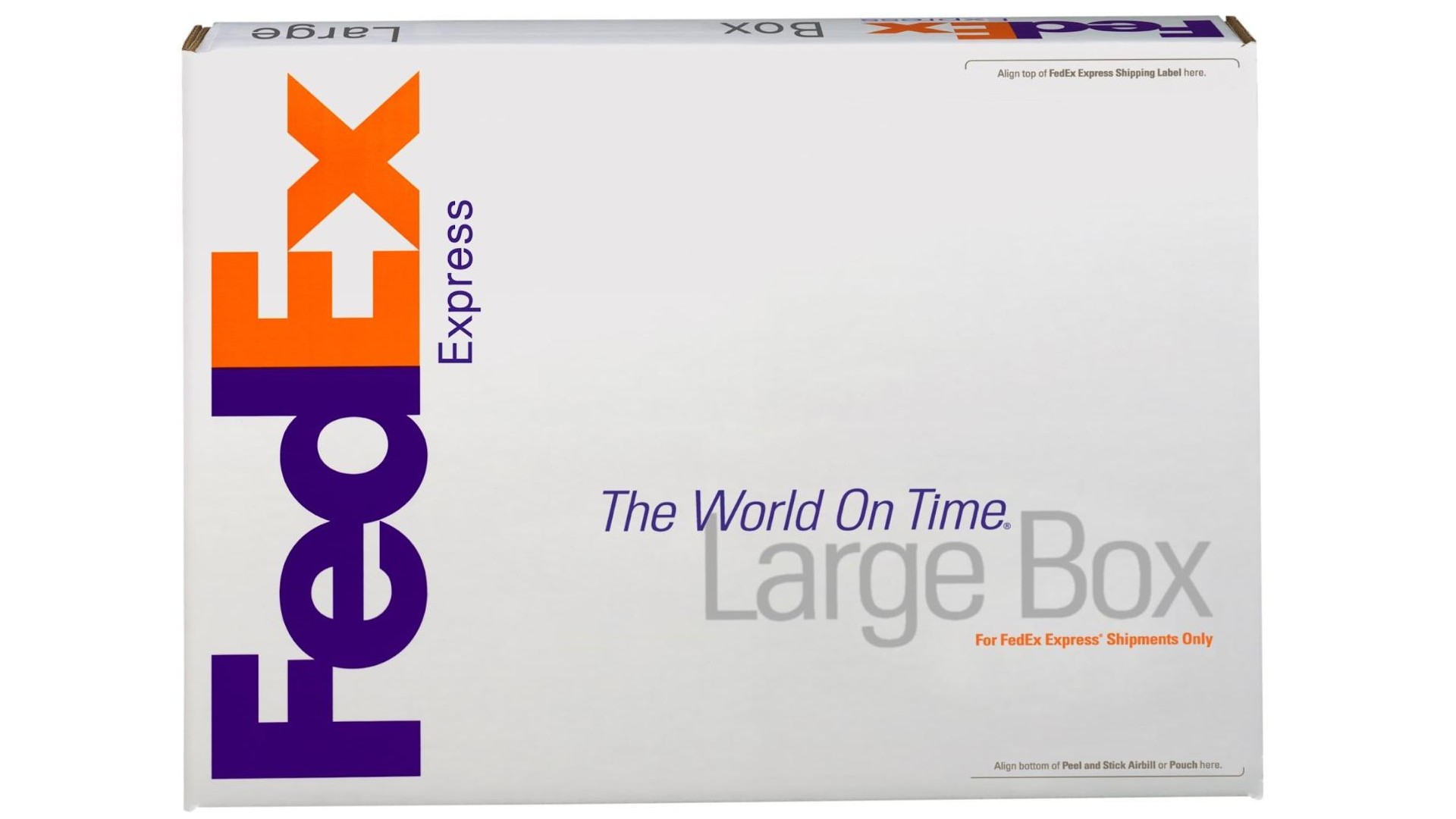
Consequently, in a strategic move, the company shortened its name to FedEx. "In 1994, Landor Associates created a breakthrough design that signalled efficiency, featuring a hidden arrow between the 'E' and 'x' in the logo, symbolising forward movement and precision," explains Allen.
The rebrand was completed with the new tagline 'The World On Time', succinctly defining the company's mission. "This comprehensive rebranding effort, from the 1990s, remains as fresh and effective today as it was when first introduced, perfectly aligning the brand's identity with its core value proposition of speed and reliability."
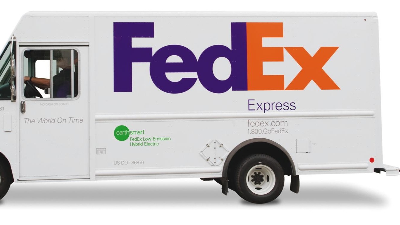
Carly Nyman, digital strategist at Brandwidth, notes that this 1994 logo has become iconic among branding experts, "for its bold design and flexibility, allowing colour variations for different business lines while maintaining a cohesive brand identity" (no wonder, then, that it's number one on our list of best logos of all time).
"With these simple design decisions, Landor Associates launched a major 1990s rebrand that met Smith’s challenge while giving a nod to the business’s offerings and market differentiators," she continues. "During this time, the company also launched fedex.com, the first transportation website where customers could track packages online, positioning the brand for success in the digital age."
08. Nintendo (1996-7)
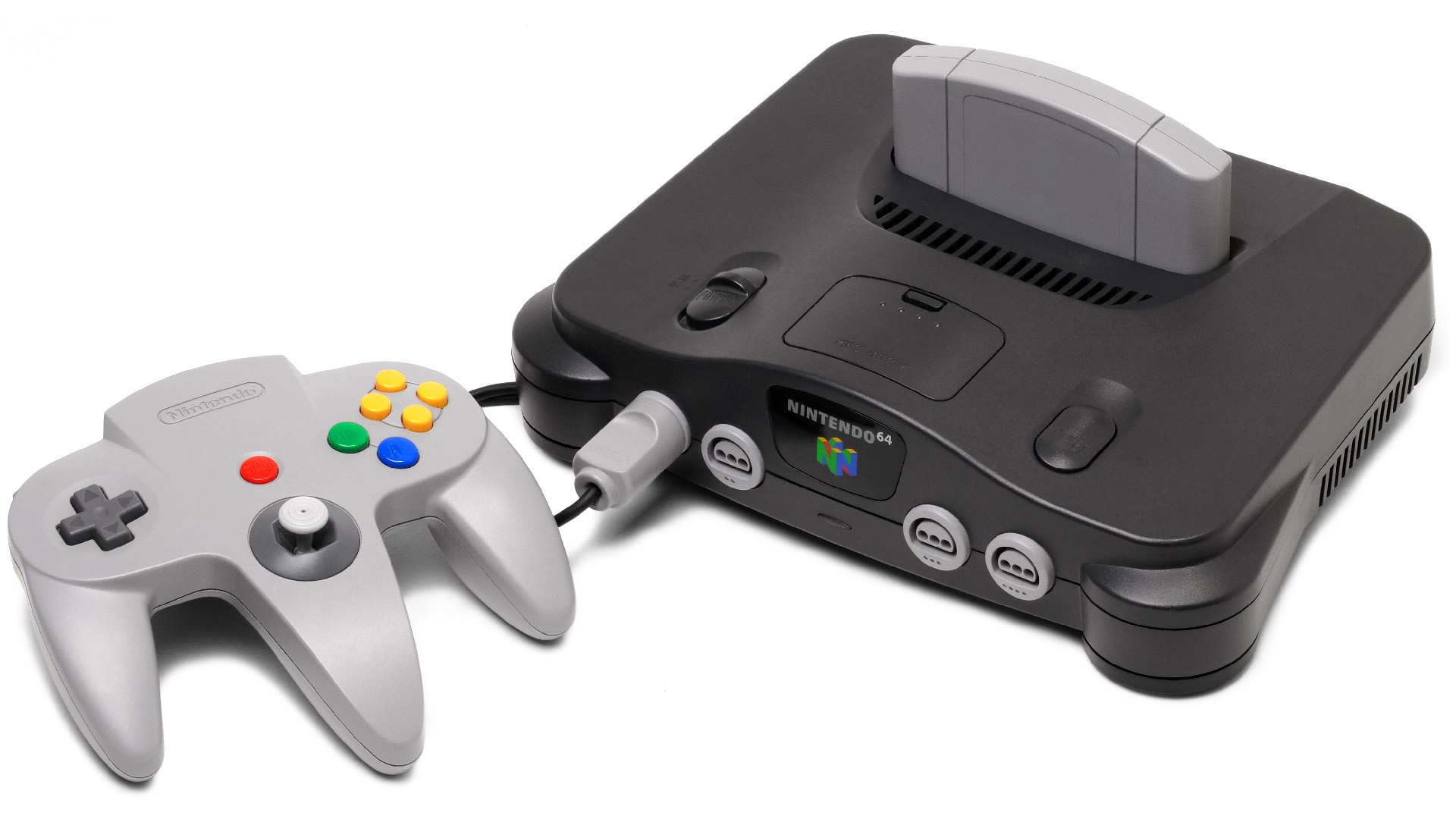
The 1990s were a pivotal time for the video games business, in which it evolved into a fully fledged industry; one which increasingly challenged traditional entertainments such as music, TV and movies for attention and dominance.
"When I think of the best rebrands from the 1990s, the Nintendo 64 immediately comes to mind," says Chris Tozer, partner and creative director at Fiasco Design. "It’s a great example of product and brand working together in harmony."
In 1996-7, Japanese video games company Nintendo moved from the two-player SNES to a four-player, social console, with an innovative controller that transformed the way people play digital games together.
"It is without doubt, one of the most recognised video game systems in history," says Chris. "Playstation might have had more success in following years, because of the data that could be stored on a CD, but arguably the N64 brand is more iconic and memorable than its Sony rival."
And Nintendo's new visual identity, he argues, perfectly encapsulated the idea of how games were moving from 2D into 3D. "The logo with its primary colour palette spoke to a vibrant new 3D world and the joystick controller allowed the freedom to explore this new dimension."
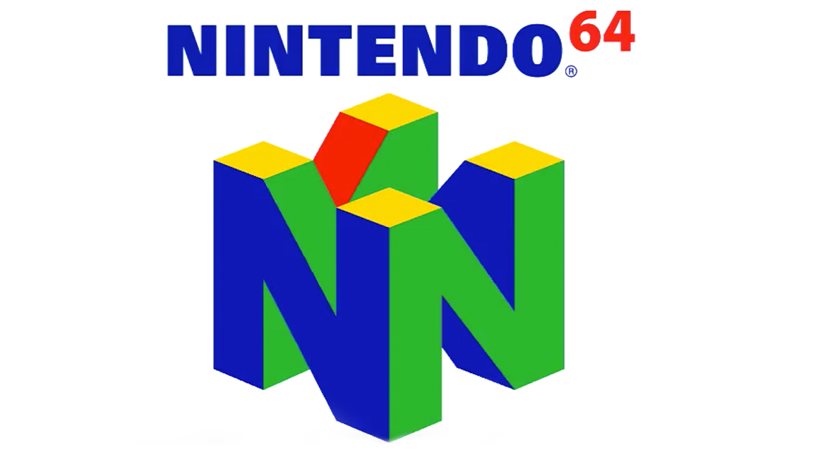
Interestingly, the Playstation 1 logo also used similar colours and a 3D style. "However, the N64's reference to a children's play block gave it universal appeal, exuding joy and fun," he explains.
Chris concedes that this is a subjective opinion, and hardcore gamers might argue the PS1's superiority for various reasons. "But, from a branding perspective, the N64 trumps it for me," he counters. "It has a stronger personality, a more memorable mark, and a clear connection between its visual identity, the product, and the flagship games released with it."
09. Apple (1997)
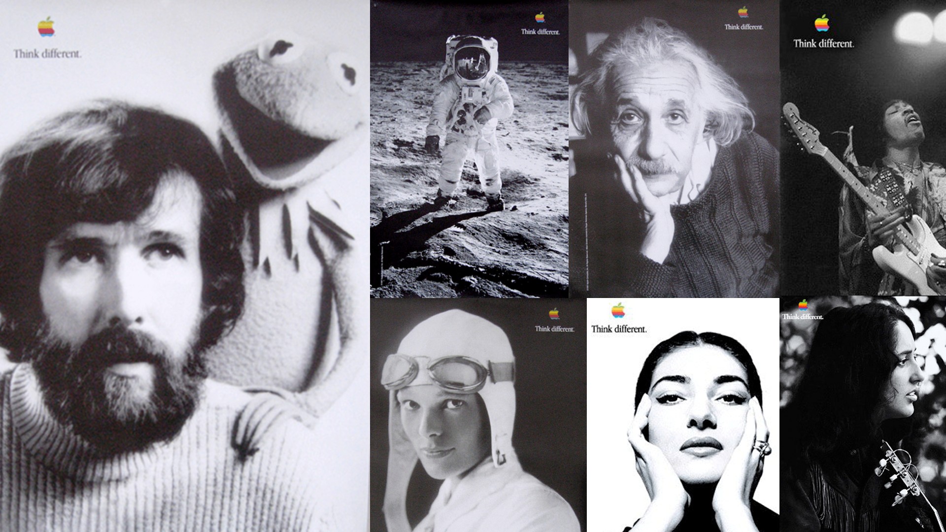
In 1997, Apple was very far from the all-conquering titan it is today. Allen sets the scene. "The company was on the brink of bankruptcy, and Apple's brand messaging was defensive, focusing on how its computers could 'fit' into the PC-dominated world and even run PC disks.
"The computer industry was fixated on 'speeds and feeds'; technical specifications and productivity features," he continues. "Every brand tried to outdo the others with claims of faster processors and enhanced capabilities."
In this year Steve Jobs returned to the company after an ignominious exit in 1985. "He took a radically different approach to rebranding Apple," explains Allen. "Instead of dwelling on ever-changing product features, he focused on those who used Apple products. The 'Think Different' campaign celebrated innovators and visionaries, targeting 'the crazy ones, the misfits, the rebels, the troublemakers... the ones who see things differently'."
As part of the rebrand, Jobs also shortened the company name from Apple Computers to simply Apple. This subtle change signaled a broader vision for the company beyond just computers, paving the way for future innovations like the iPod and iPhone.
"The rainbow apple logo was replaced with a sleek, monochrome design. This new logo embodied a modern, clean, and precise aesthetic reflected in every consumer interaction with the brand. From product design to packaging and retail experiences, Apple's new visual identity conveyed sophistication and innovation. When the iMacs were introduced in August 1998, it was the first Macintosh ever without the rainbow-coloured Apple logo."
It's worth noting that Jobs did not come up with all of this himself. For the ad campaign, for example, he invited new pitches from a number of agencies. He selected TBWA\Chiat\Day, replacing BBDO.
Lee Clow presented the 'Think Different' slogan and the concept of featuring artists and creative professionals. Jobs was, at the same time, heavily involved in the campaign's development. The entire campaign was created on Macs in just 17 days.
"This changed Apple's image from a struggling tech company to a trailblazer in innovation and creativity," notes Riley Gardiner, founder at No Strings Public Relations. "This campaign captured Apple's ethos and resonated emotionally with consumers, reshaping the brand's identity. This, plus the rebranding of Apple to Apple Inc and a dramatic update to the logo, gave the company a sleek, contemporary appearance, enhancing its modernity for the growing digital age."
10. Opal Fruits (1998)
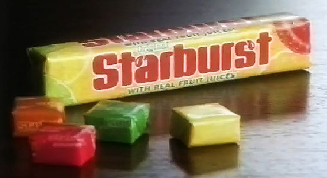
Talk to people in the UK of a certain age and they may still be angry about this. Anyone who was a child before the 1990s will remember loving a sweet called Opal Fruits, and may still call it as such. But in 1998, their manufacturer Mars Inc, changed their name to Starburst; a move that upset Brits as much as when Marathon bars became Snickers bars in 1990.
"The change did create some unhappy fans," notes Abigail. "However, it ultimately helped marketing efforts by curating a uniform appearance across the globe. Throughout, Starburst stayed true to its iconic yellow and red packaging."
Despite the vitriol from some, it clearly worked as the sweets are still on sale and popular today. Indeed, the company has even had the chance to get the best of both worlds, occasionally reintroducing the Opal Fruits name for limited periods as part of nostalgia-based marketing campaigns.
11. Burberry (1999)
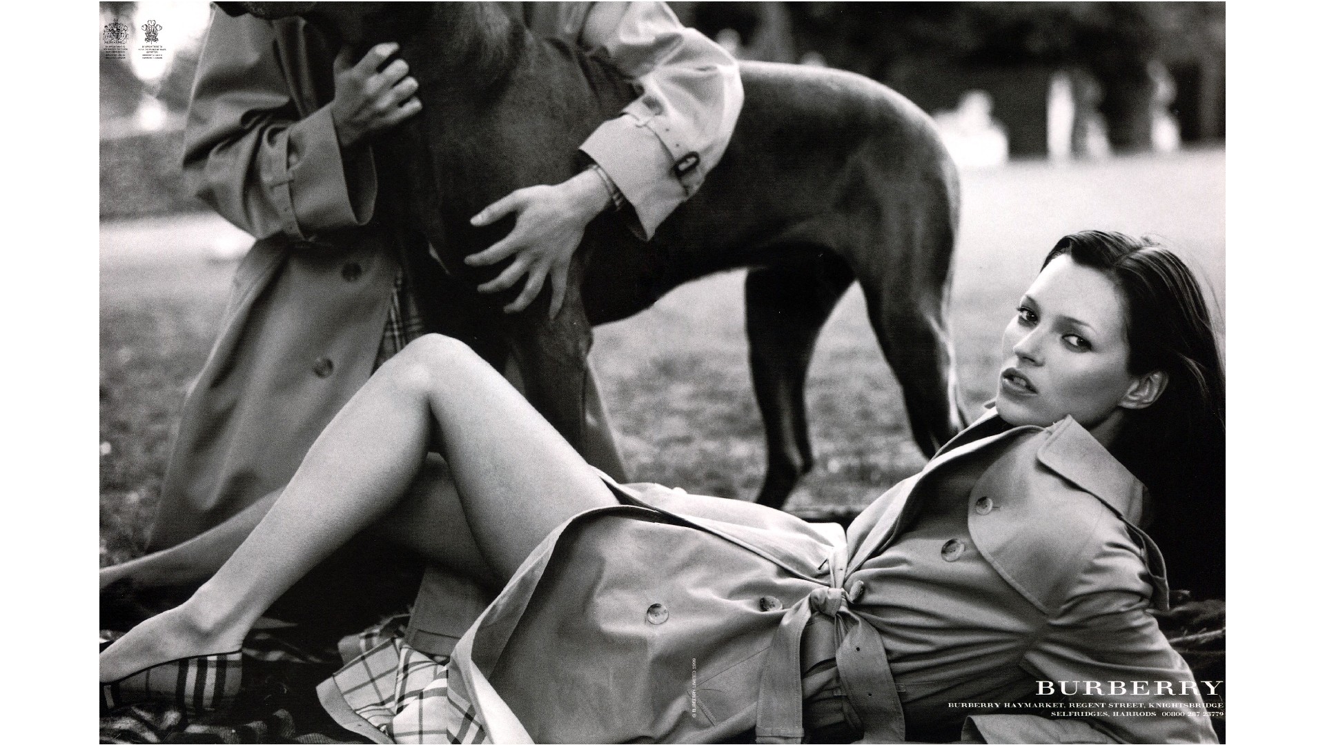
Born in 1856, luxury British fashion brand Burberry's was well known throughout the 20th century for its trench coats, leather accessories and footwear. However, by the end of the 90s it was increasingly perceived as being outdated, and was sorely in need of modernisation. Thus it embarked on a major rebrand led by creative director Christopher Bailey.
"By modernising its iconic trench coats and check patterns, Burberry not only captured a younger audience but also became a symbol of 90s cool," explains Sinita Khela, designer at Wonder. "This cultural reset fused timeless British elegance with contemporary appeal, setting trends that permeated pop culture.
"Through innovative marketing and celebrity-driven campaigns, Burberry not only revitalised its image but also paved the way for digital engagement in fashion, making its rebrand a landmark moment in both style evolution and cultural influence."
The logo also got a subtle but impactful update, courtesy of art director Fabien Baron. "Dropping the 's' of Burberry’s and switching the name to a more sleek 'Burberry London', helped to project a bold and modern new image," notes Riley. "This version of the logo lasted until 2018, when another rebranding took place."
This all came at the perfect time, nicely dovetailing with the return of Labour to government in 1997, recalls Tim Hyland, creative strategy director at Whalar. "Who better than Burberry represented shaking free the shackles of conservatism and embracing the hope and glory of what Britpop had promised?" he says. "A rebrand reflective of the time."
And this rebrand wasn't just surface-deep, but a reinvention of the brand and its clothing from top to bottom. "Designers Roberto Menichetti and Christopher Bailey reimagined the classic trench coat, splashing the iconic check pattern on everything from scarves to skirts. Rose Marie Bravo revamped stores into sleek, inviting spaces and launched chic ad campaigns featuring fashion icons like Kate Moss and the androgynous, iconic Stella Tennant."
"As a result, by the early 2000s, Burberry was back in vogue, with stars like Lily Allen keeping it in the limelight. This rebrand didn't just revive Burberry; it reinvented it, blending British heritage with cutting-edge style."
For more nostalgic rebrands, see our best rebrands of the decade series.

Tom May is an award-winning journalist specialising in art, design, photography and technology. He is the author of the books The 50 Greatest Designers (Arcturus) and Great TED Talks: Creativity (Pavilion). Tom was previously editor of Professional Photography magazine, associate editor at Creative Bloq, and deputy editor at net magazine.

