
Typography in music videos often takes centre stage, driving the aesthetic, tone, and storytelling. By looking at the typography choices in some of the most artistic music videos, we can learn valuable lessons about how text can complement, enhance, and even redefine the interpretations of production styles.
With that in mind, I’ve put together a list of 12 typography lessons drawn from some of the most influential and creative music videos. These examples illustrate how type can make a statement, push boundaries, and create unforgettable design moments. For more typography inspiration, take a look at the best typography of the decade, and for tips on creating your own type, read our typography tutorials.
01. Telephone, Lady Gaga, Beyonce: Be excessive
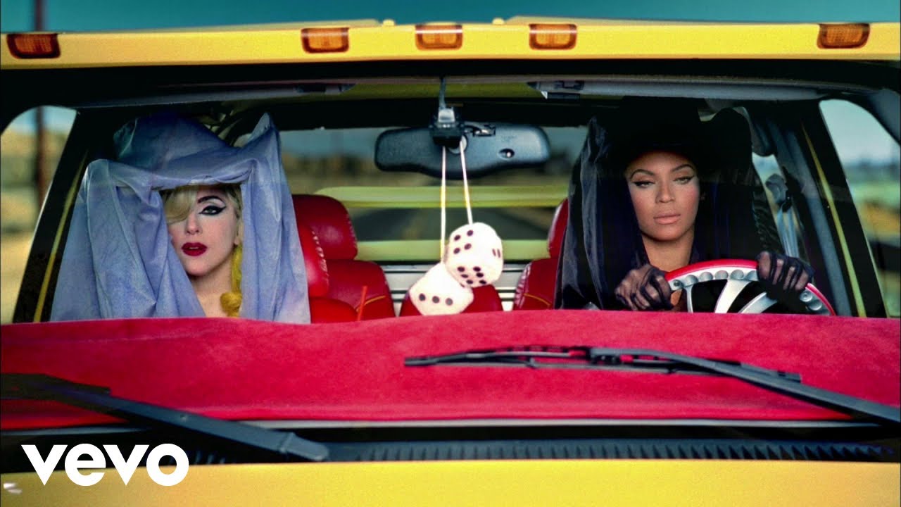
How could a music video enthusiast miss an opportunity to mention such a classic? The typography is just one of the many reasons Telephone went down in music video history – with text almost as crucial a component as Lady Gaga and Beyonce themselves. Decorative titles; subtitles; a reference to Kill Bill’s iconic car; a faux news report; a fake poison recipe and onomatopoeia labelling sound effects like a real-life cartoon – these all make up just some of the key components of typography that support the storyline of Telephone.
The elements vary in font usage and colour choices; but their excessive nature and controversial colour combinations bind all the typography together into one clear vision. This video uses purple and yellow together and made it beautiful – and that teaches all of us to not be held back by traditional design restrictions or colour theory. If you have a clear artistic vision, be as excessive as you like with it and your style will shine.
02. Stronger, Kanye West: Shock and awe!
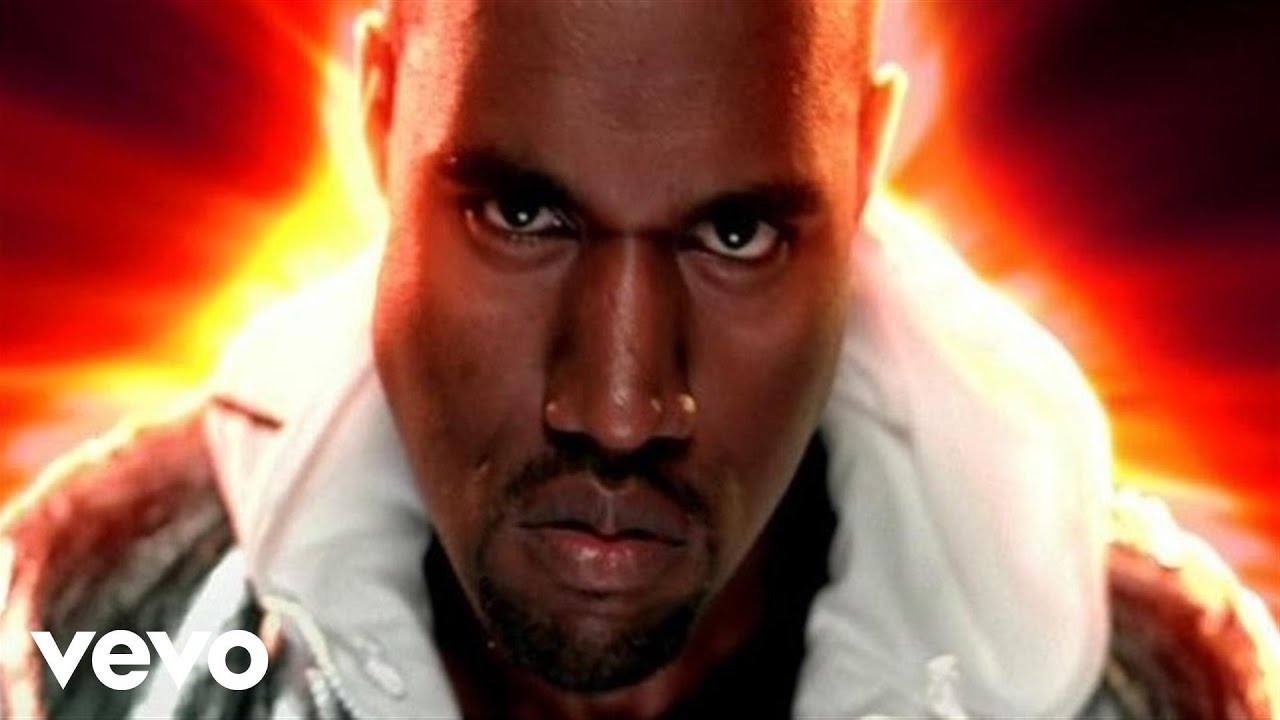
Kanye West’s music videos hold a known place on the scene; they will always shock in one way or another. Stronger appears to be inspired by Japanese culture, with large Japanese text almost spilling off the screen in its size and presence. It appears in cuts during freeze-frames and flashes to the text on a black background during certain beats. Awarded Best hip-hop Video Award at the BET hip-hop awards in 2007, this is one of Kanye's stronger music videos, the success of which is partly rooted in its rejection of subtlety. The text in Stronger cannot be missed and its aggressive presence shocks, but its artistry also awes, showing us that shock and awe will almost always garner attention.
03. Outside, George Micheal: Switch genres
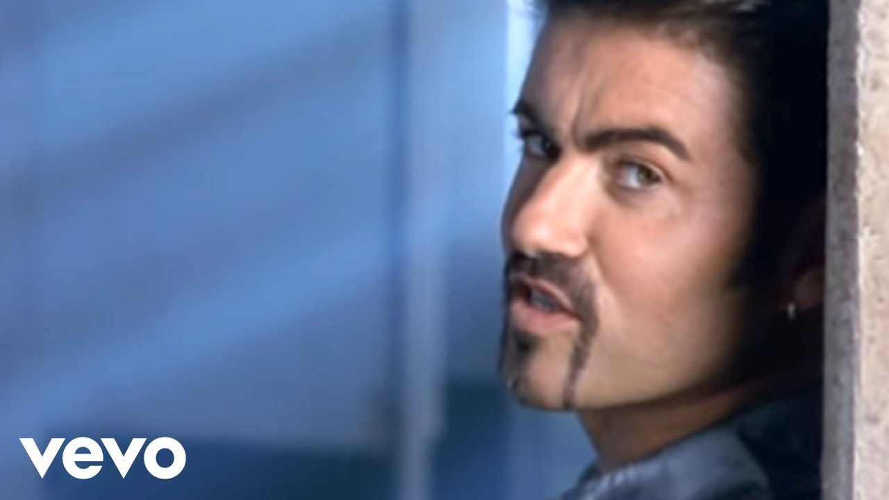
The first minute of George Michael's Outside music video is a sleazy pornographic dutch film with seedy, low-res typography that match the colours of the colour grading. As this was set in a bathroom, this cleverly showed the celebration of heterosexual couples engaging in more risqué acts (as well as a comedic display of its seediness). The retro typography echoes this choice in its red serif and old-fashioned outline. The large, high-res text then reading ‘Hollywood’, with the American flag running through it then cuts the video off to take it into George’s flippant, swanky music video, also using old-fashioned digital text in the screen’s corners to signpost some of the clips as captured on police cameras.
Outside is a perfect example of how typography can be used in such a vast range of styles all in one place to take a piece of work into any new genre, and instantly signify change in tone. The cultural moment George created in Outside would not have been possible to bring to life without the essential and fitting choices that were made with the typography.
04. Industry Baby, Lil Nas X: Props are king
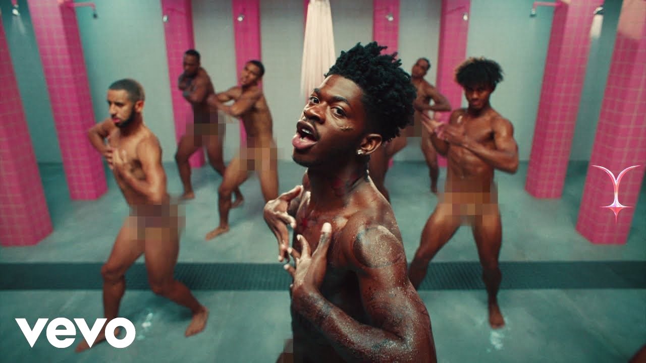
The production value of Lil Nas X’s viral music video was so flashy that typography wasn’t a key element on the surface; but what’s important to take into account is that prop design is what makes the fictional worlds artists create convincing. Typography is crucial to prop design. There’s a distinct style that went into the making of the font on the Book of Montero that Jack Harlow handed Lil Nas X. The prisoner numbers on each of their uniforms use a heavier weight than real life, which adds to the maximalist style of the art direction and complements the pink uniforms. But equally, a sans serif font has been used and the numbers remain small to retain a convincing quality to the world that’s been created. Although there is no immediately noticeable typography, the typography that formed the prop design is what made Lil Nas X's world convincing. If its importance had been underestimated, the music video would be unfinished.
05. This is America, Childish Gambino: Keep it brief
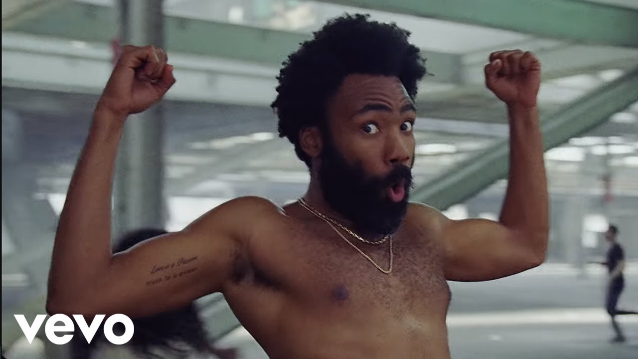
This is a music video made to deliberately disconcert by pointing out the aggressive issues America’s society and culture faces, and the location and one-shot aspect of this video is all it needs to stand on its own. The strength of the concept communicates its point, meaning that no extra graphics are needed, other than the title. The title comes on screen at the beginning of the video before it starts. The text is displayed in feminine, elegant script typography that tricks the audience into a sense of security. It drastically contrasts to the shocking scenes that then take place. The simple, subtle typography choice at the beginning emphasises the feeling of shock that the audience then experiences; effectively portraying his message with elegance. With only a few simple design choices, simple typography became the best accent to this video.
06. Shut Up and Let Me Go, The Ting Tings: Typography is a shape

Shut up and Let Me Go takes place mostly in a deconstructed domestic room surrounded by vibrant graphics pulsing with chromatic aberrations, and the text is no different. The text displays occasional short words from the lyrics and its form imitates the design of the rest of the graphics – white geometric lines that pulse in chromatic aberrations in time with the music. In this way they blend in with the design of the rest of the video and become elements. What can we learn from this? Text does not need to be a separate design element; sometimes it works best when it is merged into the rest of the design as a shape and becomes a part of the work itself.
07. Video Games, Lana Del Rey: It's all about inspirations

The music videos that made up Lana Del Rey’s first album, Born to Die, all use the same structure of anonymous, re-used and shaky vintage film all stitched together. The typography of some of the iconic signs in these scenes such as the Hollywood sign and the sign of the famous Chateau Marmont all help to immerse viewers in her dreamy world. The typography that has gone on to define her though, is the ‘Del Rey’ text in a decorative '50s font created to look as though it was captured on film. Its design imitates all of the culmination of the footage used in the video; proving that art can be created by stealing from your inspirations until you get something new that comes to be yours.
08. Get Ugly, Jason Derulo: Don't forget about hand lettering
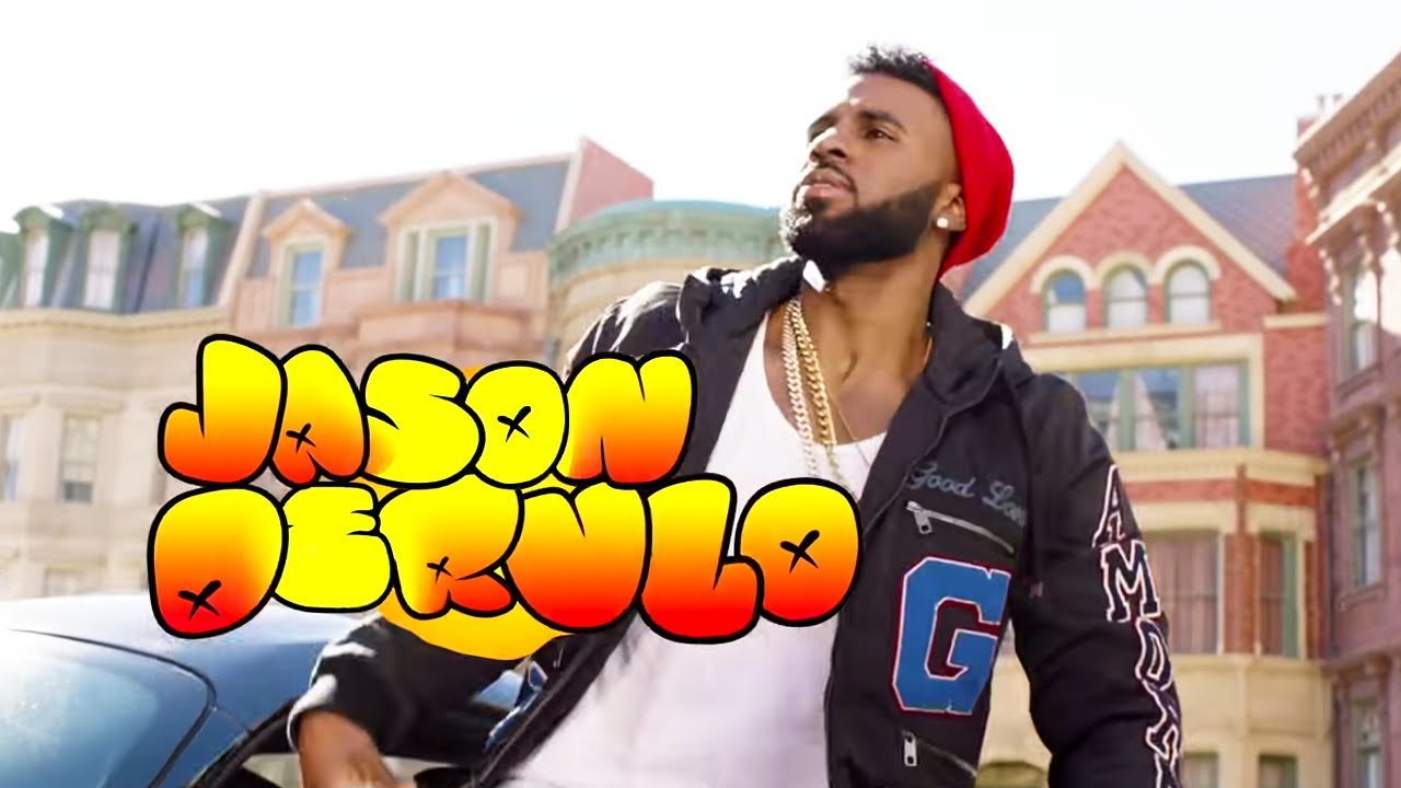
Take On Me by Aha and Subterranean Homesick Blues by Bob Dylan, both famously introduced the use of hand lettering in music videos. In a far more modern example, Jason DeRulo uses animated digital hand lettering in bright RGB colours to accentuate the vibrant, ‘80s production style that shines out of the Get Ugly video. Combined with some freeze frames and live annotations, this is a way of mixing media that cements the music video’s distinctive style.
The lesson? Don't let yourself be restricted just to the fonts other people have already made; get designing yourself and remember that you can always create your own lettering. If Jason hadn't done this we'd be watching a completely different music video now.
09. One Last Time, LP: Embrace house style
LP has curated a successful career over the years with her own music, but also as a songwriter for the stars, such as Rihanna, Celine Dion, Christina Aguilera, and the Backstreet Boys . Her own music has always been more of a niche, but the most recent music video she released saw her music gain more popularity and even emerge onto the pop scene. This is down to her consistency in branding. She has been making music videos for years, but she has never changed her style of typography – so when One Last Time came out, with one of the first scenes including film-credit like typography, it not only filled up the whole screen – accentuating the glamorous scenes and locations – it was also reminiscent of all her previously used typography in her past music videos.
This means that anyone who had watched one of her videos before would recognise her, making the video stick in the audience's head and encouraging a rewatch of her old videos. In the arts, how the title of your work is presented is who you are, and consistency in this message of who you are is everything. A house style is not always crucial, but when it is successful, LP is proof that it will be the making of your brand.
10. Back It Up, Caro Emerald: Go to a different era
Although That Man is often revered for its use of typography, this music video of Caro Emerald’s doesn’t get enough credit for its varied use of typography. Littered with text cards identical to those used in old-fashioned films of the ‘50s, each one appears to be from entirely different film genres. The video as a whole is a kaleidoscopic representation of all ‘50s graphic design that made up the film scene of the decade. Not to mention the bouncy typography that dances around Caro throughout the video, also reminiscent of Hollywood-style grainy graphics.
The text in Back it Up steps out of constructs to mix text genres, styles and create movement that makes the text appear almost as though it’s another lively character. Within the vibrancy, the vision of the ‘50s remains concise and clear. The typography is just as important as Caro in this video, as it is powerful enough to take the video and the viewer into a completely different era.
12. Found my Friends, Hayley Kiyoko: ‘Avoid clichés

Designs inspired by low-res, ‘vintage’ media of the ‘90s and early 2000s have been a popular trend for the last few years, and Hayley Kiyoko shows us in Found My Friends that this doesn’t have to make your design cliché. With her sans-serif, faded yellow typography displaying her title at the beginning of the video, she follows the general rules of the ‘vintage’ style of typography, but small differences such as the closer letter spacing and the chromatic aberrations make it look fresh and uniquely hers.
Topped off with a transition that expands the text through the camera, Hayley has created a style of ‘90s typography that although it fits into the genre rules, has not yet been done, reminding us that subtle edits make all the difference in typography. Hayley's type design is evidence that just because you want to use something popular, doesn't mean it has to be cliché.
For more on type, see our best new typefaces of 2024 or explore our free fonts post.

