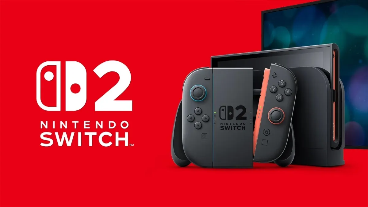
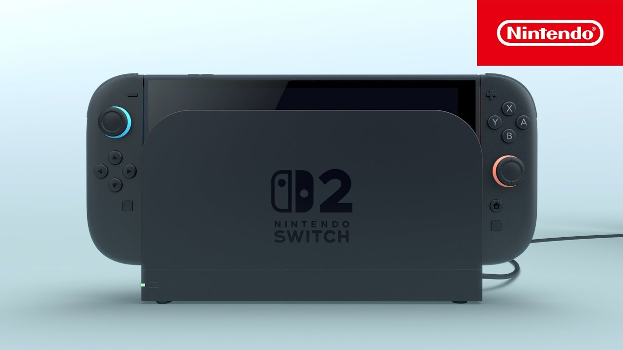
The Nintendo Switch 2 is finally here after what feels like months (years? decades?) of speculation and the rumour mill had been going so wild that the actual release of the product almost doesn't live up to the hype. Our resident Nintendo expert Beth Nicholls praised the Switch 2's modern look and sleek black design, but there's one aspect of the design that feels a little underwhelming.
The logo for one of the most anticipated handheld consoles of the year probably isn't going to be one to add to our best logos list. It features the Nintendo Switch logo featured on the first console, but with a whopping great '2' next to it. Did someone say 'basic'?
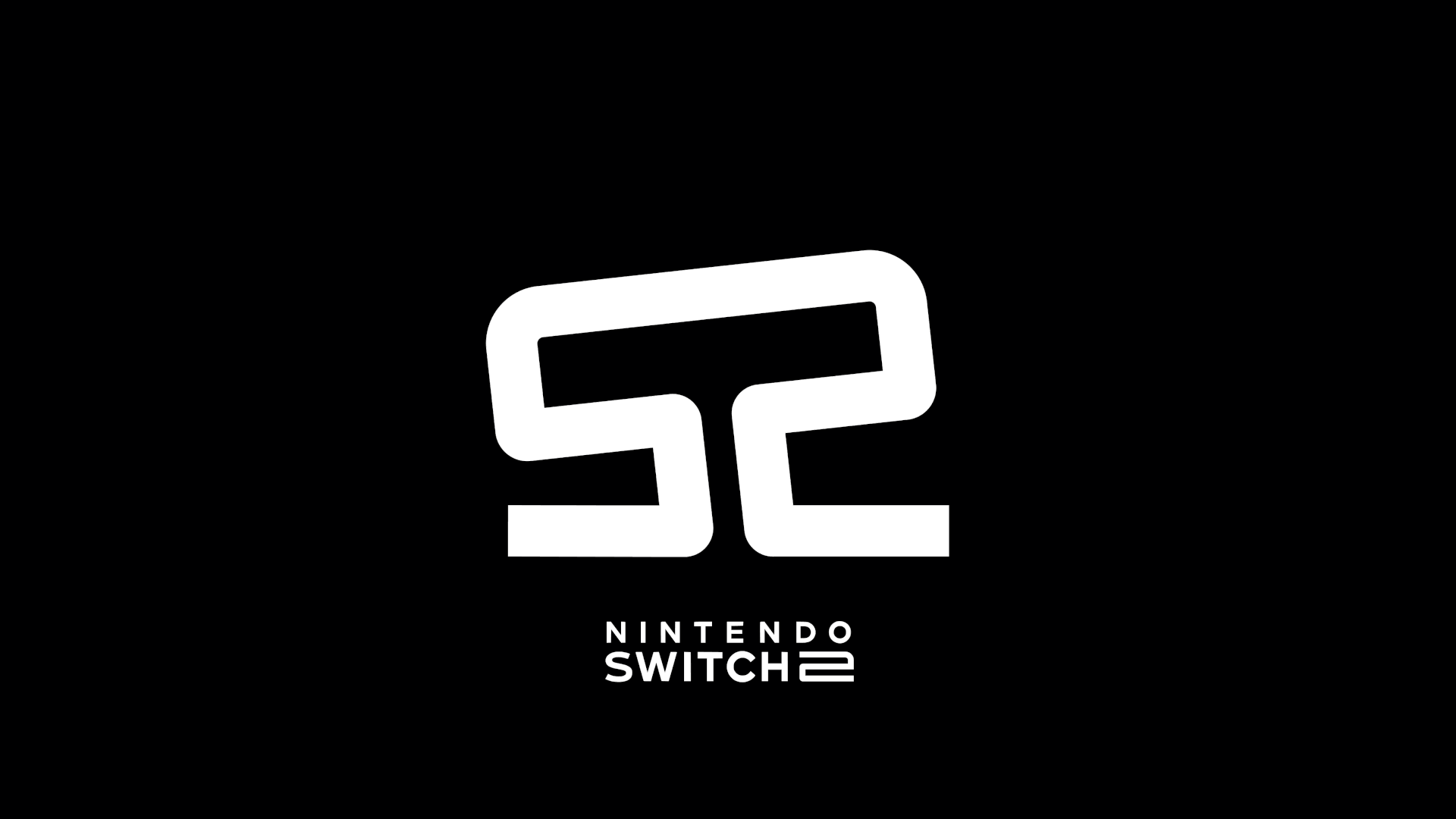
If you compare the logo we've got to some of the concept logo Switch 2 ideas that were flying around before release/people are publishing now, it's true that it's not the most exciting design. For example, there was Jason Combs' design (below) that resembles a disguised analogue stick that tilts left and right, playing on the mirrored 'S' and '2'. Beth noted before that it was almost "too genius to be the official logo". And it seems she was right.
Other people on X were also coming up with their own alternative logo ideas, some of which riffed on the idea of the two Joy-Cons:
Ok, I had one other idea for a switch 2 logo. Sorry, I can’t help myself 🤷♂️ .#nintendo #switch #switch2 #nintendoswitch2 #nintendoswitch #logo pic.twitter.com/8tVyjfEawUJanuary 15, 2025
Switch 2 logo if they locked tf in Nintendo just hire me #tbh pic.twitter.com/2vPn6rGk36January 17, 2025
But while it's tempting to cry that someone else could've done better, and it's true that Nintendo is playing it safe with this logo, the company may have good reason for doing so.
Cast your mind back to the Wii U, launched in 2012. Remember it? Did you buy it? Us neither. In this case, Nintendo went with a new name for the follow-up to the Wii. It wasn't the Wii 2 but the Wii U. And people were confused. They weren't sure whether this new console was the new Wii or a different version. And possibly for this reason, it wasn't a huge commercial success, and was discontinued in 2017 (when the Nintendo Switch launched).
By going for a more straightforward naming convention this time, and therefore logo, Nintendo is making sure it doesn't have any such confusion. Although am I the only one wondering whether we're still getting a Switch Pro?
I still think that Nintendo could have done something more exciting with the logo though, the '2' feels like it was slapped on without much care, and I'm sure there are more exciting or clever ways it could've been integrated.
For branding done right, see our best logos of the decade series.

