Use perspective to create a dynamic image
Mark Molnar shares some of his tips in making a front-view action scene pop, using perspective lines.
Sign up to Creative Bloq's daily newsletter, which brings you the latest news and inspiration from the worlds of art, design and technology.
You are now subscribed
Your newsletter sign-up was successful
Want to add more newsletters?
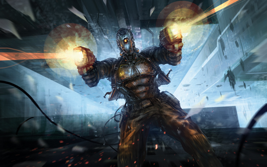
The perspective of the illustration is key, but the trick is to use two perspectives. The background environment is also an important part of a scene like this, because this is what gives a point of comparison for our character.
Hone your illustrator skills with these brilliant tutorials
I start by creating two separate perspective grids, with one vanishing point each and parallel horizon lines. I then move the two vanishing points away from each other. I also tilt the two horizon lines, which gives an extra dynamism to the illustration from the beginning.
The most important thing for painting the character is the foreshortening of his arms and the guns. You can go wild and create a strong cinematic perspective and putting the guns in the very foreground, or just keep it more natural as I've done.
Either way, you have to follow your established perspective. Why not take some reference photos of yourself and draw the arms based on those. Try not to copy the photos, but rather learn to understand your subject.
The rest of the character's body is a simple front view, so you can focus on the costume design. The legs aren't as important, but you need to match them to your perspective and give them a bit of movement to avoid a symmetrical-looking character.
01. Off the grid
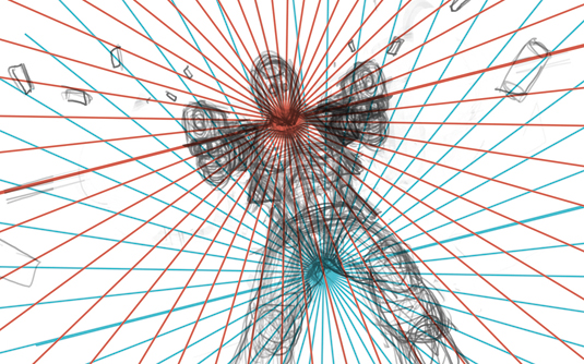
I begin the action-packed illustration by creating two separate one-point perspective grids. I then place a really rough sketch of my character on top of them.
Sign up to Creative Bloq's daily newsletter, which brings you the latest news and inspiration from the worlds of art, design and technology.
The two converging points will be my two main focal points. The upper one (drawn in red) is the head of the character and the lower one (drawn in blue) is the point in the distance that he's falling towards.
02. Sketchy
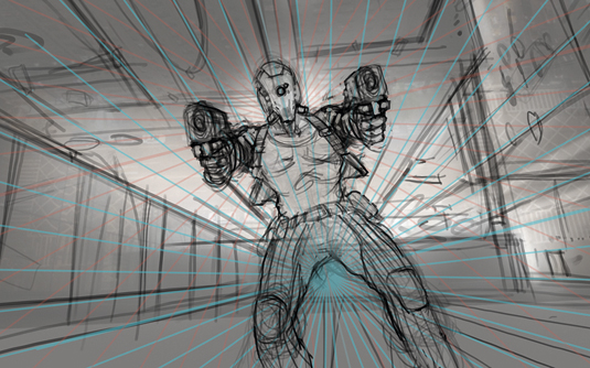
I loosely sketch up the buildings in the background, based on the lower perspective grid (blue) and add some light, which I intend to frame my character with later.
After lowering the opacity of my grids I take another pass at the line work of the character. I know that I want to change his outfit later, so I focus mainly on getting his anatomy correct.
03. Broad strokes
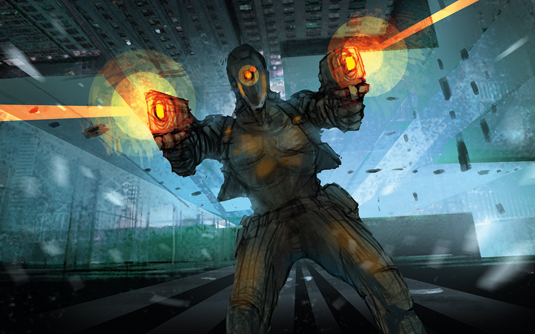
I separate the background and the character and block in the colours based on my line work. The details aren't really important, because this stage is about establishing the overall mood of the illustration.
I want to create more depth – that's why I contrast the cold desaturated blues in the background with the warm saturated oranges and browns on the character.
04. Punch it up

After fixing some minor anatomy and compositional issues I start the detailing. I add definition to the background as well, but my main focus is the character.
I then start to punch up the effects – the flying glass shards, the dust – and add more definition to the gunfire. Finally, I adjust the colours and contrast of the piece to achieve a more cinematic look.
05. Using Radial Blur
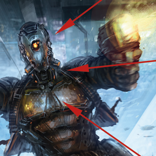
This filter can add depth and dynamism. Set it to Zoom and the effect blurs the current layer from the selected centre point towards the sides. Select your focal point to give the feel of movement, while all other elements seem slightly out of focus.
This article originally appeared in ImagineFX magazine. For more on perspective, see our piece on 5-point perspective.

Mark is a concept artist / art director specialised on the visual development, pre-production design and project art direction of film, animation and game projects. His past clients include Lucasfilm, Time Warner, Weta Workshop, Eidos, Applibot and Fantasy Flight Games.
