4 money-making ecommerce redesigns to learn from
Good UX can improve your revenue and boost conversions.

First impressions matter: so much so that brands that redesign their ecommerce sites regularly report a 20-30% increase in revenue within three to six months. The industry average for year-on-year revenue growth is less than 25%, so that's quite a boost.
Design plays a crucial role in driving every business goal for online brands. Most successful online brands update their design every three to six months and iterate on that design regularly throughout, altering colours, photos, metadata and more to increase organic search ranking, sales and customer lifetime value. When is your next redesign?
A brand redesign can be the difference between success and failure in such a competitive online market, so let's look at four examples of online stores that have designed excellent user experiences that result in greater conversions.
01. NatoMounts
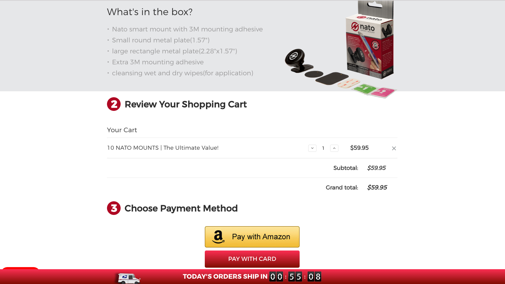
NatoMounts has done what nearly everyone in the online selling industry wants to accomplish: create a seamless selling experience from homepage to checkout. The only difference between NatoMounts and everyone else is that the brand only has a homepage and a checkout.
Brandon Chatham, founder of NatoMounts, worked with a designer to design first and foremost for mobile audiences, knowing that those on mobiles don't have the time or patience to click a bunch of small buttons.
The homepage is long; perfect for mobile scrolling. It also uses Amazon Pay at checkout to connect mobile shoppers with the industry's fastest checkout method (all customer payment data is automatically served by Amazon).
The result? Chatham has had multiple customers land on the site and purchase in 43 seconds or less. In total, NatoMounts has a 5% conversion rate for mobile audiences, and 80% of their sales come from mobile devices.
Sign up to Creative Bloq's daily newsletter, which brings you the latest news and inspiration from the worlds of art, design and technology.
"The whole experience from landing on the site to checking-out has got to take a minute or less. Our goal is to have them order as much as possible, as quickly as possible," says Chatham.
"Our eCommerce platform, BigCommerce, has built integrations with one-click payment systems, and the platform's optimised single-page checkout helps me do just that."
02. Native Union
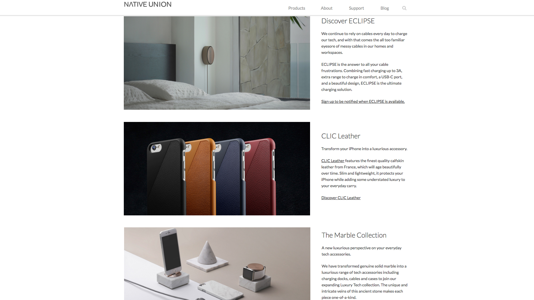
Native Union isn't your average online seller. The brand uses Kickstarter to launch new products, which immediately gives it a long list of interested customers. Plus, Native Union products can be seen offline as well – and in such notorious shops as Paper Source and Free People. It is innovating in the industry regularly, too, which is why its homepage redesign was so incredibly crucial.
"Our website is the window to the Native Union brand," says Arthur Maitre, ecommerce manager at Native Union. "Often times, the first touchpoint a customer will have is to see our products on shelves in retail locations.
"Although our products tell a story, being able to create an exploration experience on our website allows users to discover our brand values and product lines in a much more controlled and aesthetically pleasing way."
So, Native Union has redesigned its site to focus on collections, using a merchandising strategy to push new visitors down a path of least resistance to checkout. A clean layout and luxury images appeals to a techie audience, one which is likely wooed by Apple's own branding.
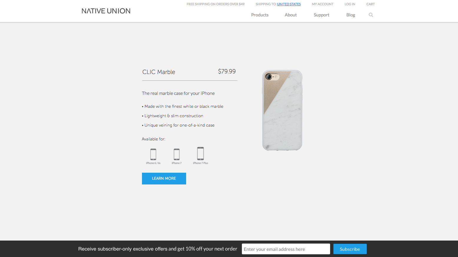
The site relaunch, however, hasn't resulted in increased conversions, but it is making the brand more money. Relying on a collections strategy allows for individual collection pages to rank incredibly well on Google – organically – and thereby save the company money in AdWords and Google PLAs.
Instead of paying for pricey ad placements, its optimised pages attract free visits from search engines. And those who do purchase are purchasing a whole lot more than they ever used to. AOV and order count are both up, 8% and 41% respectively.
"Since the redesign, traffic has increased by 67%, orders have increased by 41%, AOV has increased by 8%, and page download speed increased by 19% ," says Maitre.
03. Soundwall
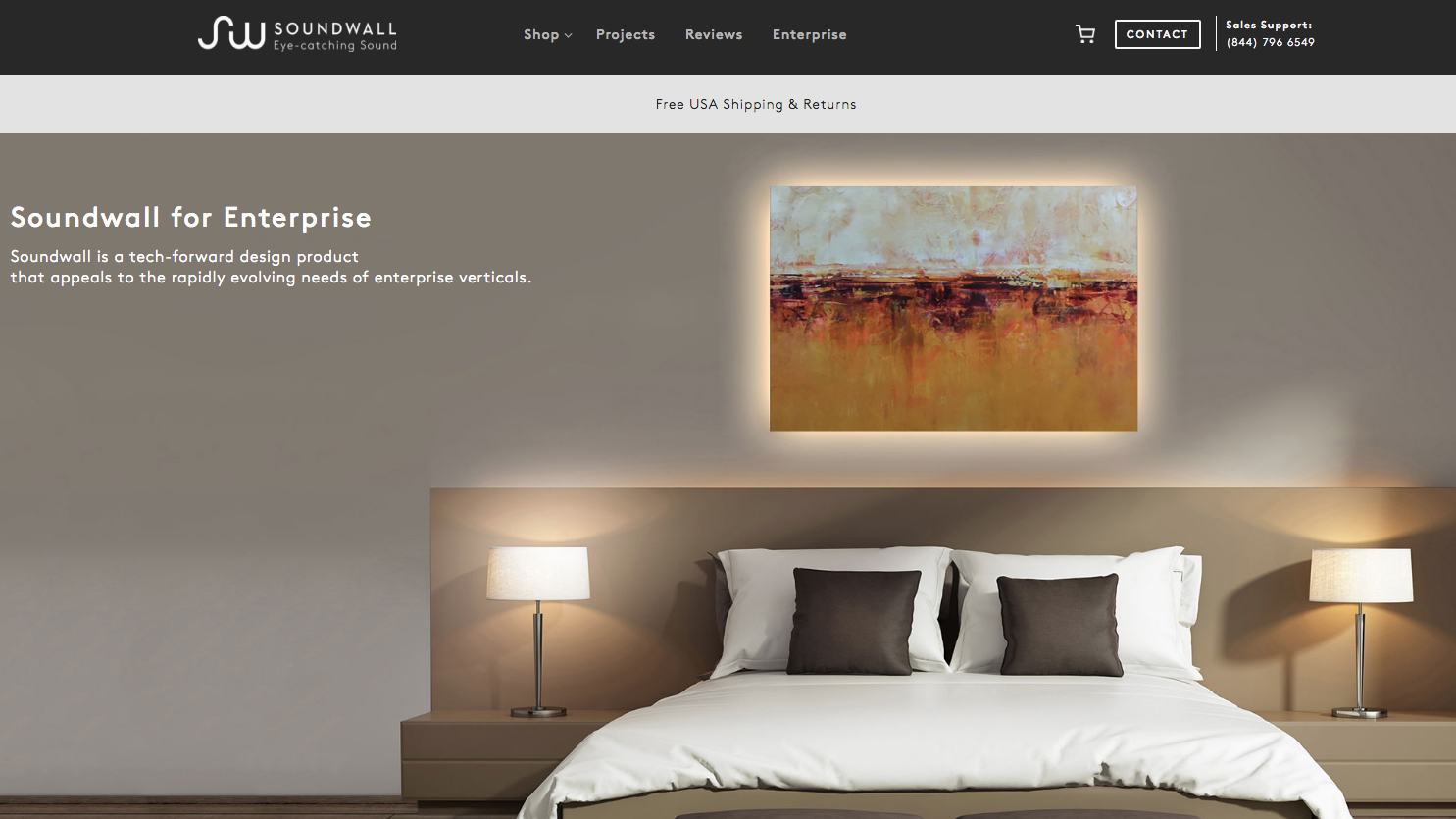
Not every redesign is exclusively focused on increasing customer conversions. This is especially true if you can make more money in bulk orders from industry leaders, such as hoteliers. This is exactly what Soundwall has done.
Soundwall's redesign has increased not just B2C conversion but also improved the site's performance for large B2B customers.
"The big win stemming from this redesign was the ground swell of interest from the hospitality space, which led one of the largest distributors of goods to the hotel industry globally to pick Soundwall up as the newest featured luxury product in their line," says Adam Goodman, president of Soundwall Inc. So what is it that it ultimately changed?
First, they cut down on the number of pages needed to explain the product. Today, Soundwall uses a direct, response-inspired homepage and a visually-focused product page. Minimal clicks. Beautiful visuals. And the changes have led to results.
"Since we relaunched, average time spent on site has increased by over 200%. Average pages per session went from 1.25 to 2.5. We've seen a 60% increase in engagement from home to shop page with a 4x increase in average time on site and 50% reduction in bounce rate," says Goodman.
04. ONYCHEK
What better way to ensure customers love your site than to ask them? NPS (Net Promoter Score) – if you aren't familiar – is an industry best standard of customer satisfaction. Customers are allowed to rate your company on a scale of 0-10. Your goal is to get to a 9 or 10 for every one. However, almost no company is able to achieve that, save for ONYCHEK.
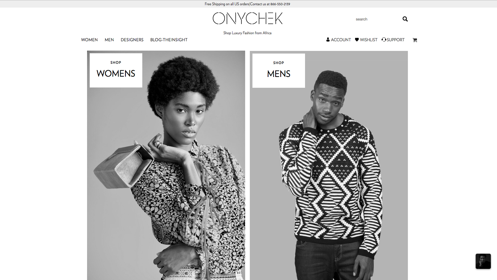
"We send NPS surveys to all of our customers, and so far we have had NPS scores of 10 and zero product returns," says Emmanuel Chekwas Nwokocha, founder of ONYCHEK. "This is because, with the minimal design, we describe our products well enough that customers know exactly what they are getting."
When you land on the ONYCHEK page you will immerse yourself in a luxury fashion experience akin to what you'd see for NYC-based brands. Except that these guys aren't from NYC – they are an African-based fashion brand and use powerful branding and visuals to draw customers in and then give back to their local community.
Using merchandised collections, new product features, and a "buy now" footer, the site pushes users to explore additional content and products and make more purchases than most other sites.
"Our conversion rate this April increased by 138.46% compared to March, " says Nwokocha. "We put UI and UX in the forefront of our design idea to make it really easy to shop. Here is an exact quote we received: 'I love your site – it's simple and focuses mainly on your products'."
This article originally appeared in net magazine issue 296. Buy it here.
Related articles:

