Brand Impact Awards 2016 winners revealed
The Partners, johnson banks, North and Purpose all scooped multiple trophies at last night’s celebration of the world’s best branding. Here’s the full list of victors...
Sign up to Creative Bloq's daily newsletter, which brings you the latest news and inspiration from the worlds of art, design and technology.
You are now subscribed
Your newsletter sign-up was successful
Want to add more newsletters?
Many of the world's leading brand strategists, designers and their clients gathered last night at Ham Yard Hotel in London for Computer Arts’ third-annual Brand Impact Awards.
Judged by an elite panel from top agencies including Turner Duckworth, GBH and Wolff Olins, as well as client-side judges from top brands like Coca-Cola, Virgin and Monotype, the projects in this year's shortlist represent the very best of the world's branding.
From over 160 entries, 47 outstanding projects from 33 different agencies made the shortlist. But who went home with a trophy? We round up the winners at the Brand Impact Awards 2016…
Bars and Restaurants
Highly Commended: Blok Design – Nota Bene
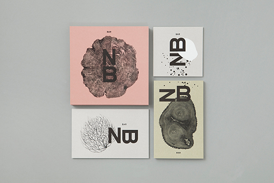
Inspired by top Canadian chef David Lee’s cooking, Blok Design’s rebrand of Nota Bene restaurant makes use of simple three-colour palette that echoes the interior design by +tongtong.
Culture
Highly Commended: The Chase – Robert Walker: The Fifth Continent
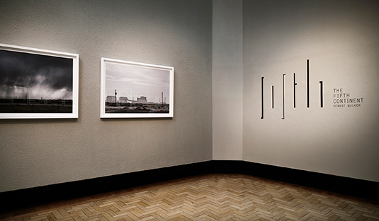
To reflect the barren landscape photography in Robert Walker’s exhibition The Fifth Continent, The Chase used a muted palette and simple lines of varying thickness to subtly echo the linear elements in the work.
Sign up to Creative Bloq's daily newsletter, which brings you the latest news and inspiration from the worlds of art, design and technology.
Highly Commended: Wolff Olins – The Met
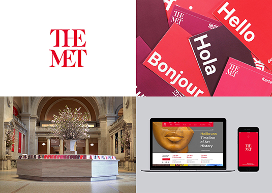
Wolff Olins’ bold rebrand of New York’s Metropolitan Museum of Art into simply ‘The Met’ unifies the museum’s activities under one robust system, which celebrates both the authority and the openness of the organisation.
Winner: Purpose – Birmingham Hippodrome
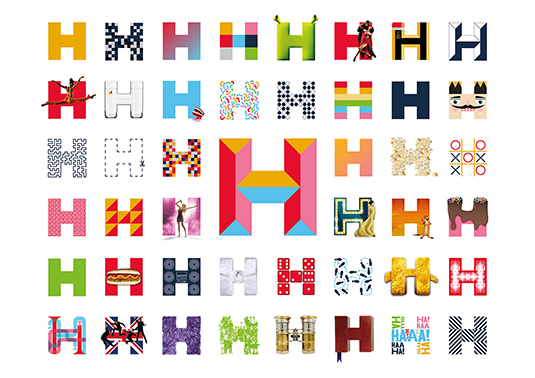
Birmingham Hippodrome’s identity was confused and inconsistent, with the venue taking a back seat to its productions. Purpose reversed that with a truly versatile and engaging system, using the tagline ‘a stage for life’
Winner: SB – RIBA: The Brutalist Playground
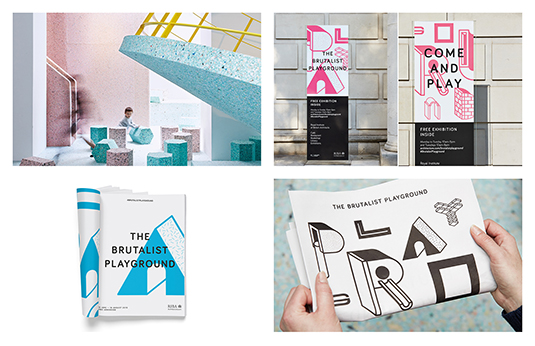
SB’s playful, dynamic identity for The Brutalist Playground – an immersive installation by Turner Prize nominees Assemble and Simon Terrill, that occupies the entire architecture gallery at the Royal Institute of British Architects (RIBA) – is based around a bespoke typeface, built from Tetris-like blocks.
Education
Highly Commended: Alphabetical – D&AD New Blood: Fly on the Wall
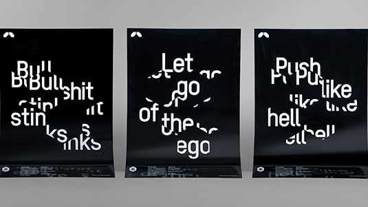
D&AD New Blood’s Fly on the Wall project provides insider insights into design. Alphabetical released a ‘fly’ on Twitter to visit the world’s top studios, collating the best advice into a set of graphic posters.
Highly Commended: Bond & Coyne – Arts University Bournemouth: One Piece of Advice for
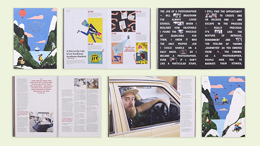
Bond & Coyne gathered ‘one piece of advice’ for new graduates from Arts University Bournemouth’s alumni network, turning them into illustrated prints handed out at the graduation ceremony. It became a magazine, an events series and a podcast.
Winner: Purpose – Society for Experimental Biology
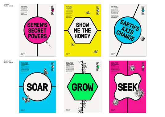
The Society for Experimental Biology’s rebrand had to appeal to both established and younger scientists. Purpose combined a network of bold lines and shapes with biological illustrations and vibrant highlight colours.
Winner: NB – Ravensbourne
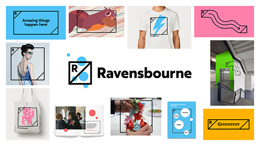
With the question ‘What does a creative university look like?’ in mind, NB revisited the idea of a crest, developing a simple mark that opens up to become a flexible framing device, brimming with energy.
Winner: johnson banks – Dear World...Yours Cambridge
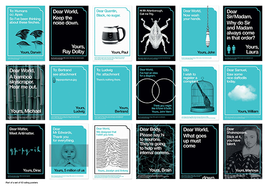
johnson banks’ inspired University of Cambridge campaign focuses on its profound impact on the world, and how it will affect its future – all framed as a letter that begins ‘Dear World’ and ends ‘Yours, Cambridge’
FMCG
Highly Commended: Pearlfisher – Manomasa
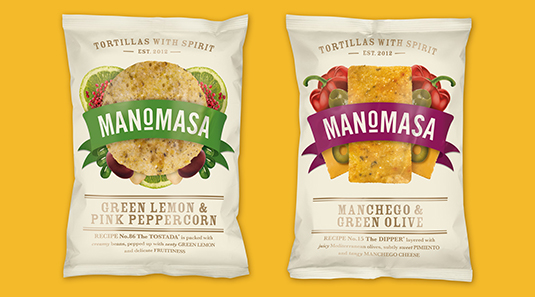
Born on the back-streets of Mexico, Manomasa celebrates the quality and variety of street food. Pearlfisher used a montaged illustration style to reflect layers of taste, combined with a bold graphic language.
Highly Commended: Sagmeister & Walsh – Appy Fizz
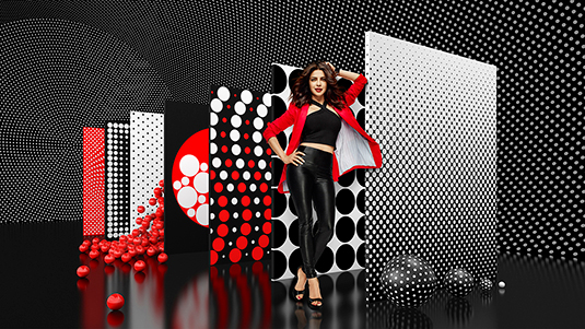
For apple juice brand Appy Fizz, Sagmeister & Walsh visualised carbonated bubbles through a dynamic graphic language of spheres and circles in a bold red, white and black palette, giving the Indian brand a stylish overhaul
Winner: Turner Duckworth – Brawny
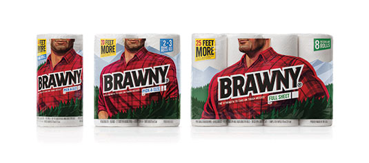
Turner Duckworth rebranded American paper towel brand Brawny, reinventing its mascot as a mighty giant. Consumers shared the packaging on social media, holding it in front of their faces to ‘become’ the Brawny giant.
Not-For-Profit
Highly Commended: The Partners – Fine Cell Work: A Stitch in Time
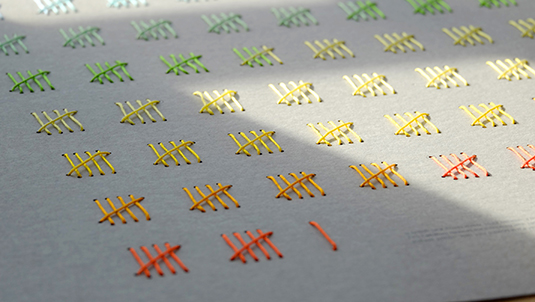
Fine Cell Work trains prisoners in paid, skilled, creative needlework while in their cells. The Partners created a calendar for supporters to purchase, alongside the creative needlework itself
Highly Commended: Peter & Paul – Chicken Town
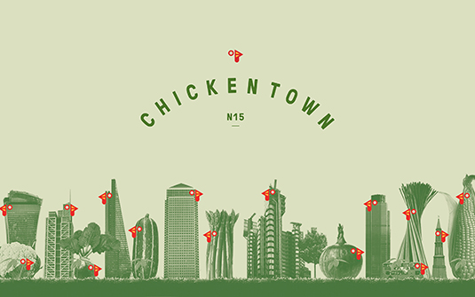
In response to rising child obesity levels, Chicken Town serves a healthier alternative to fried chicken, and gives on-the-job training to young people. Peter & Paul’s cheeky identity captures the spirit of the venture.
Highly Commended: The Clearing – Breast Cancer Now
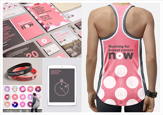
When Breakthrough Breast Cancer and Breast Cancer Campaign merged, they needed a unified brand to help them achieve their shared ambition: stop women dying of breast cancer by 2050. The Clearing rose to the challenge.
Winner: The Partners – BHF: Care Instructions That Really Care
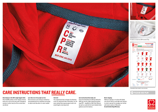
Briefed with designing a fundraising T-shirt for the British Heart Foundation, The Partners took it a step further by stitching a simple but ingenious ‘care label’ inside, giving CPR instructions.
Professional Services
Highly Commended: North – Arjowiggins

North was tasked with making Arjowiggins the go-to brand for designers, printers and luxury brands. A new positioning – ‘international standards for creative papers’ – lies at the core of the identity system.
Winner: SomeOne – Debbie Thomas
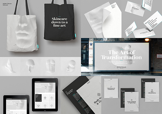
A bold departure from traditional ‘beauty’ imagery, SomeOne’s rebrand of skincare brand Debbie Thomas is underpinned by a striking set of photos, created by pressing mannequins’ faces, hands and bodies into flour.
Property
Highly Commended: Bienal Comunicación – Workcenter México
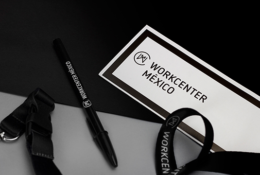
Shared office space Workcenter México needed an identity to reflect its collaborative spirit. Inspired by the architecture, Bienal Comunicación created a simple but highly versatile grid system to tie it together.
Retail
Winner: North – Co-op
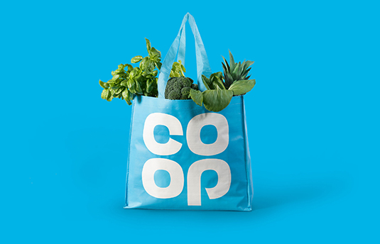
North’s widely discussed rebrand draws on Co-op’s past by bringing the iconic 1960’s cloverleaf motif back to the fore, celebrating its heritage while giving the brand a fresh, modern overhaul.
Winner: The Partners – Argos: Simple Value
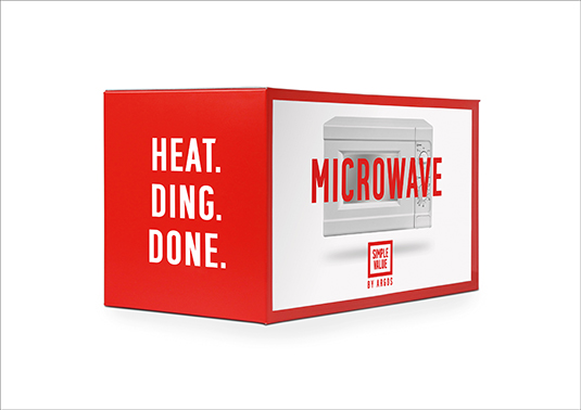
The Partners follows its total rebrand of Argos with a campaign for its Value Range. Combining witty copywriting with bold colour and black-and-white photography, it proves simple doesn’t just mean basic.
Sports
Highly Commended: GBH – Louis Vuitton America’s Cup 2016
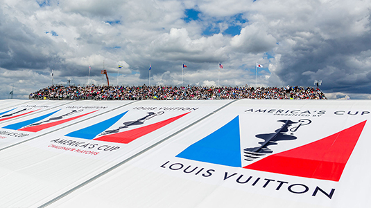
Louis Vuitton has sponsored The America's Cup for 32 years. In 2016, GBH deconstructed its iconic marque into abstract triangles to represent competing sailing boats, creating a truly versatile graphic language.
Winner: Hulse & Durrell – Olympic Heritage Collection
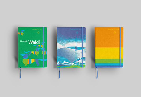
Faced with unifying all the art and design from the Olympic Games into one comprehensive collection, Hulse & Durrell researched decades’ worth of design manuals and brand guidelines for this ambitious project.
Technology and Telecoms
Highly Commended: Moving Brands – Eir
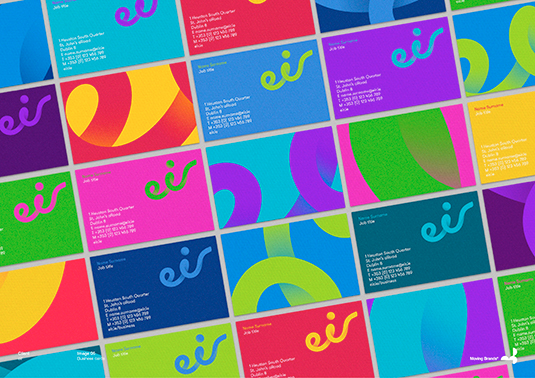
When Ireland’s largest telco invested in the country’s fastest-ever broadband network, Moving Brands was tasked with changing preconceptions of its service via a major rebrand, renaming Eircom to simply ‘eir’.
Wine, Beer and Spirits
Highly Commended: Turner Duckworth – Miller Lite Steinie
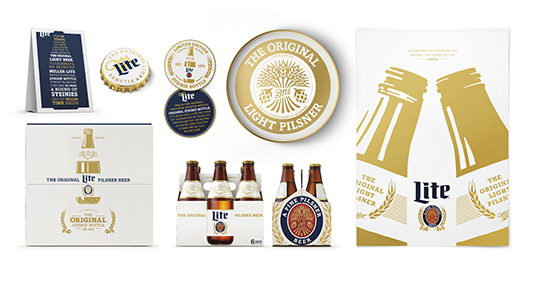
For Miller Lite’s 40th anniversary, Turner Duckworth reinvigorated the Steinie bottle design from 1975, adding subtle graphic embellishments with a stylish white and gold palette.
Social Impact Award
Highly Commended: The Partners – BHF: Care Labels That Really Care

Every branded piece of clothing sold by British Heart Foundation now carries CPR instructions, and there are ongoing talks about introducing the labels in school uniforms and high street fashion.
Winner: The Clearing – Breast Cancer Now

Since the rebrand, Breast Cancer Now campaigner numbers have doubled. New partners include M&S and the Metro, the team have successfully lobbied to lower drug pricing, and over 200 MPs are on board as ambassadors.
Collaboration Award
Winner: The Partners – Investec Journal
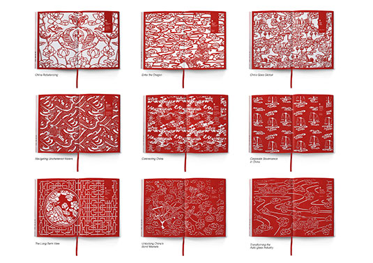
To encourage investment in China, The Partners collaborated with Lorraine Nam on a series of intricate illustrations, cut from red paper. Symbolic of good fortune, the red becomes more intense in later chapters
Best of Show
Winner: johnsonbanks – Dear World… Yours, Cambridge

The judges applauded the witty copywriting and versatility of this campaign for Cambridge University, calling it a fittingly smart approach for the sector.
Don’t miss the next issue of Computer Arts, on sale 16 September, for a full round-up of the award-winning projects, plus exclusive insights from the agencies behind them. Subscribe today and save 20% on Adobe’s Creative Cloud photography package.

Nick has worked with world-class agencies including Wolff Olins, Taxi Studio and Vault49 on brand storytelling, tone of voice and verbal strategy for global brands such as Virgin, TikTok, and Bite Back 2030. Nick launched the Brand Impact Awards in 2013 while editor of Computer Arts, and remains chair of judges. He's written for Creative Bloq on design and branding matters since the site's launch.
