Colour harmony in 3D art: 16 things to consider
Create aesthetically pleasing images with an understanding of colour harmony.
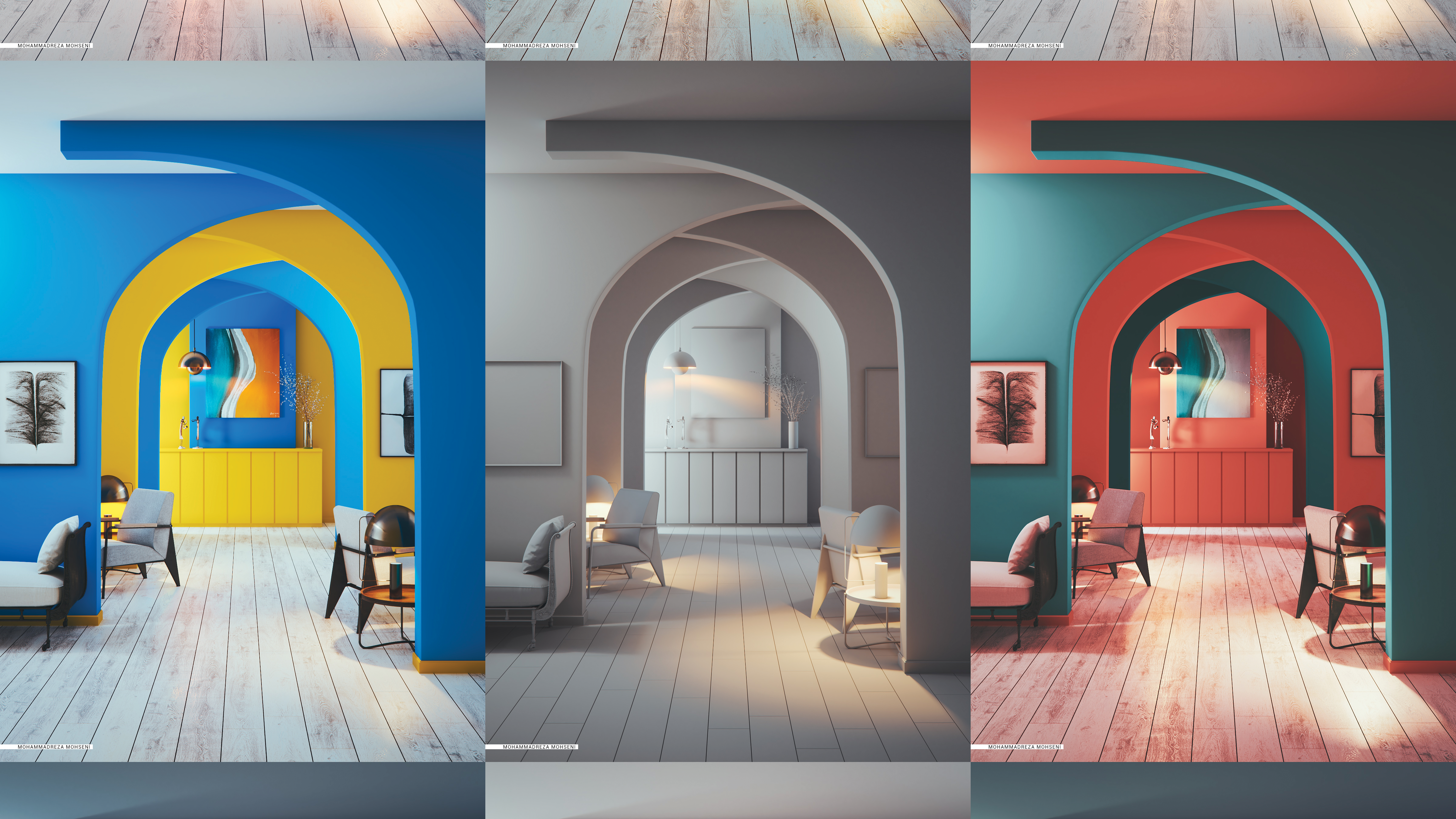
As artists, the way we use colours in every aspect of our artwork, including lighting, textures, materials and so on, is vitally important, because colour is one of the fundamental elements of communication and of the interactions we seek with our audiences.
Thus, we need to understand colour thoroughly and use it with utmost care. To achieve this, knowing the history of colour theories may help you when it comes to choosing the right colour wheel as a base for your work. As a next step, understanding colour spaces and attributes will help you understand the basis of colour harmony theories, which we can use to create aesthetically pleasing images even in very simple scenes.
In this article we will cover some colour theories and harmonies that you can use in any visualisation or 3D art project you may take on. We will also introduce some of the tools available that can help create colour palettes for your projects.
Article continues belowKeep in mind that these are just tools to use; it is important for you to understand the theories behind them in order to choose the right one for your project’s purpose, and for creating the desired emotions and effect on your audience.
01. Colour theory history
The first colour wheel has been attributed to Sir Isaac Newton, who arranged red, orange, yellow, green, blue, indigo and violet into a natural progression on a rotating disk. As the disk spins, the colours blur together so rapidly that the human eye sees white. From there the organisation of colour has taken many forms, from tables and charts to triangles and wheels.
02. Colour wheels
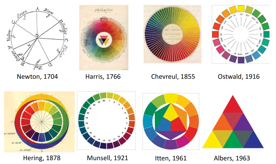
A colour wheel is an abstract illustrative organisation of colour hues around a circle, which shows the relationships between primary colours, secondary colours, tertiary colours and so on. We have several different representations of colour based on different primary colours, but typically artists tend to use blue, red and yellow as primary colours. Alternative representations are based on RGB (red, green, blue) or RGV (red, green, violet).
03. Itten colour wheel
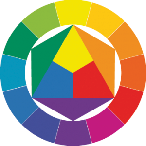
The Itten colour wheel consists of 12 colours, three of which are primary, three are secondary and six tertiary. The influence of psychoanalysis is apparent in Itten’s colour theory, as he was one of the first to associate different colours with specific emotions and to study the impact of colour on our moods. Itten was one of the first people to define and identify strategies for successful colour combinations. Through his research he devised some methodologies for coordinating colours utilising the hue's contrasting properties.
Sign up to Creative Bloq's daily newsletter, which brings you the latest news and inspiration from the worlds of art, design and technology.
04. Colour attributes
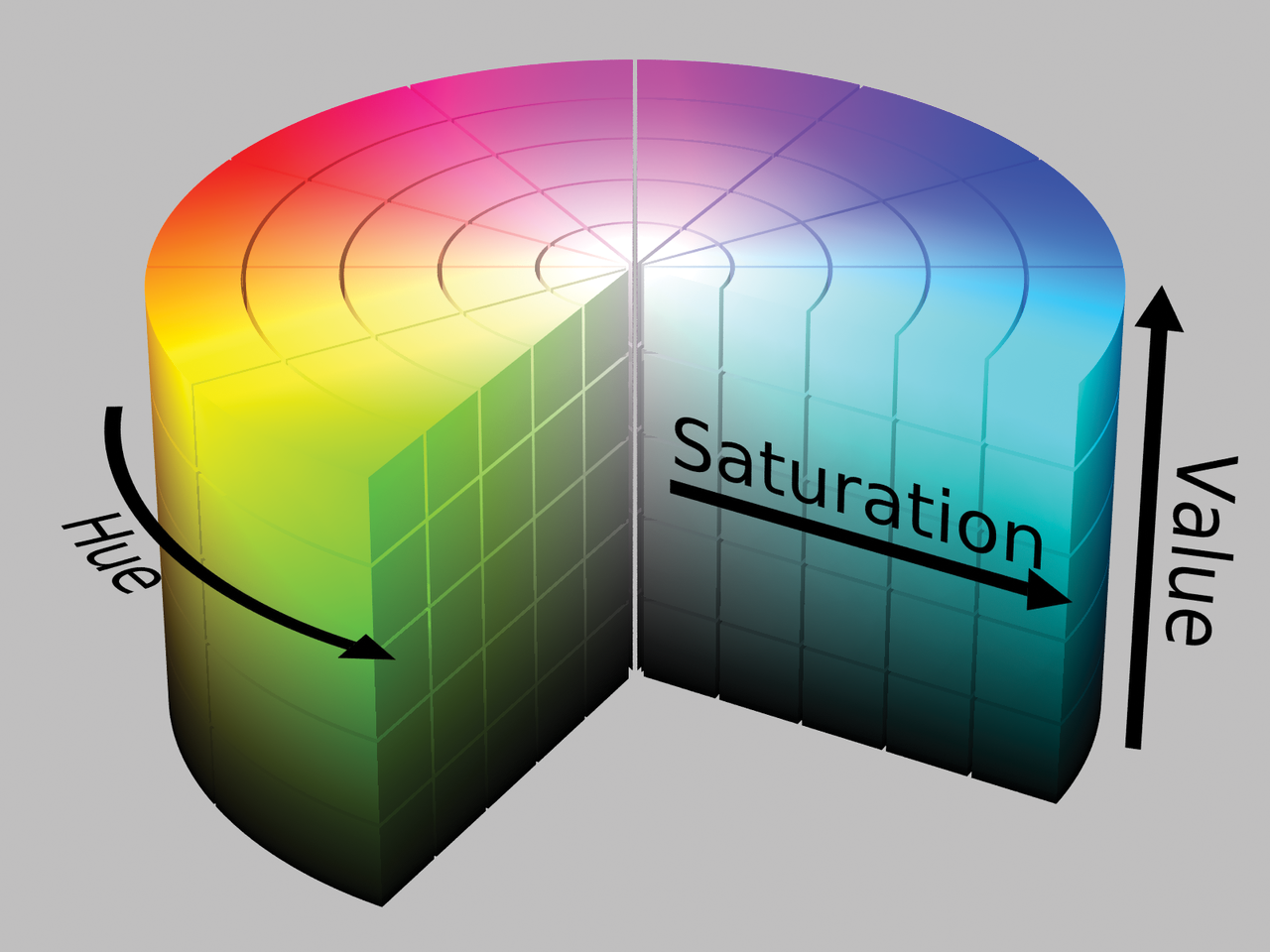
Before jumping to colour harmony and suitable colour for different spaces, we must talk about some colour attributes that let us define the colours as numbers for different colour spaces.
Colour can be presented in different spaces using different attributes. Here are the names of some different colour spaces you may came across: LAB, LABn, LXY, MXY, MABe, MXYe, SXYe, HSPn, HSP, HSPne, HSP3, HSP Itten, YUV, CMYK, sRGB, RGBW, among others. Here we will take a look at HSV as our space and describe its attributes, which are Hue, Saturation and Value.
05. Hue

Hue can be more specifically described as the dominant wavelength and is the first item we refer to when adding in the three components of a colour. It essentially refers to a colour having full saturation.
06. Saturation

Saturation defines the brilliance and intensity of a colour. When a pigment hue is ‘toned’, both white and black (grey) are added to the colour to reduce the saturation. In this model saturation is a number from 0 to 100%. Sometimes the value is calculated from 0 to 1. When the value is 0, the colour is grey and when the value is 1, the colour is a primary colour.
07. Value

Value refers to the lightness or darkness of a colour. It indicates the quantity of light reflected. When referring to pigments, dark values with black added are called ‘shades’ of the given hue name.
Light values with white pigment added are called ‘tints’ of the hue name. In this model value ranges from 0 to 100%. When the value is 0 the colour space will be totally black. With the increase in the value, the colour space brightness increases and shows various colours.
08. Colour harmonies
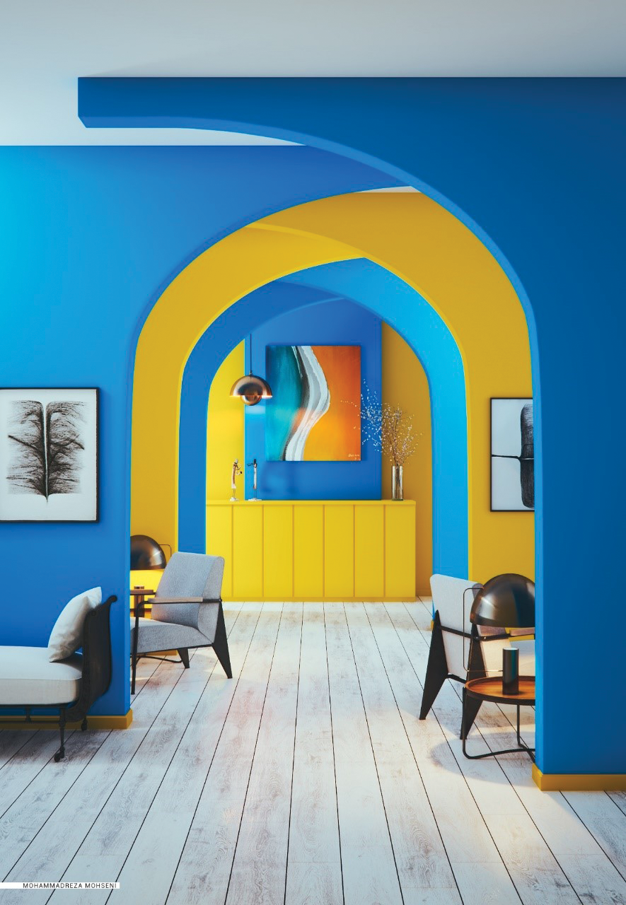
So by converting colour representation to numbers we can work with some simple maths to achieve colour harmonies using different formula. As we discussed earlier, Itten presented some strategies and models for creating harmonies
Some of the most usable models are: Monochromatic, Analogous, Complementary, Splitcomplementary, Tetradic and Triad. In the following steps, we will discuss these harmonies – of course, you may end up using only one of these in your project.
09. Monochromatic
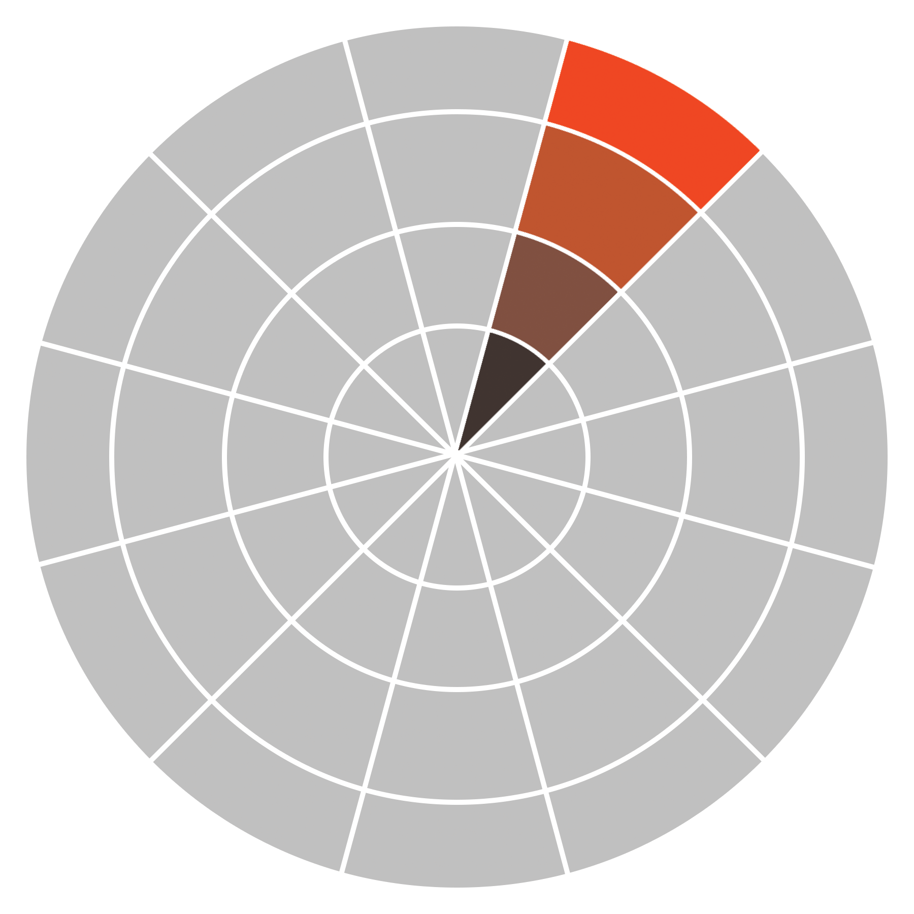
Monochromatic harmony uses various values (tints, tones, and shades) within the same colour family. So for formulating in HSV we do not need to change the hue, just value and saturation would do.
You may find changing both for each desired colour is more efficient. This one will create a relatively low contrast but a pleasing image, because all colours have the same hue, and it can be used for a smooth and relaxing effect.
10. Analogous
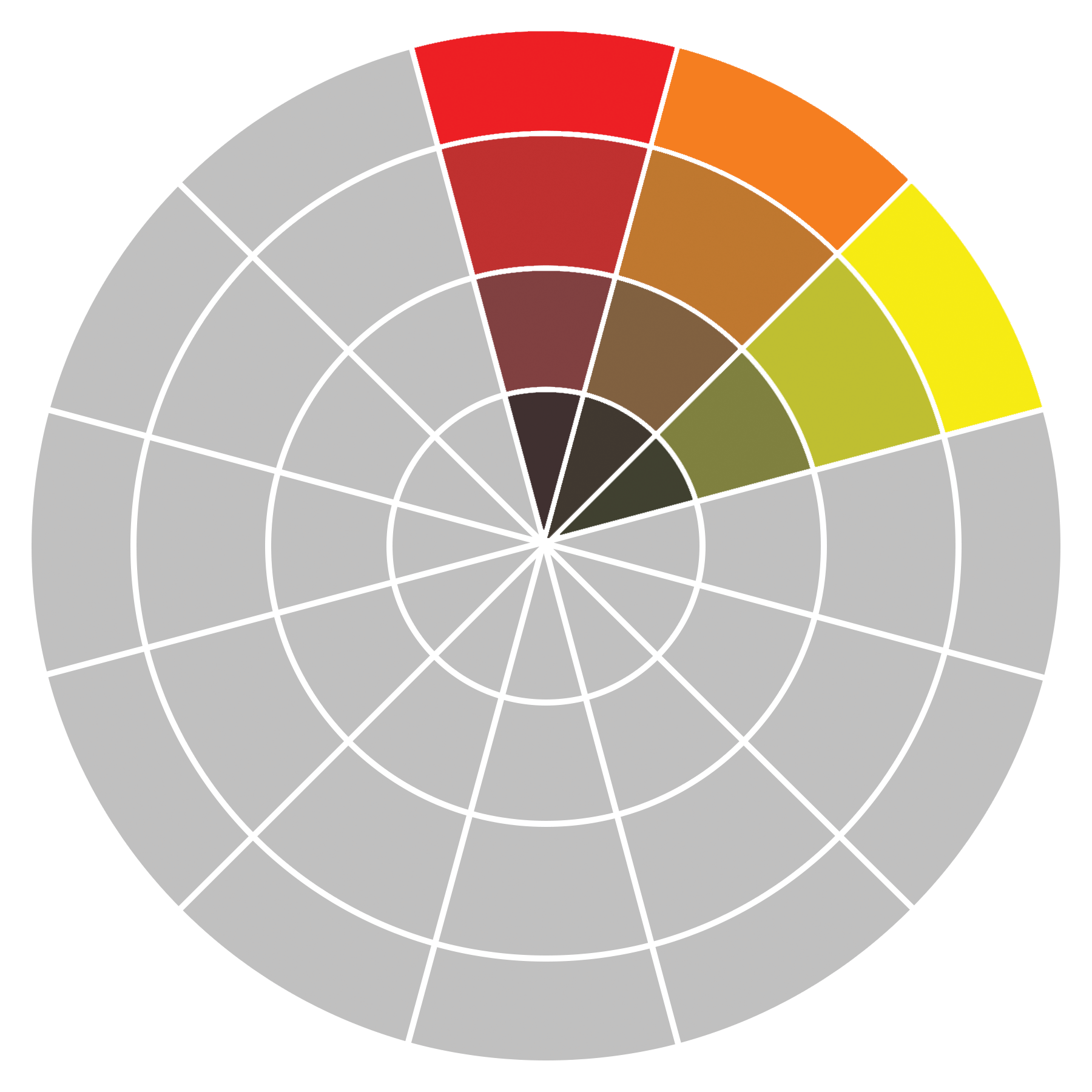
Analogous harmonies are based on three or more colours that sit side by side on the colour wheel. With regards to HSV space, you must determine the number of sections of your colour wheel, and then the hue degree of each section will be ‘360 / number of sections’.
In this case, hue will be changed to base colour hue ± each section portion of the colour wheel. And for more colour, changing both the value and the saturation would also be considered. This will create a relatively low contrast, but more contrasted than Monochromatic.
However, it can still have a smooth and relaxing effect on our audience, but you’ll also have a more colourful image.
11. Complementary
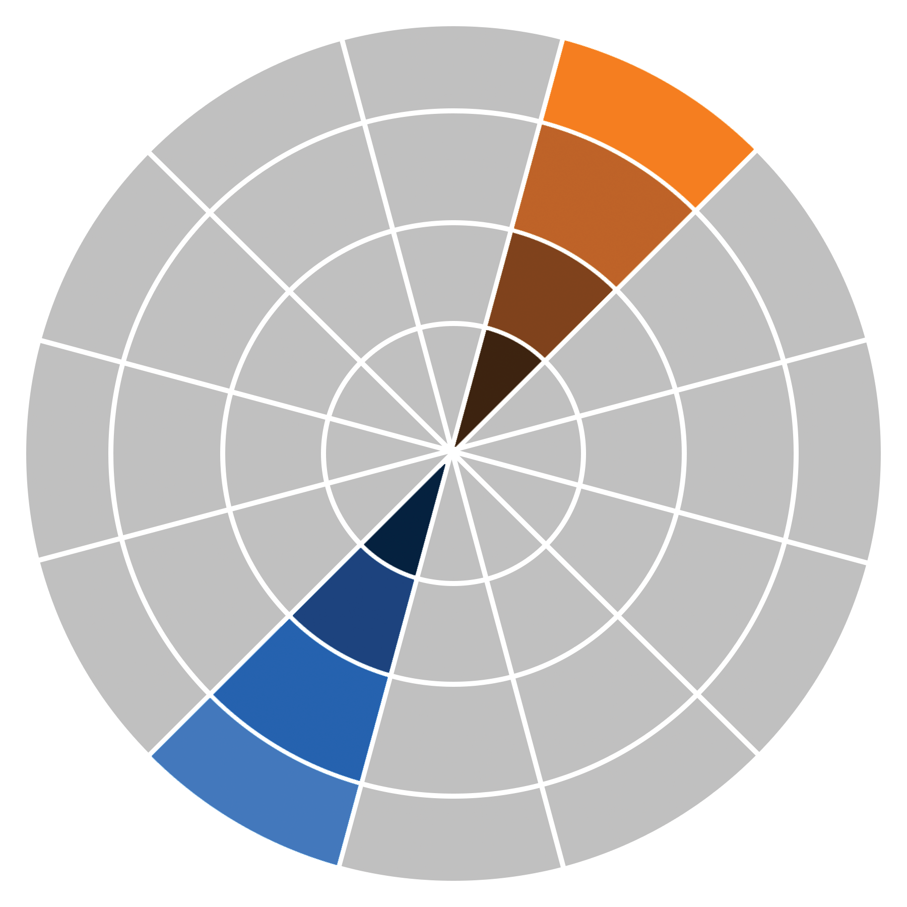
Complementary colours are those that appear opposite each other on the colour wheel. So in regards to HSV, this model needed a hue change of 180 degrees. For more colour, we can also change the value or even the saturation based on our needs for each project. This harmony will create very strong contrast and can be used for dramatic effect. In addition, it can be used to create cinematic lighting and general material or mood colours.
12. Split-complementary
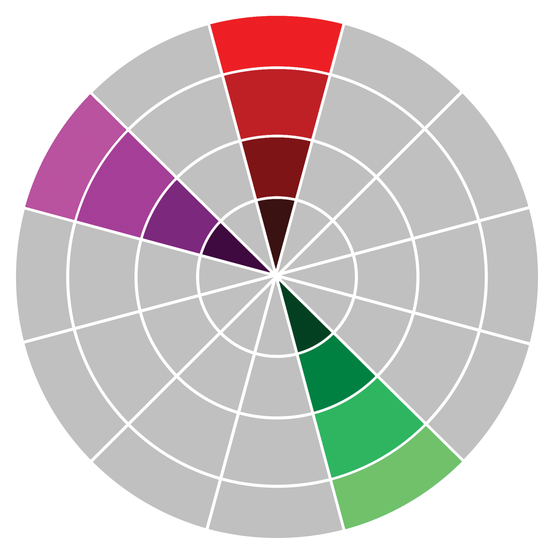
Split-complementary colour arrangement is the result of one colour paired with two colours on either side of the original colour’s direct complement, creating a scheme containing three colours. For HSV, we consider ‘180 degrees ± (360 degrees / number of sections)’ for the two colours that are almost complementary of our base colour.
It may be useful for those who want very high-contrast images but a few more sets of colours. It can create a relatively smoother contrast in comparison to complementary colour harmony.
13. Tetradic
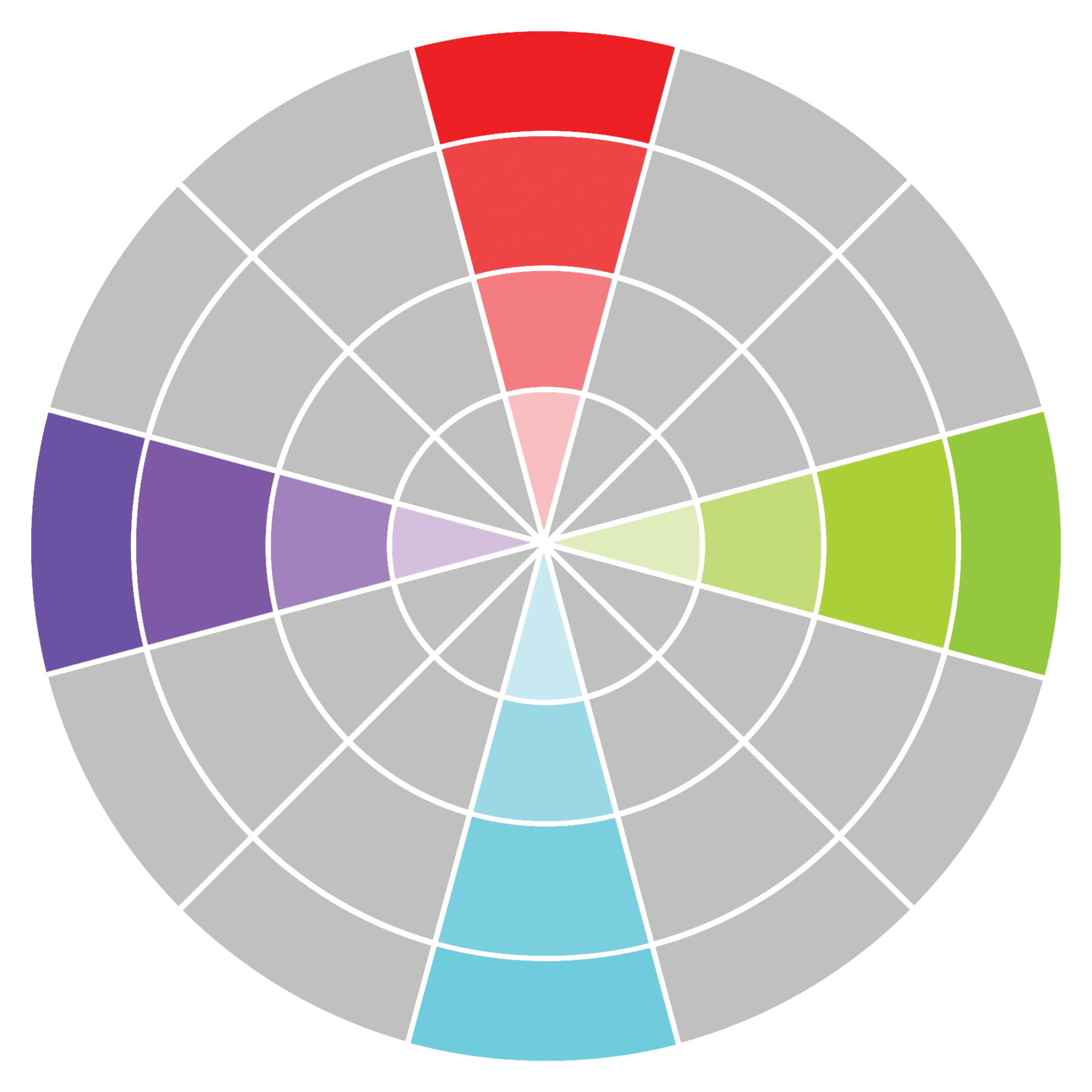
Tetradic colours are a combination of two sets of complementary colours, which gives us more colours with high contrast (in case sets of complementary colour are not enough for you). When looking at the HSV colour space, this one is just like two complementary colours, so 180-degree differences between the colours would be considered.
14. Triad
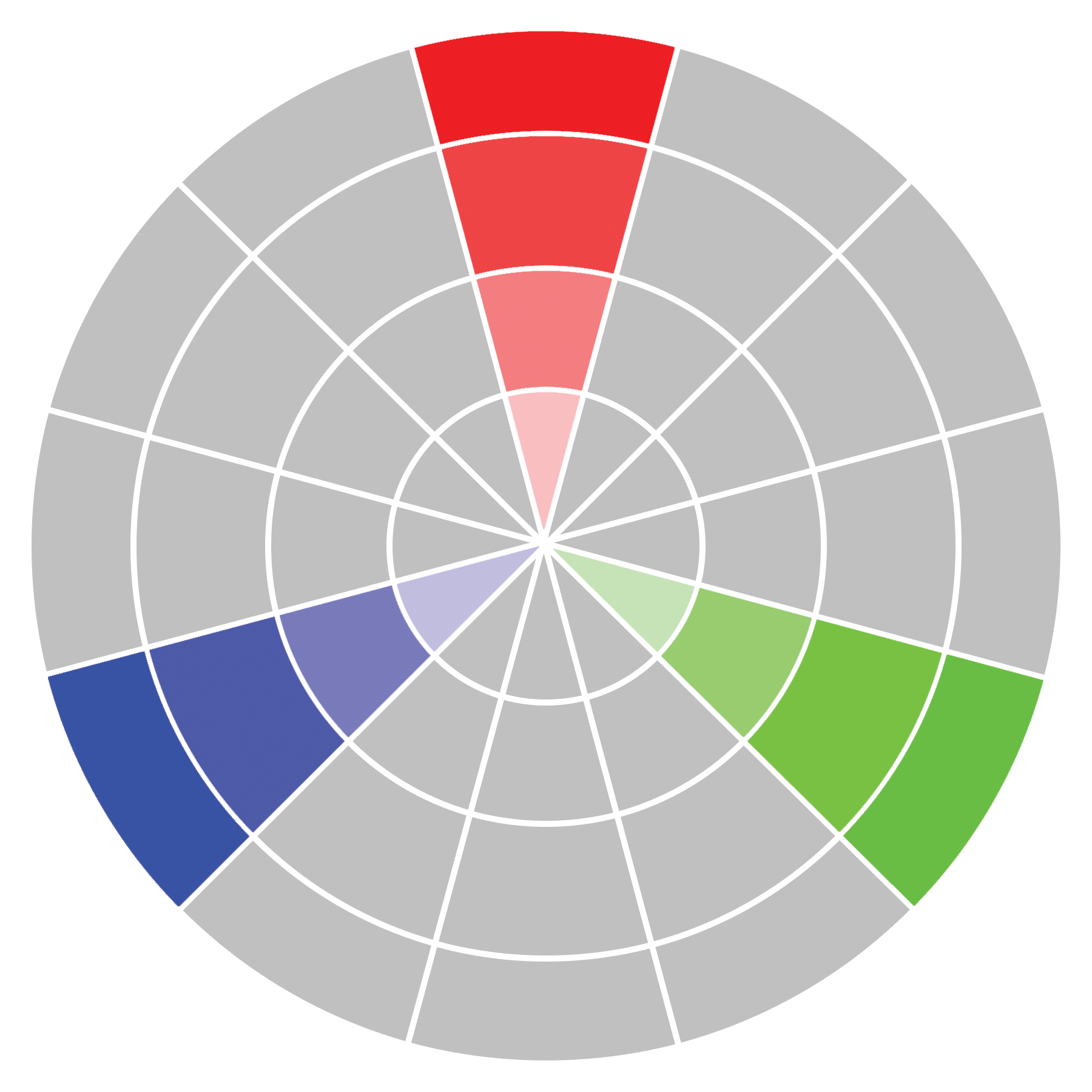
Triad colours are three colours equally spaced from one another, creating an equilateral triangle on the colour wheel. In regards to HSV, 120-degree hue changes would be considered, and for more colour we also use value and saturation here. This one will create a relatively high contrast and also a very colourful image. This might have a different kind of effect on audiences – some may like it while some may not, so it is kind of risky to use, but it may also add some uniqueness to your artwork.
15. Colour harmony tools
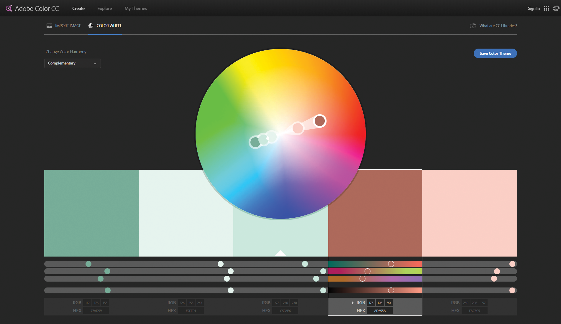
Now that we have introduced you to colour harmonies, the next step would be to select the harmony you need in order to create your desired effect. There are several tools online that can help you with this, including plugins, scripts and standalone software. The choice is yours, but I will introduce some of the options here for those who may be interested.
- Adobe Color CC An efficient and intuitive online tool created by Adobe, featuring an interactive colour wheel and easy colour theme creation.
- Paletton A very creative tool useful for generating colour harmonies using different modes.
- Coolors.co This online tool supports various modes and export functions, and it has an iOS and Chrome extension app as well.
- Cool Picker plugin for 3ds Max This plugin adds a very cool colour picker with a colour wheel and HSV space for the easy creation of different colours.
- Color Harmony script for 3ds Max This one is written by myself; it can support several harmony modes and give you information about select colour in RGB and HEX colour code in SRGB or Linear space (based on colour picker space).
There are many other tools available that you can use online, as well as apps and extensions or scripts for software like Photoshop.
16. Colour broad

Finally, we can create our colour board or palette just like a painter and start making our scenes using this colour board. You can even memorise the colour codes, but there are tools to do that for you – like colour swatches in Photoshop, the colour clipboard in 3ds Max or even the Color Harmony script for 3ds Max.
On some occasions you may find a need to use a separate colour harmony for different aspects of your scene, so be patient with creating colour boards and a selection of colour harmonies.
This article was originally published in issue 244 of 3D World. Buy issue 244 or subscribe to 3D World.
Related articles:
