Disrupt your design thinking
Sign up to Creative Bloq's daily newsletter, which brings you the latest news and inspiration from the worlds of art, design and technology.
You are now subscribed
Your newsletter sign-up was successful
Want to add more newsletters?
Remember when you decided you wanted to be a designer? It sounded like a dream job. You’d be able to express yourself. Originate new and exciting ideas. Craft bold, game-changing visions. How’s that working out for you?
It’s all too easy to feel like your creativity is being stifled by clients, bosses, colleagues. But sometimes, that’s just an excuse. In fact, we often end up restricting ourselves by our own design conservatism.
While by definition they’re in the minority, there are many designers who consistently defy convention... and still keep their clients happy
You find yourself drawing on the same visual elements that other designers are using everywhere you look without ever thinking about why you’re doing so. Sometimes you realise you’re subconsciously second-guessing what others want to see, rather than trying to push things forward. And while the results may be adequate and fulfil the brief, you know in your heart that they’re never going to win any awards.
Article continues belowIf crafting safe and predictable work is threatening to become your default setting, maybe it’s time to change things up and dabble in a little experimental design. That can be a little scary, but you’ll probably be pleasantly surprised with the results; or if not, at least with the process itself. Most importantly, you will have reignited your original passion for design that’s been flickering on a low flame for far too long.
The good news is, you won’t be alone. While by definition they’re in the minority, there are many designers and studios who consistently and successfully defy convention, even occasionally breaking the rules of design. And despite this (or perhaps because of it), they still manage to keep their clients happy.
Here we speak to six of them, to find out how breaking away from the norm, experimenting and daring to be different doesn’t necessarily mean compromising your business goals. You can, it seems, have your design cake and eat it. Here's how to disrupt your design thinking.
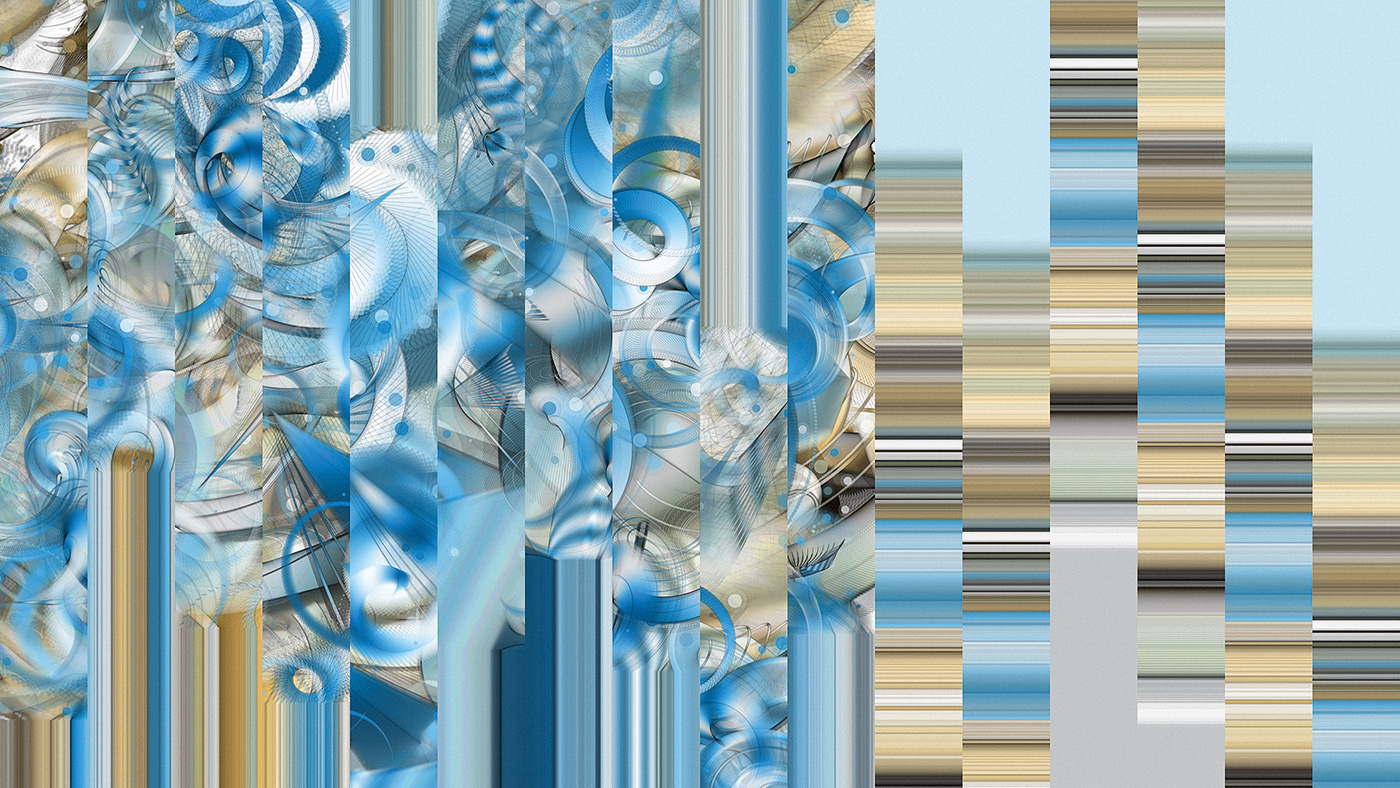
Opener image: Joshua Davis
Sign up to Creative Bloq's daily newsletter, which brings you the latest news and inspiration from the worlds of art, design and technology.
01. Push against trends
Many design studios take great pains to boast on their websites of being ‘disruptive’, ‘unconventional’, ‘blue-sky thinkers’ and so on. But often if you then take a look at their work, you’ll find it’s actually disappointingly conventional and, for want of a better word, dull. Some, though, really do manage to match their rhetoric with action. Take the London-based graphic design duo of Kjell Ekhorn and Jon Forss, aka Non-Format.
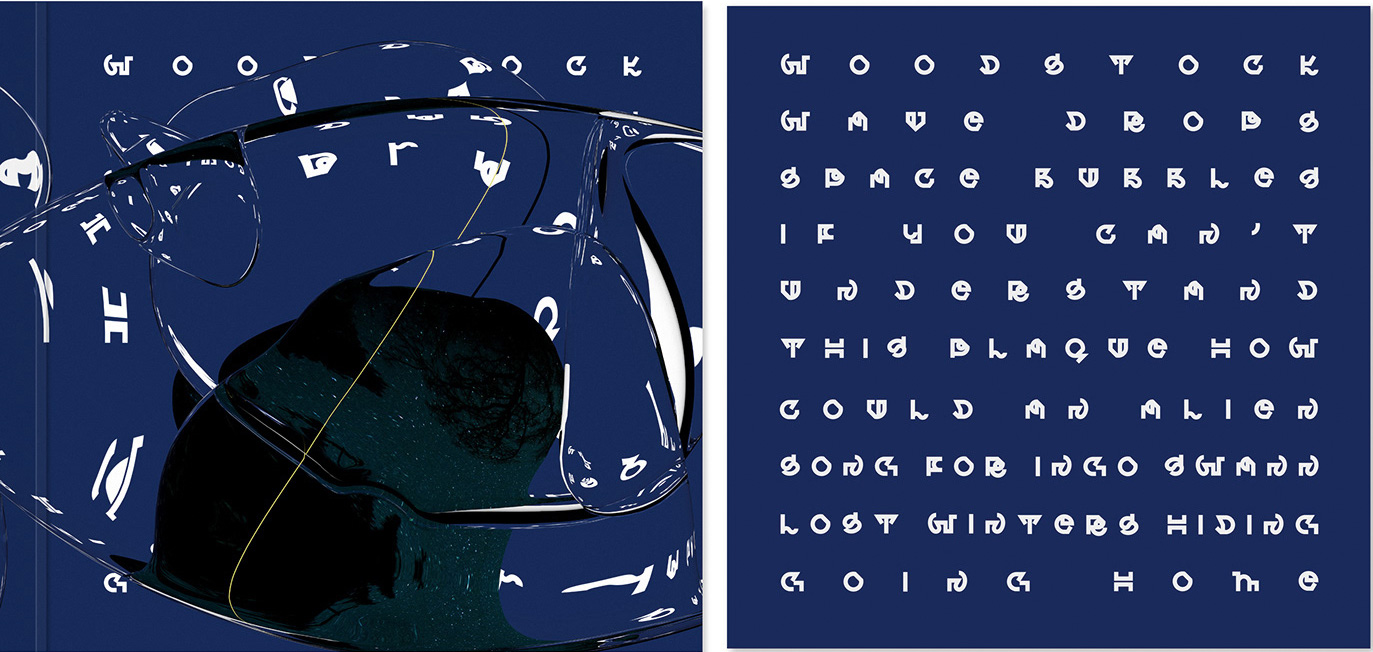
Back in 2005, they were starting to feel as though they had become stuck in a rut. “We consciously abandoned the decorative work we were starting to be pigeon-holed for, and actively sought a new approach that was much simpler and deliberately brutalist,” Forss recalls. “We started creating our own typefaces for the first time, which were super-bold and often quite difficult to read. We were just so sick of seeing so much decorative layering going on, which we’d been guilty of too. Graphic design at the time seemed to be at peak ‘maximalism’. We wanted to throw everything out and start again with something really simple; something that we felt we had complete control over.”
Nowadays Non-Format’s client list includes big names like Adobe, Channel 4, Coca-Cola, Nokia and UNIQLO, but they haven’t compromised their stance. “We try to be as experimental as we can with everything we do,” says Forss. “Sometimes that manifests itself in the visual aspects, sometimes in the choice of how to communicate. But either way, we question everything, especially the brief itself. We have a saying: ‘Don’t ask what the client wants. Ask them what they’re trying to achieve’.”
02. Find new ways to tell the story
Josh Newman is principal creative director at ST8MNT, a studio that has done work for Taylor Swift, Bonnaroo and the National Geographic Channel, amongst others. “Often, clients want designs that look like everyone else’s,” he reveals. “But that won’t capture the uniqueness of who they are. When you’re building brands, it comes down to presenting a unique product.” And that often means going in a very different direction to the visual conventions of that market.

For example, take ‘Rock your Run’, Toyota’s sponsorship of the Rock ‘n’ Roll Marathon Series, which ST8MNT branded in collaboration with REACH experiential marketing agency. In doing so, they made a decision to take quite a surreal step, bringing a geometric look and feel to the graphic elements and typography that’s a far cry from conventional sports branding.
But it works, and not through being different for its own sake; it’s because there’s a clear reason for the unusual treatment. “This direction emanates light and movement through city streets,” explains Newman. “Additional design elements include images of instruments and runners streaked with lights, glow and energy fragments. The aim was to capture the energy of the marathon events, complement the Toyota brand and pull attendees into Toyota’s activations.”
03. Learn design theory first
Anne Ulku, an independent designer based in Minneapolis whose clients include Target, Nickelodeon, HP and Apple, believes that the better you understand the rules of design theory, the easier it is to playfully bend and break them. It’s a principle she puts into practice with all of her work, most evidently in a print titled Break Rules Beautifully.
“That specific piece was for a group show at a wood type printing studio, Hamilton Ink Spot in Saint Paul, Minnesota,” she explains. “I created, carved and printed my own poster using linoleum block printing. That was during the time when I was learning all the basics of what makes good typography, within which there are so many rules and structures. I got interested in the push and pull of that, the idea of creating something that’s more abstract and illegible. So the idea was to create something that embodies the idea of breaking the rules of design. Could I make it so illegible that it becomes super-abstract, but also do it in a very beautiful way, where it just creates a whole new experience and expression to anyone who may look at it?”
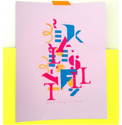
It’s not that Ulku thinks the rules of design are bad or wrong; it’s simply that by playfully subverting them we can understand them better, and unlock our own creativity a little more. She’s even given workshops for the American Institute of Graphic Arts (AIGA) outlining her process, and it’s an approach she applies, to a greater or lesser extent, to all her client work.
“A really good structure and form is what people expect,” she points out. “But if you can take that structure, that grid, that foundation, and know where there’s room to expand, mix things a little bit quirkily, or create something that throws everyone off-kilter, then that’s where the unexpected can happen, in a way that lets people reach outside their comfort zone.”
04. Break one rule at a time
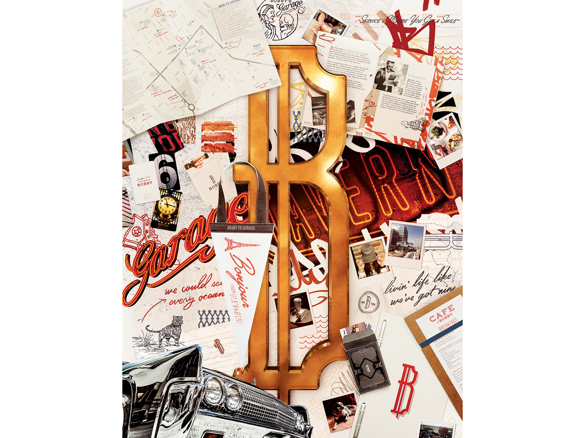
In a commission for Bobby Hotel, a boutique establishment in Nashville, ST8MNT purposely broke the rules of hierarchy in the layout of a pocket guide and poster. There was reason behind the rebellion, says ST8MNT’s art director Ryon Nishimori.
“They don’t have the typical flow of something following the rules of hierarchy, and allow your eyes to bounce around to discover the little elements in the designs that make them so fun,” he explains. “The communication is still intact and in a way, even though the basic rules of hierarchy have been broken, there is still enough of an element intact just to draw your eyes into the design.”
“Hierarchy, colour, form, function… all these things can be extrapolated and changed, but there needs to be a reason why," continues Nishimori. "For instance, because it’s going to communicate something a little differently, tell a different story of perspective, to communicate the unique aspects of whatever you’re working on.”
He adds that when you break one rule, it can be a good idea to double-down on another, to achieve a sense of balance within the design. “So, for example, if you’ve broken a typography rule, and made the text less legible as a result, you can use hierarchy to balance that out and help guide the reader through your design more easily.”
Maintaining a healthy balance of form and function isn’t the only way to break rules, he adds, but it is a decent start. “Balance is usually a good thing to have. Because if you break every rule, you’re probably going to lose communication and the message, which ultimately makes the design pointless. For example, back in the 1990s, David Carson broke the rules of magazine layout. But look at the Ray Gun magazines, where he did all of the crazy stuff with type: he still set it in black so you could discern and read it!”
05. Rethink what a designer is
Rebelling against design conventions is one thing, but what about rethinking what a designer does in general? One woman who’s done precisely that is Nassia Inglessis.
Her work combining design, cutting-edge science and engineering is truly groundbreaking and category-defying – from her 3D-printed glass architectural columns for Milan Design Week, to the convergence of craft and automation as Augmented Materiality in her installations for London’s V&A Museum. But that’s nothing new, as she’s been cheerfully disregarding career boundaries ever since she was a student.

Having studied engineering at Oxford, Inglessis then got interested in art and design and how it could cross over with science. After training at The Royal College of Art, she eventually founded Studio INI, which she describes as “an experimental design studio with a human centric approach to explore matter in the context of cognition”.
Throughout her journey, she says that what she terms academic and professional “disobedience” has been a constant source of inspiration to her. “Disobeying the norm has been the path through learning and discovering more,” she stresses. “And that’s continued throughout my journey. For example, seeing how freely glass blowers work with that material, that immediately generated a spark of inspiration, because I had this freedom to be a bit more flexible with the rules.
“At the end of the day, discovery comes from disobedience,” she stresses. “Discovery has to challenge what is already there, or go beyond what you know. So you have to disobey. Scientists disobey their predecessors. Designers disobey conventions. Of course, there is a side of disobedience that is just destructive, but it’s important to channel that into creativity, and into discovery.”
06. Prepare to start again… and again
The key to disruptive design is experimentation, says Ulku, and it’s an approach she often follows in her own practice. She explains: “A lot of my work is: ‘I’m going to try this, and I’m going to try that’. It’s a self-exploration of how can I represent these abstract thoughts and concepts in my mind, and put them out there for people to take in, or discover something about themselves; opening their eyes to curiosity and wonder.”
I had to learn that there isn’t a correct answer, and see the value in the journey
Anne Ulku
It might sound fun and exciting, but Ulku stresses that it’s not a walk in the park. Experimentation by its very nature means lots of starting again… and again. “The majority of my work gets killed or thrown out,” she reveals. “But you have to go through all those exercises of doing everything that’s wrong, and lots of trial and error, before you come to a solution that feels right.”
It’s very time consuming, so you have to put in the hours. And psychologically, you need to be strong-minded too, adds Inglessis. “You have to step into the dark. The failures happen, and the rejections happen. And so you really have to be very stubborn and persevering. You have to have a bit of a masochistic nature, I won’t lie!
“It’s scary, but fun at the same time,” she continues. “In my case, I literally had to learn that there isn’t a correct answer, and see the value in the journey. And forget the word failure. Call it experimentation… because that’s exactly what experimentation is.”
07. Subvert stereotypes
The broader ‘rules’ and conventions of society are open to question by designers, too. In fact, it’s something that Swedish creative studio Snask has made into something of an artform.
To take a seemingly trivial example, the company’s signature colour is pink. “People ask us why,” says founder and creative director Fredrik Öst. “They see it as representing femininity or sexuality. But that’s all made up. In fact, just a few centuries ago, pink was seen as manly; because it’s a shade of red, and red was associated with blood and royalty. The only people allowed to wear it were men of providence. So claiming that pink is female is just buying into the modern commercial idea that female babies wear pink and male babies wear blue. There’s simply no logic to it.”
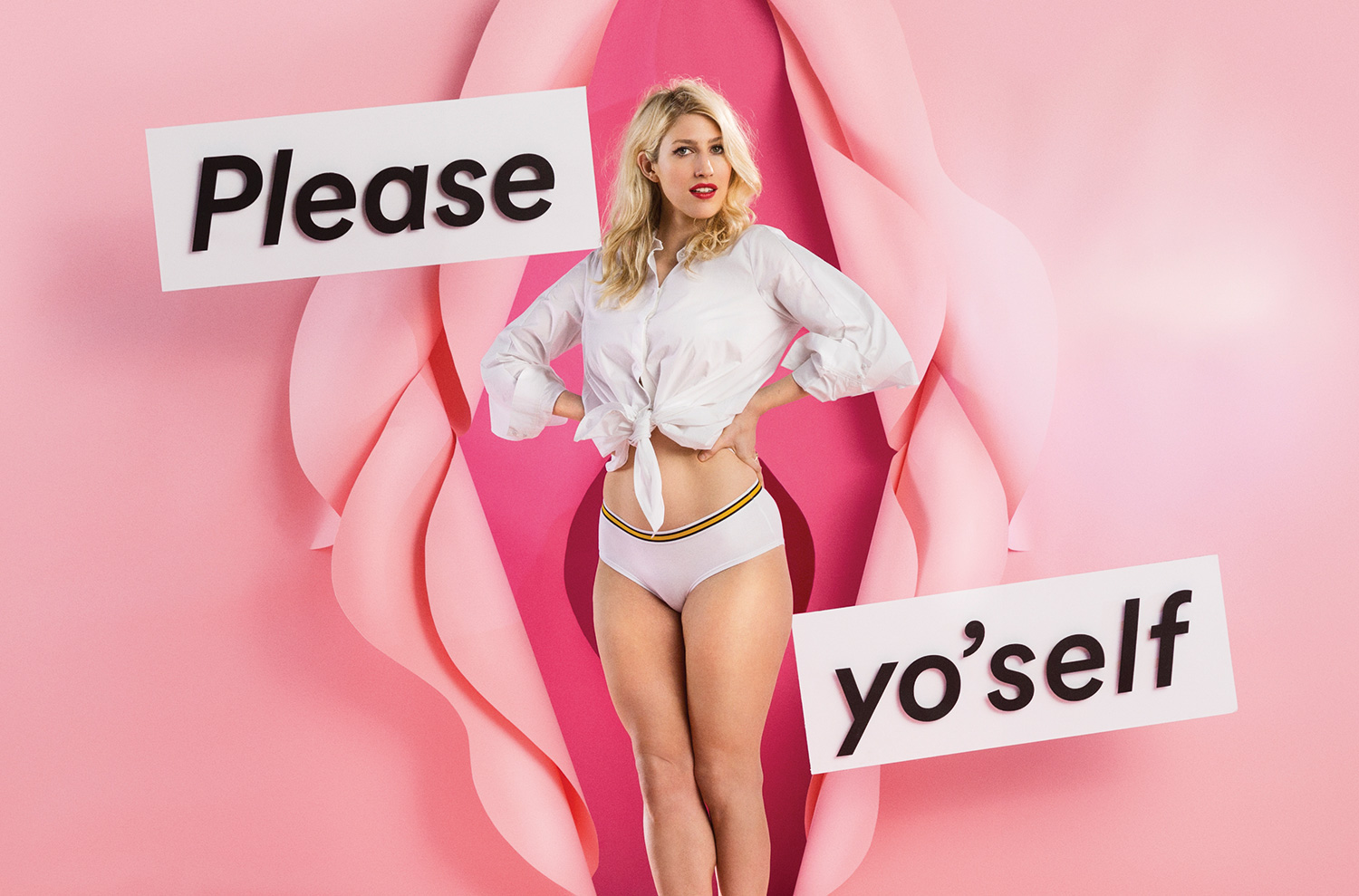
It’s this questioning of rules and norms that led Öst and Jakan Magnus to launch Snask straight out of university. “We didn’t want to get jobs in an industry built by old white men, that had made-up rules, that was built on outdated theories,” he explains. “So we launched a startup and thought: ‘Let’s sail west and see what’s over there, do our thing. Let’s make all the mistakes that we can, and learn from them’.”
Their business model was unconventional, too. “Profit was never our number-one reason for existing,” Öst stresses. “It was: create a vehicle to have fun. Something that felt less like going to a job on the Monday and more like going to a hobby.”
Yet despite this confrontational attitude, Snask still got clients. “The interesting thing is that for our first five years in business, more than 90 per cent of our clients were female,” reveals Öst. “We sometimes had requests from older men but they were really offended by everything: our age, our name, everything.”
We didn’t want jobs in an industry built by old white men, that had made-up rules, that was built on outdated theories
Fredrik Öst, Snask
Over the years, though, that’s changed, and now brands of all kinds are queuing up to ask the design studio to work for them. A recent example is Sneakersnstuff, a super-hip chain of retail stores that’s gone from a small indie focused on collectables to industry-leading tastemaker in a mere matter of years.
When the company came to Snask, the studio’s attitude was typically provocative. “They wanted us to create a cool film about their waterproof sneaker, which they made in collaboration with Adidas,” recalls Öst. “But instead of making a cool film, we were like, woah, your industry’s so cool, and your branding’s so cool that we think you should do it… uncool. Because it’s much nicer if, instead of everyone being so super-cool and fresh, you might be a bit uncool, or even very uncool”
Following this theme, Snask ended up filming a hilariously tongue-in-cheek spot for the brand about Thomas, an enthusiast for ‘puddle jumping’ (you can watch it above). “He is extremely uncool, but he thinks he’s cool in a way,” explains Öst. Snask also made a similarly ironic short subverting the concept of the internet cat video. All of this sounds so wrong, but the humour is so clever and the execution so spot-on, that it just works brilliantly.
08. Get yourself a reputation
From disruptive outliers to main players, clients and studios have been on very similar journeys, and as is often the case, it’s led to a perfect meeting of minds. It’s an experience that’s also familiar to ILoveDust, a creative studio based in Brighton and Southsea that’s been pushing back against industry norms since 2003.
Today, the client list includes global titans like Nike, Red Bull, Xbox and Coca-Cola, but that hasn’t stopped the company from devising ways to break boundaries. “We’re always looking to push new styles, and are definitely nearer the experimental end of the spectrum: breaking the rules, stretching the type, messing with the colours,” explains lead designer Matt Howarth. “Most of our clients come to us precisely because they know we don’t follow the rules.”
Most of our clients come to us precisely because they know we don’t follow the rules
Matt Howarth, ILoveDust
And the more you get known for experimental work, the more clients ask for it; “A good portfolio of successful badass rule-breaking work always helps”, he notes.
This attitude has dovetailed nicely with its most notable new client, the zeitgeist-grabbing, disruptive ‘retailtainment’ platform NTWRK launched by Aaron Levant, which has been grabbing headlines everywhere for its innovative business model, something that has been dubbed ‘QVC meets Comic Con’.
“The NTWRK platform is the first of its kind, and so they wanted some fresh visuals to launch the service,” explains Howarth. “NTWRK literally said: ‘Do what you feel is right for us’.” The studio let their imaginations rip, and the resulting spot is a crazed mashup of retro 1980s typography, sci-fi graphics and 8-bit silliness.
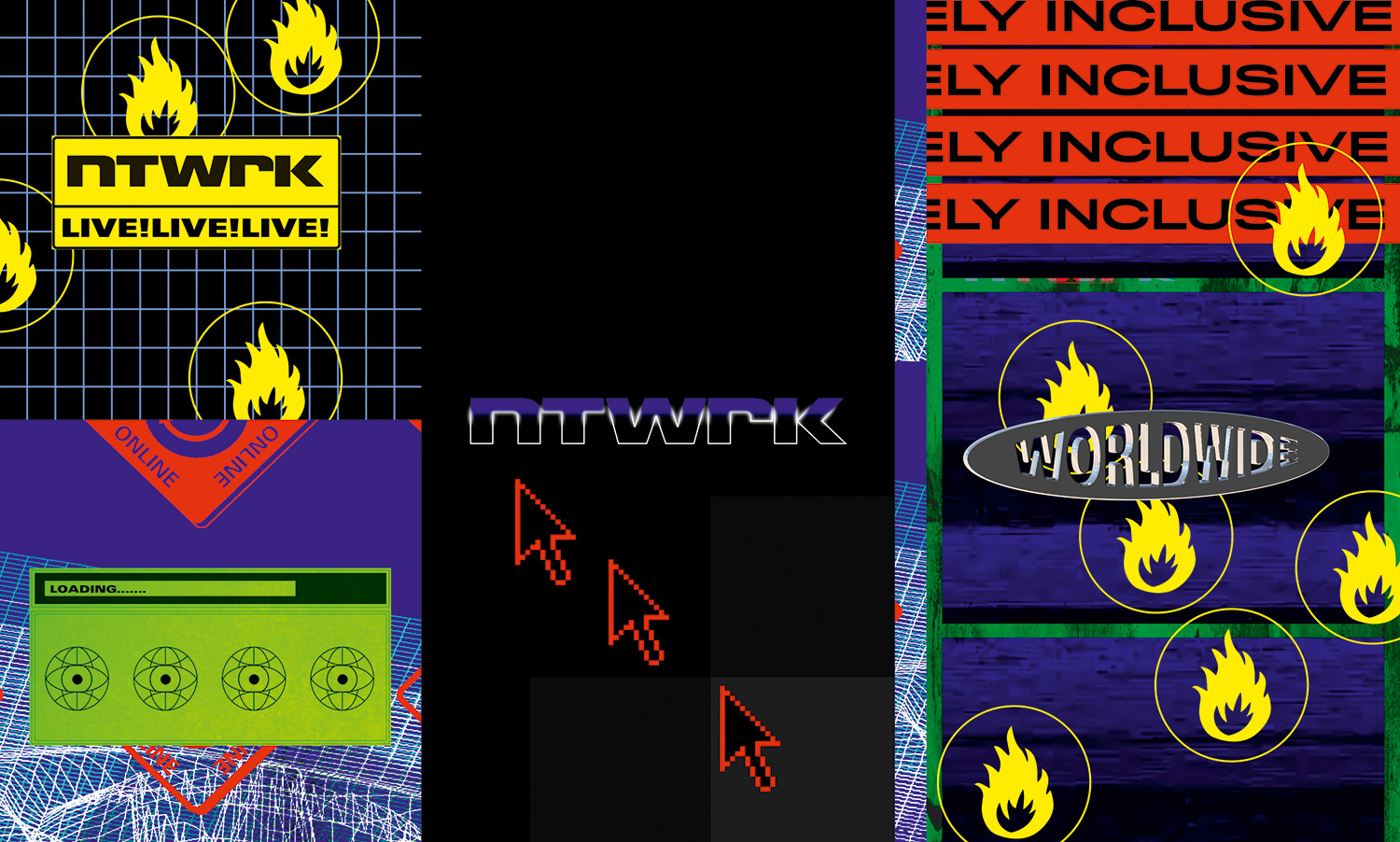
It’s certainly not the kind of ‘explainer’ animation we’re used to seeing for a launch of a new brand; it makes very little sense to the uninitiated. But in the hall-of-mirrors world of modern social media, where what appeals to Generation Z is almost by definition incomprehensible to the rest of society, it seems strangely perfect. “We had a lot of fun with that one,” smiles Howarth.
More and more areas of business are seeing disruptive new entrants, and it’s a trend that’s only likely to accelerate as we move towards the 2020s. Innovative new platforms are likely to demand innovative new design thinking, so there’s never been a better time to build yourself a reputation for breaking away from convention and be open to disobeying design rules as a way forward.
This article was originally published in Computer Arts, the world's best-selling design magazine. Buy issue 288 or subscribe.
Read more:
- 8 inspiring graphic design game-changers
- 11 of the biggest graphic design trends for 2019
- 9 tips for better side projects

Tom May is an award-winning journalist specialising in art, design, photography and technology. His latest book, The 50 Greatest Designers (Arcturus Publishing), was published this June. He's also author of Great TED Talks: Creativity (Pavilion Books). Tom was previously editor of Professional Photography magazine, associate editor at Creative Bloq, and deputy editor at net magazine.
